Most website owners don’t take their About Us page very seriously.
They’ll talk about themselves for a bit, upload a photo or two, and then call it a day. Worse, they rarely update the darn thing — the About page they threw together on Day 1 is the same one they’re sporting months (or even years) later.
That’s a problem because most visitors to your website aren’t old, familiar faces — they’re first-timers coming from Google who don’t know anything about you.
And the first thing many of those visitors do? Yep, they check out your About Us or About Me page.
Sophisticated bloggers, freelance writers, and business owners know the About page is one of the most important pages on your website — it introduces you to new readers, potential customers, and future adoring fans.
And the websites that get them right — like the ones I’m about to share with you — have a huge advantage over their competitors.
So, ready for some inspiration? Let’s dive in.
The Best About Us Page Examples
1. Todd Henry
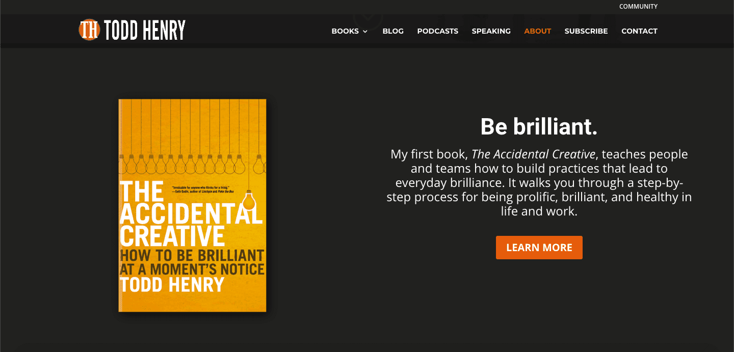
Why Todd Brown’s About Me Page is So Good
Todd Brown writes with the precision of a Navy S.E.A.L. sniper within each section of the page. Every word plays a role and delivers. It’s the writing equivalent of Bruce Lee’s one-inch punch.
What You Can Learn From Todd Brown’s About Me Page
Once you say what you need to say, stop writing.
2. Advance Your Reach
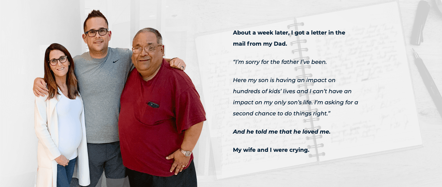
Why Advance Your Reach’s About Us Page is So Good
Many great About pages talk about their company’s history solving a specific problem. Few people talk about solving a personal problem as foundational as fixing a broken relationship with your father.
Is it me or is someone cutting onions in here?
What You Can Learn From Advance Your Reach’s About Us Page
Don’t be afraid of getting vulnerable, especially if it’s central to why you chose your path. Letting your guard down builds a stronger bond with your ideal readers and more effectively repels the ones who aren’t a match anyway. Win-win.
3. Grammarly
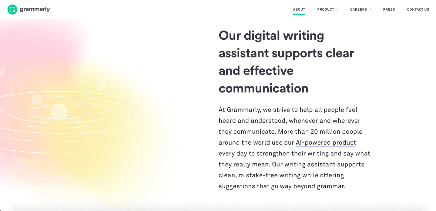
Why Grammarly’s About Us Page is So Good
Grammarly has a cult following with professional writers. And Grammarly prominently displays the reason why right on their About page. Their benefit-rich copy serves as a beacon to bring more writers into their warm embrace.
What You Can Learn From Grammarly’s About Us Page
Make your mission statement loud and clear. Grammarly’s mission statement — “to improve lives by improving communication” — is at the very top of their About page. Make sure readers can find yours too.
4. Ramit Sethi
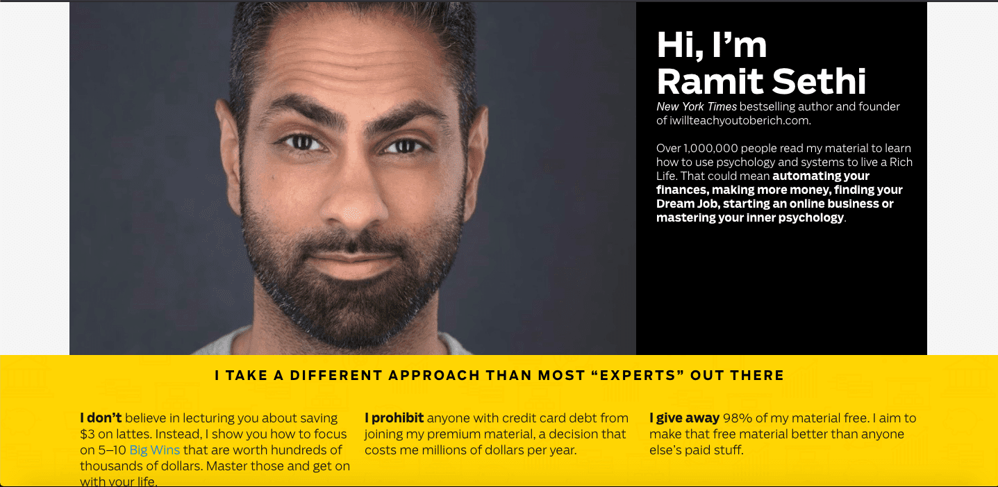
Why Ramit Sethi’s About Me Page is So Good
Ramit’s ‘About Me’ page stands out for two reasons:
First, he positions himself as a contrarian — the anti-expert expert.
Second, Ramit is known for being long-winded. He’s true to form on his About page, but it’s worth reading every word.
What You Can Learn From Ramit Sethi’s About Me Page
There’s no such thing as “too long” when it comes to content, if it’s engaging and informative. It’s important to be true to yourself and not just mimic what you see other people doing.
5. Ray Edwards
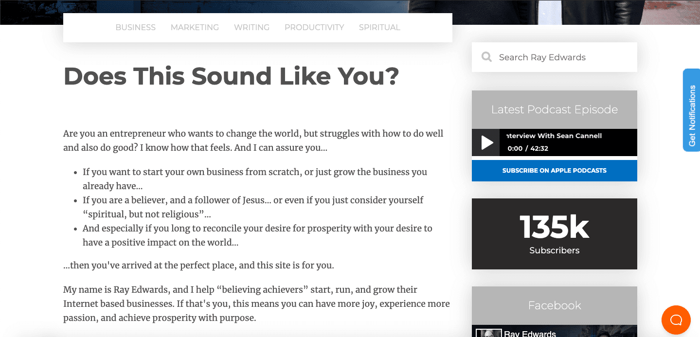
Why Ray Edwards’ About Me Page is So Good
Ray takes advantage of the way the human brain is wired. He knows that, when people see a question, they want to answer it. In the case of his About page, they have to read more to have enough info to answer the question.
And if it does sound like them, they’re more likely to keep reading, which is exactly what he wants.
What You Can Learn From Ray Edwards’ About Me Page
You can get your point across about what you offer, while still keeping your reader as the focal point. Frame what you’re selling in how it will help your reader.
6. SiteGround
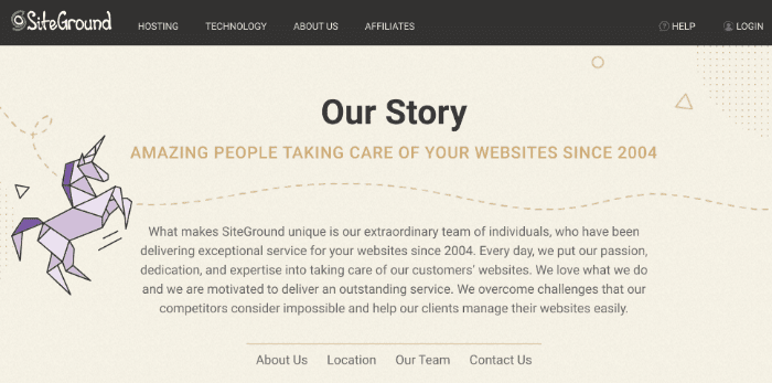
Why SiteGround’s About Us Page is So Good
SiteGround lets you know right away that they’ve been in the web hosting game since 2004. You can’t overstate the value of getting potential customers comfortable that you’re not going to go all Bernie Madoff on them.
What You Can Learn From SiteGround’s About Us Page
Repetition can be a good thing. If you have a key advantage versus your competitors, say it loud and say it proud. In SiteGround’s case — longevity, loyalty, and innovation make for quite the trio.
7. Truvani
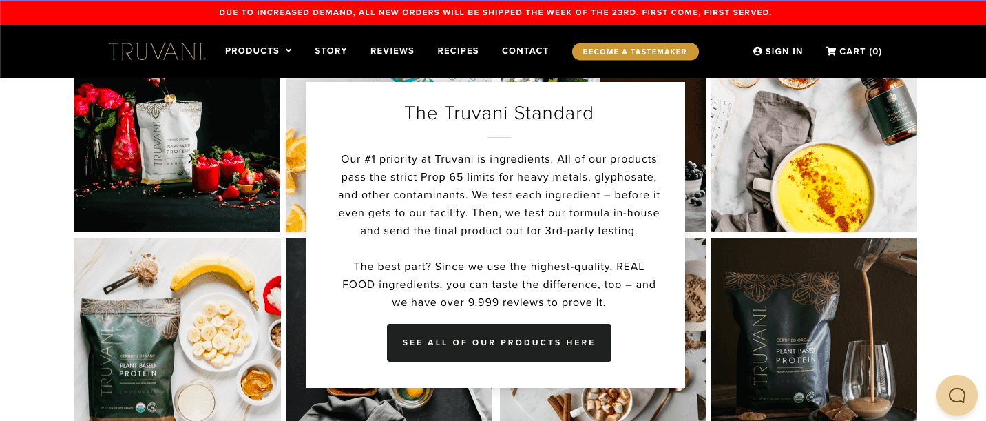
Why Truvani’s About Us Page is So Good
The copywriting and web design here are fingerlickin’ good — the page seamlessly transitions from establishing a rapport (based on values) to selling. The CTA (call-to-action) isn’t all neon signs and flashing lights, but you can’t miss it.
What You Can Learn From Truvani’s About Us Page
It’s okay to “sell” on your About page. People didn’t just show up on your ecommerce site to do some light reading. Make a quick connection, and then make it easy for them to get your product.
8. SE Ranking
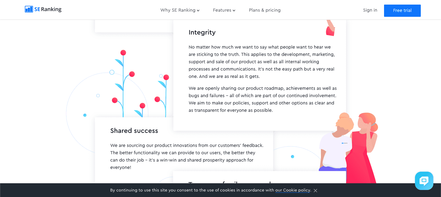
Why SE Ranking’s About Us Page is So Good
Differentiating your company when it’s in a crowded niche isn’t easy. An “all-in-one SEO tool”, SE Ranking competes with the likes of Moz, SEMrush, and Ahrefs.
But despite the stiff competition, SE Ranking doesn’t overdo it. Their About page projects calm and serenity by using solid copy and a pleasing color scheme.
What You Can Learn From SE Ranking’s About Us Page
You don’t have to “go big” to be effective. A nice page design featuring bold colors and top-notch copy will always jump off the screen.
9. Yellow Leaf Hammocks

Why Yellow Leaf Hammocks’ About Us Page is So Good
In a word: simplicity.
Yellow Leaf Hammocks combines a socially-conscious mission statement with a product description that lets potential clients know everything they need in only three lines of above-the-fold text.
What You Can Learn From Yellow Leaf Hammocks’ About Us Page
You don’t have to write a novel in order to make a great first impression. Having a clear, compelling, catchy message — prominently displayed above the fold — helps you grab your readers’ attention before they turn away.
10. WP Engine
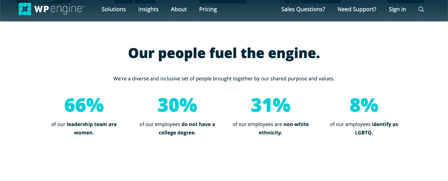
Why WP Engine’s About Us Page is So Good
WP Engine does a lot of things well on their About page, but I love the “Our people fuel the engine” section toward the bottom of the page.
It shows WP Engine knows their target customer cares about diversity, and that it’s a key differentiator for them.
What You Can Learn From WP Engine’s About Us Page
Using numbers makes your About Us page feel official. If you’re a business that has interesting data at your disposal, following WP Engine’s lead and prominently display it.
11. Kajabi
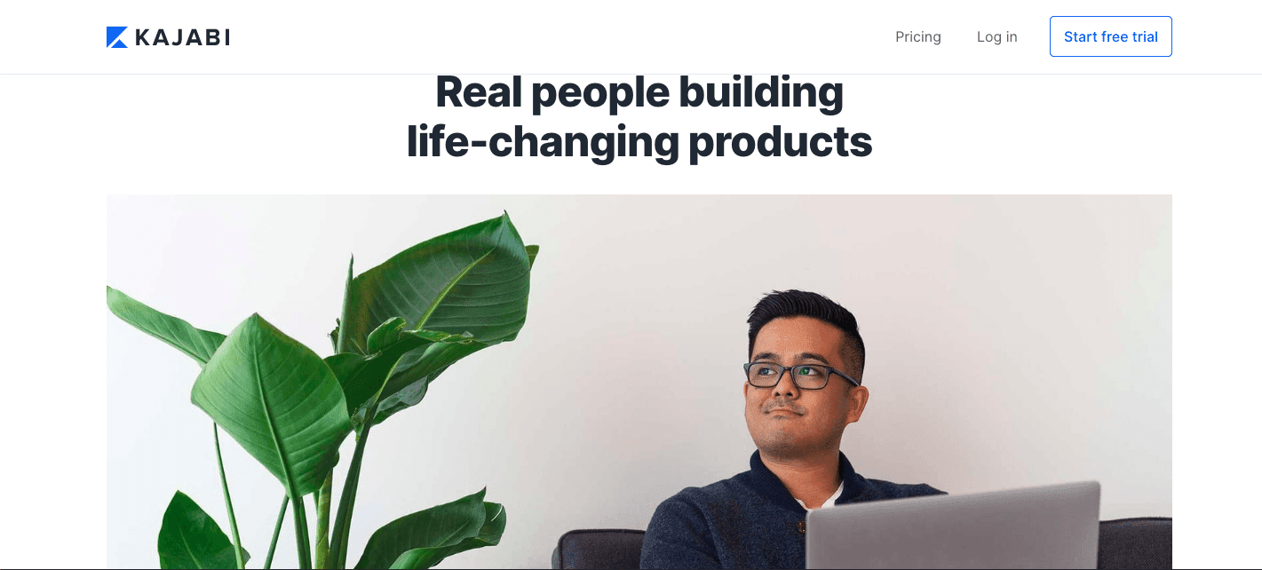
Why Kajabi’s About Us Page is So Good
From the large, high-quality photo that greets you, to the way they casually weave in four unrelated success stories of customers to show the lengths of their unconditional support, Kajabi’s About page feels like it was crafted by someone you might know.
What You Can Learn From Kajabi’s About Us Page
Don’t make it all about you. Speak directly to the type of reader (or customer) you want to attract. Come across as a friend who can help them, not a stranger looking to get something from them.
12. RKA Ink
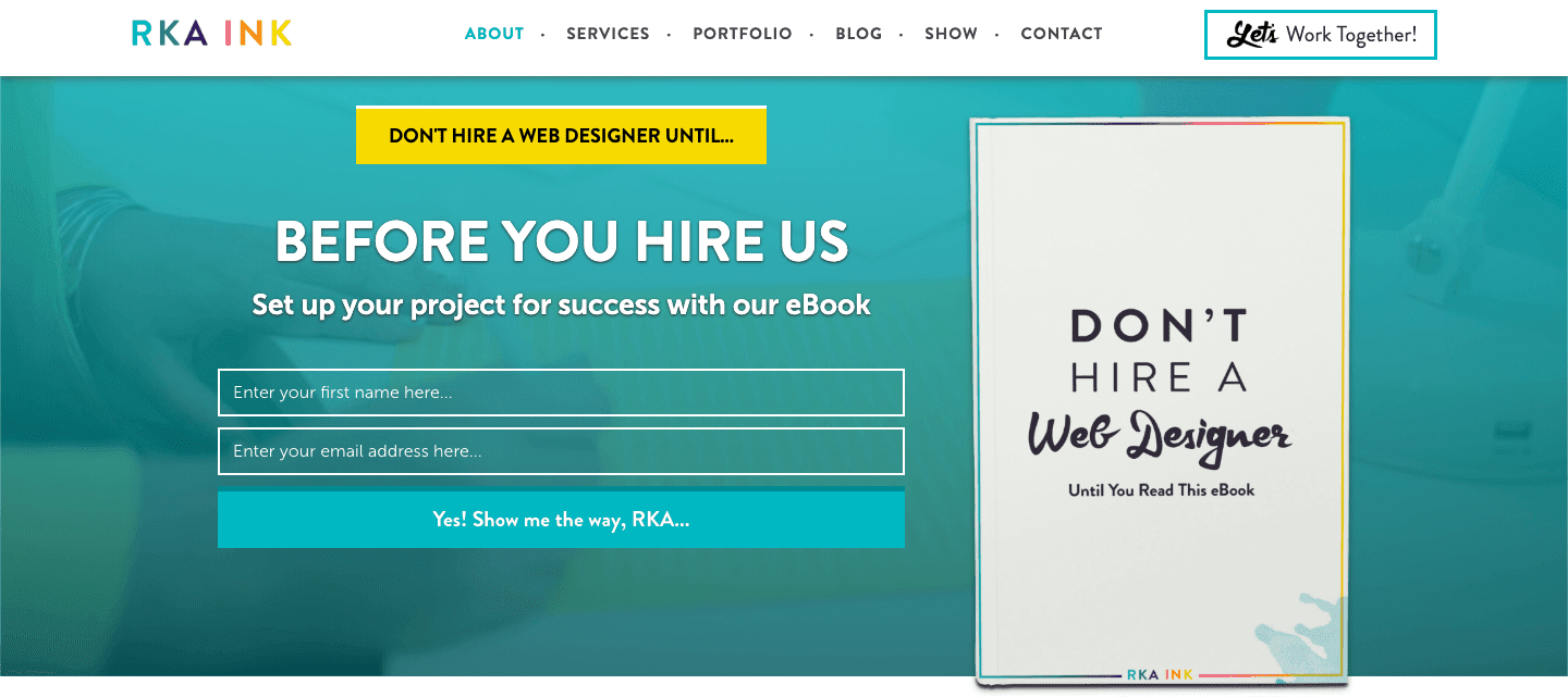
Why RKA Ink’s About Us Page is So Good
RKA Ink’s About page tells you not to hire them (or anyone else) until you’ve read a free eBook. Of course, not only does this eBook bring them email leads, but its content helps convince readers why they are the best option.
It’s a rare example where you end up in a long-term relationship with a company because they told you NOT to hire them.
What You Can Learn From RKA Ink’s About Us Page
Just because you have a business doesn’t mean you can’t have a personal brand. And if you can showcase the same writing or design chops on your site that you want clients to buy, you’ll be way ahead of your competition.
13. Bob Goff
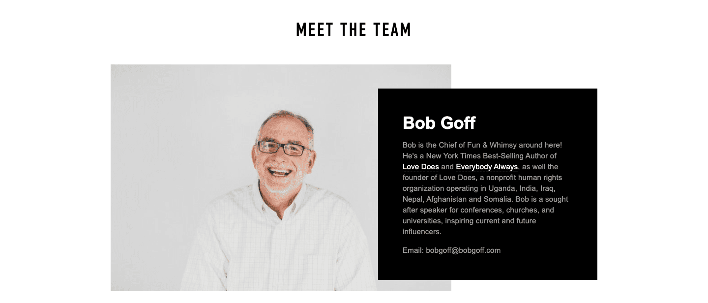
Why Bob Goff’s About Us Page is So Good
Bob Goff uses his website’s About page to introduce you to his team members. A headshot for each team employee is given, allowing readers to put names to faces.
What You Can Learn From Bob Goff’s About Us Page
Let readers and potential customers learn about everyone in your company, not just the head honcho.
14. FreshBooks

Why FreshBook’s About Us Page is So Good
Freshbooks turned their About page into a second home page — with links for everything you might want to know about them. It’s surprising we don’t see businesses use this approach more frequently.
What You Can Learn From FreshBook’s About Us Page
Large and small businesses — like people — can be multifaceted. Thoughtfully putting all aspects of your business on display casts a wider net, which attracts a larger group of people to bring into your world.
15. Harvest
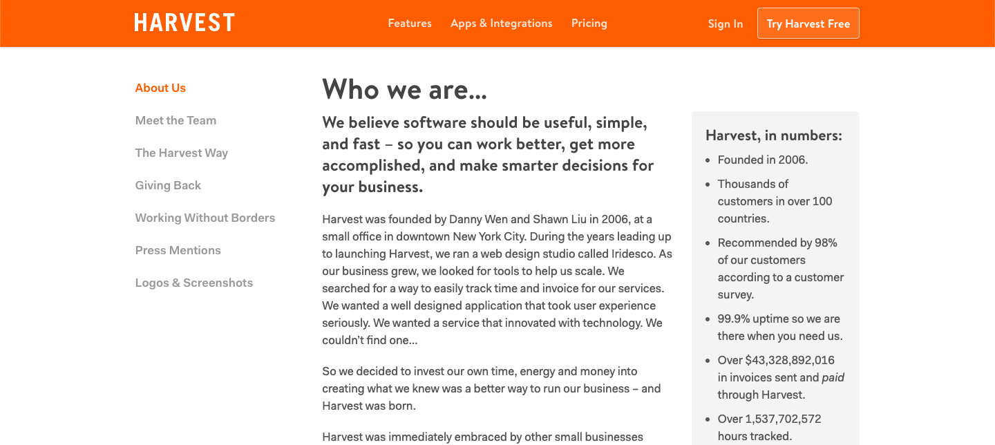
Why Harvest’s About Us Page is So Good
Harvest creates a perfect user experience on their About page for the no-frills, busy professional. They give you direct links so you can jump straight to whatever you’re looking for. No scrolling.
What You Can Learn From Harvest’s About Us Page
“Simple design works” is the main lesson, but there are two important storytelling lessons here too:
First, people love origin stories.
Second, business origin stories are even better when they start by solving your own problem. It exponentially ramps up the relatability.
16. iThemes
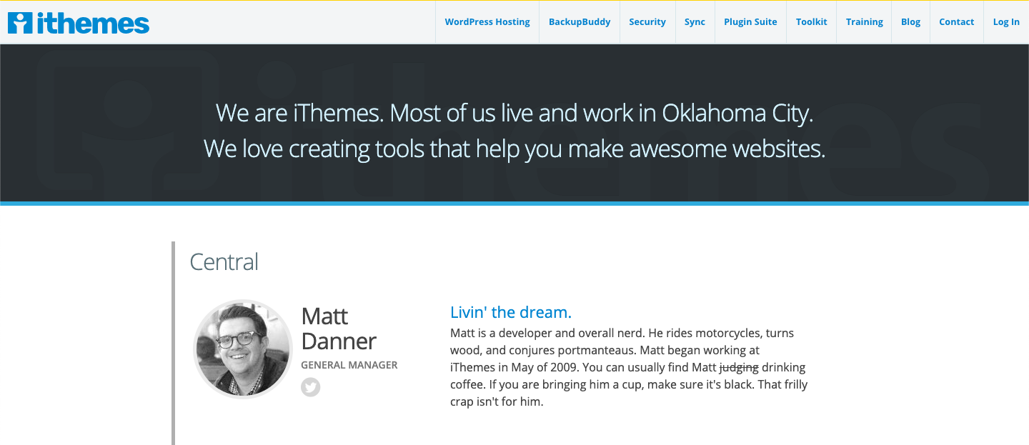
Why iThemes’ About Us Page is So Good
In a word: community. They start with the Oklahoma City shoutout and then each person on the team shares a catchphrase or motto. You can learn a lot about a person from what they choose as their catchphrase.
What You Can Learn From iThemes’ About Us Page
Highlight the people who comprise your company, not just the company itself. iThemes’ About page gives the name of the company, its home city, and a simple tagline. The rest of the page is dedicated to their people — who they are, what they do, and how you can connect with them on social media.
17. Wave
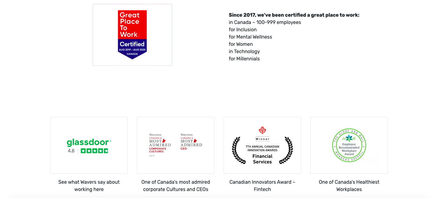
Why Wave’s About Us Page is So Good
Testimonials are great social proof, but business awards are just as effective (if not more so). And they’ve been collecting business awards like Pac Man gobbling up power pellets, Wave’s About page prominently displays them.
What You Can Learn From Wave’s About Us Page
Awards add instant credibility. And whether or not the reader has heard of the company giving out the award doesn’t matter nearly as much as you think it might.
18. Asana
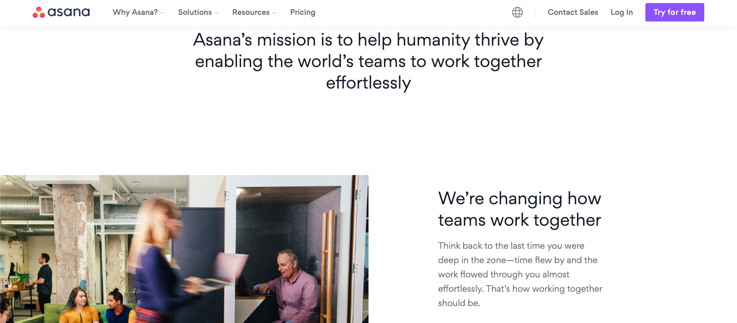
Why Asana’s About Us Page is So Good
The pictures Asana uses are fantastic at giving new readers a glimpse behind the scenes at their office. Each one looks like a photo you have on your camera roll, complete with the action blur in the screenshot above.
What You Can Learn From Asana’s About Us Page
Your photos don’t need to go through a gauntlet of 23 Snapchat filters to make a first impression that sticks with your reader. The photos just need to match your overall message.
19. BuzzStream
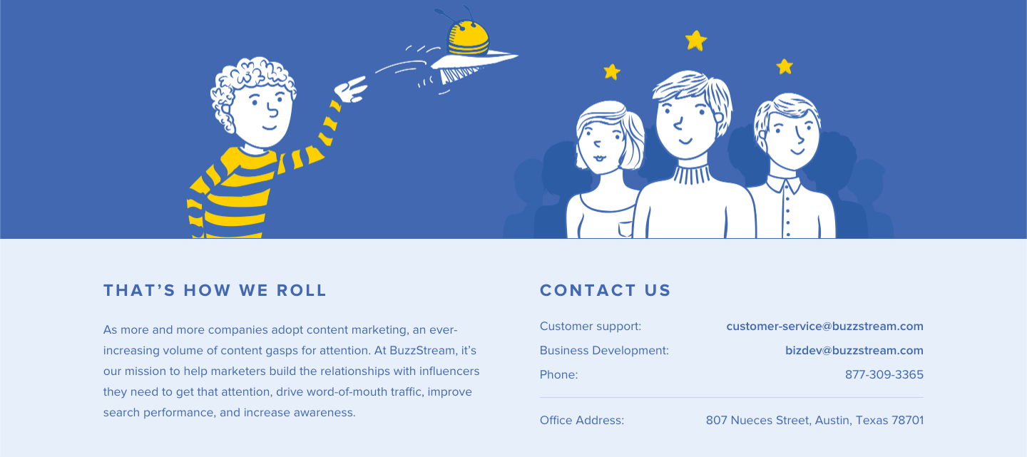
Why BuzzStream’s About Us Page is So Good
BuzzStream’s About page gives you enough info to know what BuzzStream does, but not how they do it. It stirs up curiosity, while giving the reader multiple ways to contact BuzzStream if they want to learn more.
What You Can Learn From BuzzStream’s About Us Page
With the right hook, you don’t need to tell your whole story on your About Us page. You can place your bait and wait for the leads to start pouring in.
20. Marie Forleo
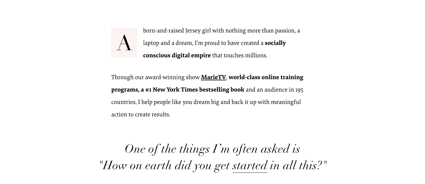
Why Marie Forleo’s About Me Page is So Good
A beautiful website isn’t worth much if the content sucks. Marie Forleo not only has one of the most eye-catching About pages on the web, but she also hits you right in the feels with her heartfelt words.
It reads as close to a letter to a friend as you’ll see.
What You Can Learn From Marie Forleo’s About Me Page
Read Marie’s About page and you’ll learn how to write about what you believe in — and why — without it looking like a bulleted buzzword bingo cheat sheet.
Aside: She also has a book with the best title ever — Everything Is Figureoutable (affiliate link).
21. Ann Handley
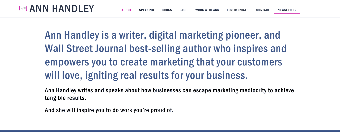
Why Ann Handley’s About Me Page is So Good
I love Ann Handley’s stuff. And her About Me page is no different. Her value proposition is so dialed in, it almost brings a tear to my eye. The testimonials in the speech bubbles are a great touch too.
What You Can Learn From Ann Handley’s About Me Page
Third person works great when you have lots of accolades (like Ann) to showcase. Written in the first person, it might come across as bragging.
22. Nathan Barry
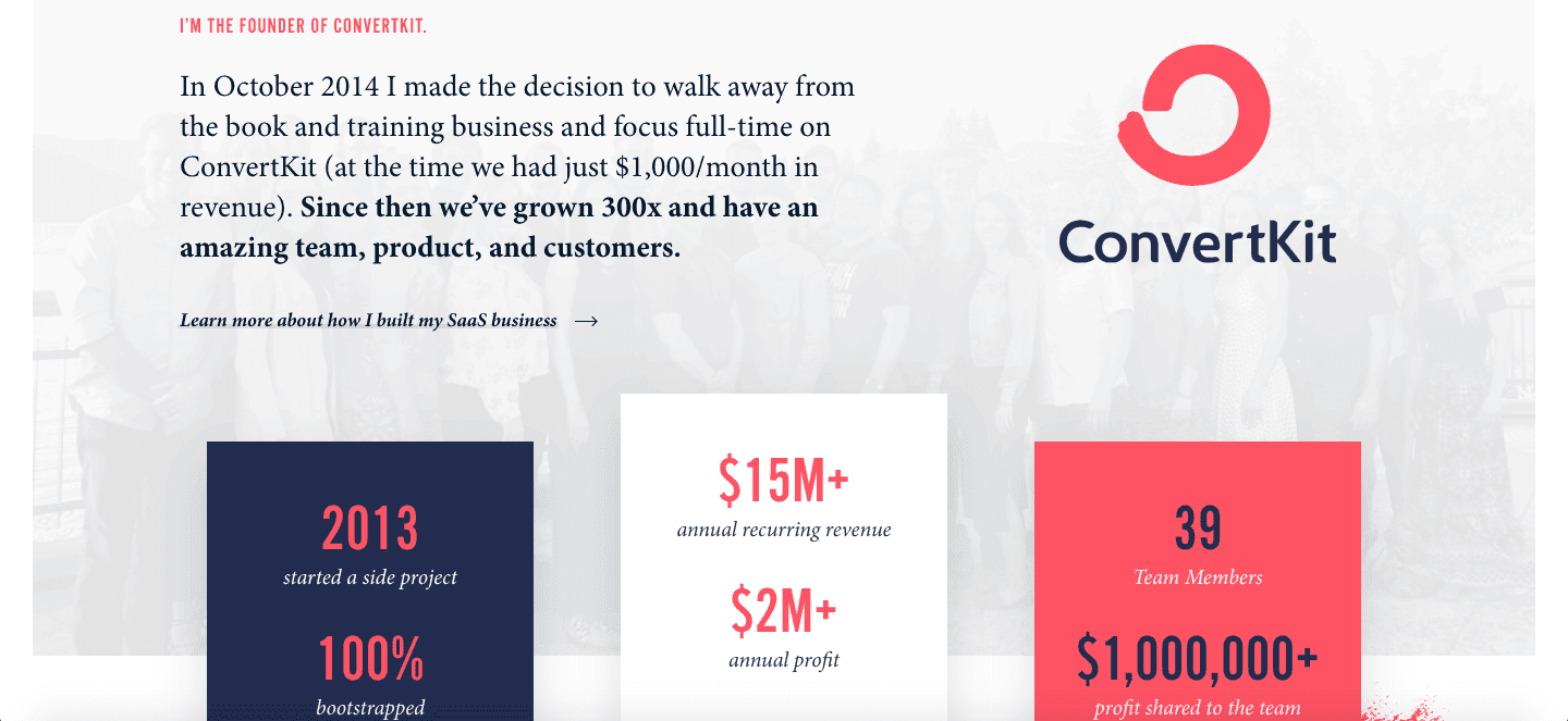
Why Nathan Barry’s About Me Page is So Good
The founder of ConvertKit, Nathan Barry knows dropping the names of a few well-known customers (“Gretchen Rubin, Chris Guillebeau, Pat Flynn, Tim Ferriss, Carrie-Anne Moss, and Tim McGraw”) work as well as any raving 5-star review when it comes to proving your product does everything you promise.
What You Can Learn From Nathan Barry’s About Me Page
If you have a high-profile customer, subscriber, or admirer, don’t be afraid to leverage it.
Also, positioning is key. I switched to ConvertKit from MailChimp partly because I learned ConvertKit was built for blogging — made by creators for creators (like me). If you’re part of your target audience, be sure to say so.
23. Tarzan Kay
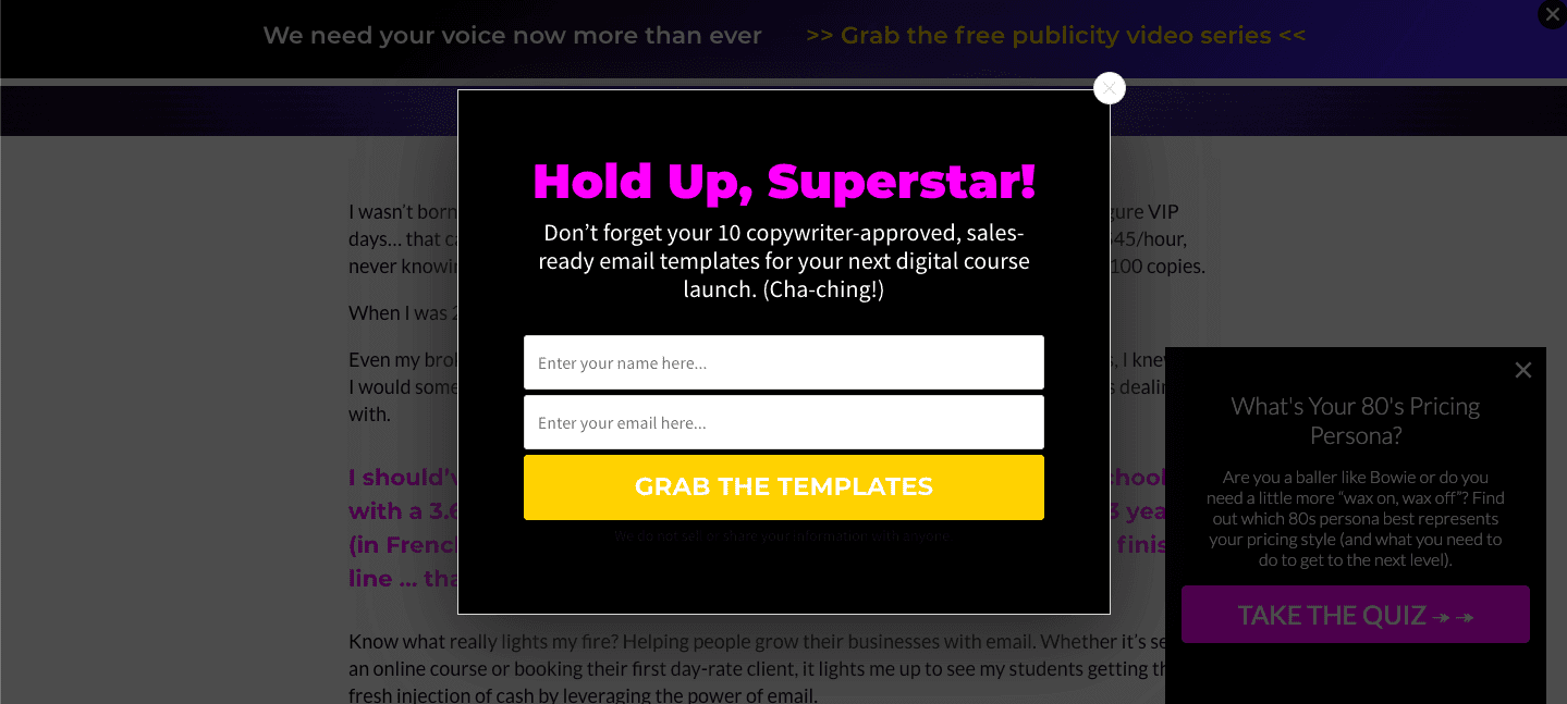
Why Tarzan Kay’s About Me Page is So Good
Between the popups for the 80s pricing persona and referring to me as a “superstar”, I totally would have signed up for Tarzan Kay’s email list if I wasn’t already on it.
Tarzan’s About page is a masterclass on writing with personality. No person on the planet could plagiarize her page and get away with it.
What You Can Learn From Tarzan Kay’s About Me Page
There’s a reason “hero’s journey” stories are so popular. Most people see themselves as the underdog.
“If this other person who was broker than I am could turn it around, then so can I (with their help).”
If you have a hero’s journey story, use it on your About page.
24. Talking Shrimp

Why Talking Shrimp’s About Me Page is So Good
Laura Belgray’s About page has possibly the best FAQs I’ve ever seen. You need to just go read them because I can’t do them justice. Humor. Fun Facts. Persuasion. It’s all there.
What You Can Learn From Talking Shrimp’s About Me Page
If you’re legitimately funny, don’t be afraid to sprinkle humor throughout your About page.
Through Laura’s humor and powerful word wizardry, you’re probably going to want to redo your own About page with FAQs like hers. Luckily for you, she has a course on that — conveniently linked to in her About page.
25. Tim Ferris
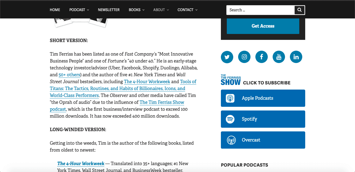
Why Tim Ferris’ About Me Page is So Good
Tim includes a TL;DR version of his bio on his About page. But honestly, if you read the first bullet in the “long winded” version, you’ll want to read the rest. I’d even go so far as to call Tim the king of social proof.
What You Can Learn From Tim Ferris’ About Me Page
Communicating how you help people in a brief statement is one thing. Summarizing your life’s impact and still doing it justice is a different story. You can learn how to do it by studying Tim’s short version.
26. Jessica Lawlor
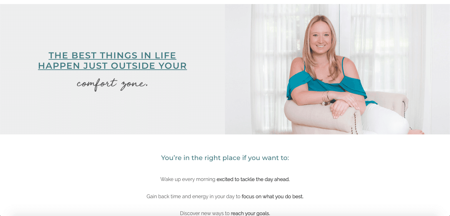
Why Jessica Lawlor’s About Me Page is So Good
Jessica lets you know she’s about pushing boundaries, but pulls the reader back in letting them know this is the right place for them before any knee-jerk fear makes them click away. It’s the perfect balance of reality and what could be.
What You Can Learn From Jessica Lawlor’s About Me Page
Focusing on aspirations that feel within reach to your readers is more likely to get them to take action. This means sometimes you may have to underpromise on what you can deliver. Weird but true.
27. The Creative Penn
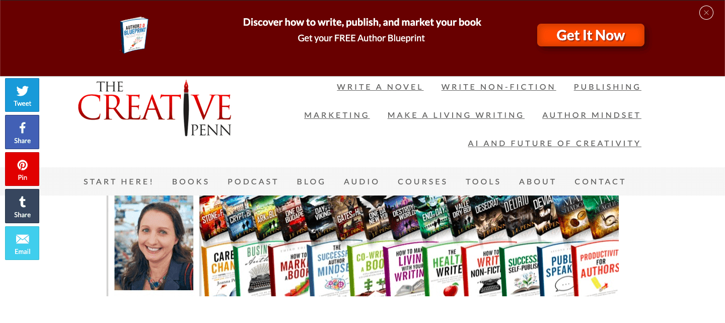
Why The Creative Penn’s About Me Page is So Good
They say an image is worth a thousand words. In Joanna Penn’s case, that’s spot on. The first thing you see on her About page (for a site dedicated to writing, no less) is a photo of her TWENTY-SIX books. It certainly got my attention.
What You Can Learn From The Creative Penn’s About Me Page
Sharing your journey — even as you’re on it — is a great way to establish credibility and build a following with people who want to learn the gems you’ve picked up so far.
28. Ashlyn Writes
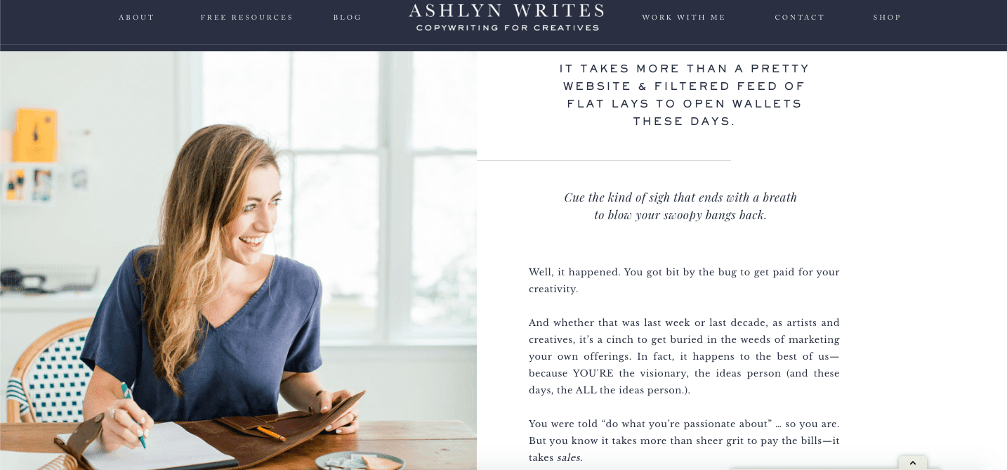
Why Ashlyn Writes’ About Me Page is So Good
*Chef’s kiss* to the specificity Ashlyn Carter uses throughout her About page. She makes it perfectly clear who should (and shouldn’t) use her services.
What You Can Learn From Ashlyn Writes’ About Me Page
Specific writing slaughters ambiguous writing in a back-alley street fight all day long. Writing for everyone means you’re writing for no one.
29. B2B Launcher
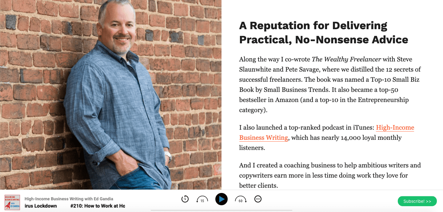
Why B2B Launcher’s About Me Page is So Good
Practical and no-nonsense are two of my favorite things. You can see Ed’s commitment to both with his “choose your own adventure” style of lead magnet pop-up. He gives immediately-actionable information for each group of people.
What You Can Learn From B2B Launcher’s About Me Page
If you want to address two audiences on the same page, it helps if those personas are at different points on the same development journey (i.e. beginning writer vs. six-figure writer). If you can pull it off, it’s highly effective.
What’s Your Favorite About Page?
Too many bloggers, freelance writers, and business owners take their About pages for granted.
But not you.
You know the About Us page is the second most important page on your site — only ranking behind your homepage.
And you now have 29 great About Us page examples to inspire your own.
All that’s left is to take what you learned and put it into practice.
Which example above was your favorite?
Is there a great About page example we missed?
Let us know in the comments below!
The post 29 Best About Us & About Me Pages (+ Why They’re So Good) appeared first on Smart Blogger.
from Smart Blogger https://ift.tt/3gISaGU

No comments:
Post a Comment