Yahoo unveiled its first-ever smartphone, as it tries to establish itself as a budget phone service.
Once the darling of the internet companies, Yahoo fell on hard times before eventually being acquired by Verizon. Back in March, Verizon launched Yahoo Mobile, a low-budget cell phone service. Its claim to fame is combining Verizon’s network with the ad-free Yahoo Mail Pro, all for $39.99 a month.
Now the company is releasing its first-ever smartphone, the Yahoo Mobile ZTE Blade A3Y. The phone is $49.99 and comes in Yahoo’s trademark purple.
“As the world continues to adapt to a new socially-distant normal, content and connectivity have become key for consumers who are craving new experiences and connections to the ones they love,” said Guru Gowrappan, CEO of Verizon Media. “With the launch of the Yahoo Mobile phone, we are bringing a unique and valuable offering to users with Yahoo’s unified suite of products, trusted content, commerce and the reliability of Verizon’s unparalleled network.”
In many ways, Yahoo Mobile and its new phone seem like a solution in search of a problem. With the myriad of budget services that piggyback on one of the big three carriers, the new phone and service may live or die based on how much customers like Yahoo’s services.
“Digital transformation was the opportunity for our generation before COVID,” says ServiceNow CEO Bill McDermott. “Now with COVID, it has accelerated and exacerbated all the issues of broken systems and siloed operations. Before COVID they didn’t want to be told to go into a cubicle. Do you think after COVID once this thing clears up at some point in the future they are going to be told to go into a cubicle? No, they’re going to be digital.”
Digital transformation was the opportunity for our generation before COVID. Now with COVID, it has accelerated and exacerbated all the issues of broken systems and siloed operations. People are not realizing that 75% of the workforce by 2025 will be millennial generation people. Before COVID they didn’t want to be told to go into a cubicle. Do you think after COVID once this thing clears up at some point in the future they are going to be told to go into a cubicle? No, they’re going to be digital.
They’re also going to absolutely expect their employer to give them the best tools. The big idea if you want to give the customer a Michelin 3 experience is you have to fuse the employee experience and the customer experience on a common platform. This way most things can be automated for the customer on a self-service basis. The things that can’t be automated can immediately be workflow ordered to get the right person in the right place with the right skill set at the right time. That’s what we do and that’s why this is a thrilling moment.
Now Platform Is the Standard For Digital Transformation
The Now platform has become the standard for digital transformation in business today. If you think about most of these companies they’re grappling with the future of work. They have to accommodate their employees. They have very distributed workforces. How are they going to get them the tools that they need and onboard them properly? In some cases, they never even meet the people they hire. Then obviously, how are they going to manage the experience they have digitally?
This also goes direct to the customer. How do you go direct to the consumer? How do you make sure you give them a great service so they stay loyal to you? The ServiceNow Platform is at the epicenter of all of that. More and more, developers are building new innovation on the fly on the Now Platform. The Now platform has become a standard for large enterprises around the world. The ecosystem and the network effect building on that are truly sensational. We’re extremely fired up because we want to make work… work better for people all over the world. What we’re trying to do is get to the essence of everything.
ServiceNow CEO Bill McDermott: COVID Has Accelerated Digital Transformation
“Close to 60 percent of our sales are coming from e-commerce,” says Panera CEO Niren Chaudhary. “By focusing on servicing customers through our off-premise channels, leveraging e-commerce, and then rapidly innovating we’ve seen a very smart recovery on our brand and also a stronger business model emerging from the pandemic. What’s clearly playing out is the off-premise channel is seeing dramatic growth.”
Niren Chaudhary, CEO of Panera, discusses how the company has focused on ecommerce and the “off-premise channel” to drive dramatic growth:
Panera’s Ecommerce Pivot Sparks Dramatic Growth
Panera is actually emerging quite strongly through the pandemic because we’ve been completely focused on what we have control over. By focusing on servicing customers through our off-premise channels, leveraging e-commerce, and then rapidly innovating we’ve seen a very smart recovery on our brand and also a stronger business model emerging from the pandemic. What’s clearly playing out is the off-premise channel is seeing dramatic growth.
To give you a sense, our delivery is growing by over 100 percent, drive-throughs are growing by over 60-70 percent, and rapid pickup is seeing strong growth. The off-premise channels are growing very strongly and in some ways compensating for the decline in business on-premise. Pre-pandemic we were probably about 60-40 in terms of off-premise versus on-premise. Now it is predominantly off-premise convenience for our customers as we’re moving in that direction.
Close to 60 percent of our sales are coming from e-commerce. Brands that are able to leverage their e-commerce strength and pivot very sharply on providing convenience and off-premise are beginning to see a smart recovery.
It’s All About Convenience, Ecommerce, and Innovation
There are three levers that we’re working on to get our business back on track: convenience, e-commerce, and then meaningful innovation. Included in that are cool foods, a coffee subscription program, and most recently the flatbread pizza launch. We’re very excited about this because it’s the launch of a new food category at Panera, one that we haven’t had before. It’s a bullseye innovation in terms of what the customer is looking for at this time. Customers are looking for a warm shareable at-home meal solution for their families. The flatbread pizza fits perfectly for that.
We’re doing it in a uniquely Panera way as you would expect. We’re leveraging the credibility of our breads. We have unique ingredients that are all clean, they’re fresh, we have double blend cheese, bold flavors of our sauces, and it’s stone-baked. Think of this as a pizza that customers love but done in a very unique Panera way. That’s why we’re so excited.
Panera CEO Niren Chaudhary: Ecommerce Pivot Sparks Dramatic Growth
“There are too many infographics out there. How is anyone going to notice mine?”
“They are too expensive, and we just don’t see the ROI.”
If you or your boss are saying any of these statements, you aren’t wrong.
Like any marketing tactic, the infographic space is now saturated. You can’t just throw a few stats together, add some images and expect the backlinks to magically appear.
That’s why I’m going to show you how you can create infographics that still generate thousands of shares and backlinks.
First, I’ll break down a case study that made infographics popular and then I’ll show you how to leverage it in 2021.
We’ve helped Fortune 500 companies, venture backed startups and companies like yours grow revenues faster. Get A Free Consultation
Infographics Statistics
Before we dive into the “how” of creating a stunning infographic and helping to make it go viral, let's start with the “why”.
Here are some great statistics that prove infographics are still a great content marketing investment:
Articles with infographics got 178% more links than standard articles
65% of brands use infographics in their content marketing efforts
Infographics have had the biggest increase in usage among B2B marketers in the last four years — now at 65%.
59% of B2C marketers use infographics in their marketing
Articles featuring infographics received 72% more views than normal articles
Infographics receive 3x more shares than any other type of content on social media
Infographics are 30x more likely to be read from top to bottom than blog posts or articles
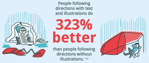
When people hear information, they're likely to remember only 10% of that information three days later. However, if a relevant image is paired with that same information, people retained 65% of the information three days later.
People following directions with text and illustrations do 323% better than people following directions without illustrations:
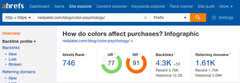
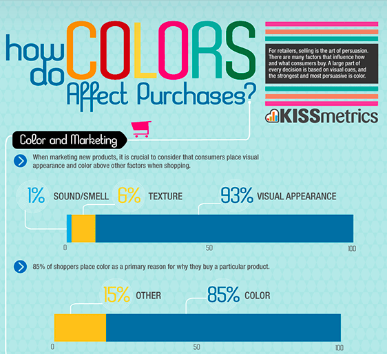
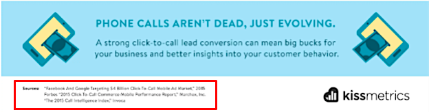
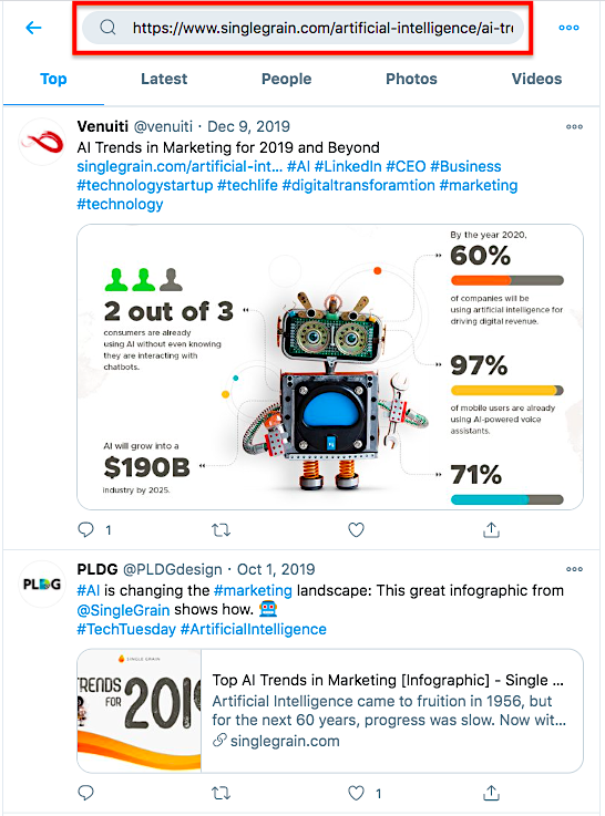
Marketing expert Neil Patel wrote a blog post on Quick Sprout in 2012 called Why Content Marketing Is the New SEO and he broke down stats from Kissmetrics on what happened when he published 40-50 infographics. I’ve seen some pretty great stats in my time, and let me tell you — these stats were crazy!
Kissmetrics' backlinks, search traffic and rankings mainly came from those infographics, according to Neil:
Imagine paying $50 per link (which most decent bloggers charge at minimum). It would have cost so much more to get the same amount of traffic through paid links. The results were pretty conclusive:
Infographics were far and away the best ROI that Kissmetrics ever produced through any form of online marketing.
Digital Marketing Philippines Infographic
Sure, Neil has a lot of brand power and can make just about anything go viral if he really wants to. But, since everyone is trying to leverage infographics, the ROI isn’t as good, right?
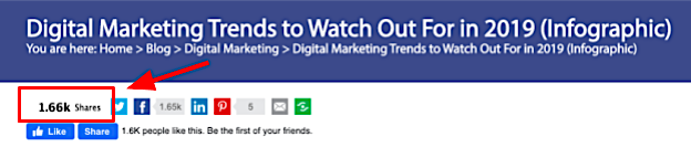
Well, here is an example of an infographic from 2019 that was done by a company called Digital Marketing Philippines, which doesn't have the same brand power as someone like Neil. It received over 1,600 shares and is both data- and text-rich:
Notice that this infographic also has elaborate design and is much more text rich than some older infographics:
Keep in mind, by the way, that although the marketing industry is saturated with infographics, other industries are still catching on. So if you are in a developing industry, this can provide a huge benefit to you.
Where Do You Find Great Infographics for Inspiration?
What goes into creating a viral infographic?
Because Neil has sort of pioneered the idea of creating quality infographics, a lot of people have tried to emulate it. Unfortunately, most fall short in the detail and design which ultimately causes the infographic to fail. Since infographics don’t work as well as they used to due to saturation, it is crucial that they are created with rich new data and high-quality design.
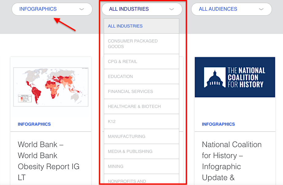
1) Visually
If you want to draw inspiration from great infographics, start at Visually:
Ask yourself which elements really stick out. Some infographics are just images without real data attached to them, some have poor layouts and others are really hard to digest.
The best part about Visually is that you can sort by industry and audience as well:
It’s another directory that you can use to search for infographics for inspiration or to hire talent.
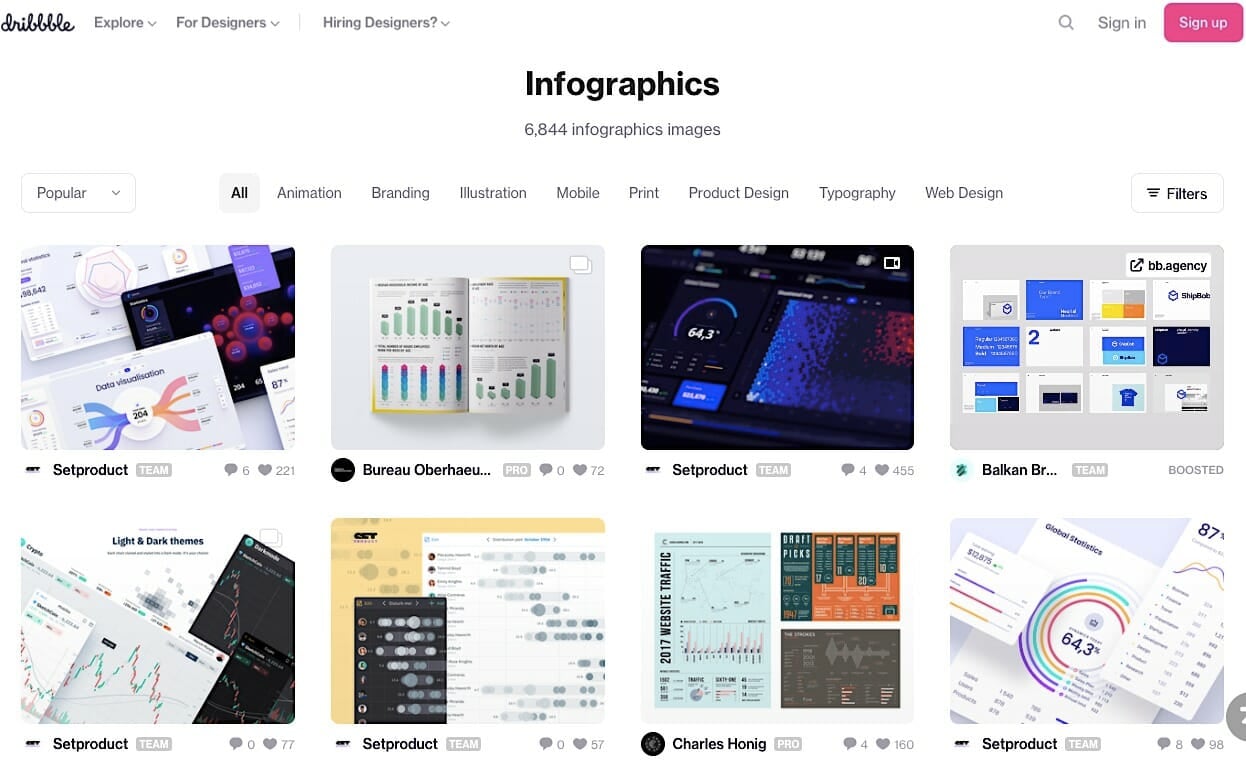
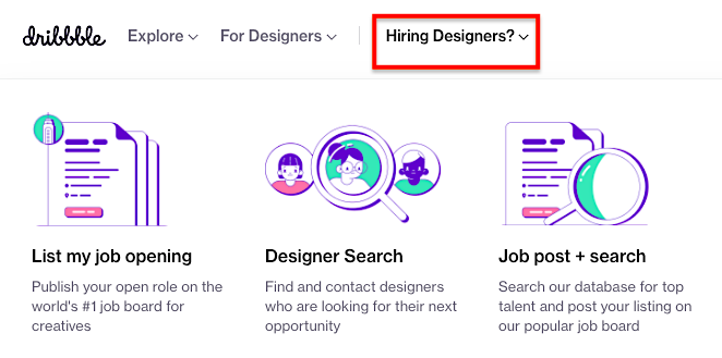
You can find good designers on Dribbble for under $1,000. In fact, you can often find great infographic designers in other countries for around $200. If you aren’t sure how to hire designers, check out this Marketing School episodeWhere Can You Hire Great Designers?
I've found great designers on this platform:
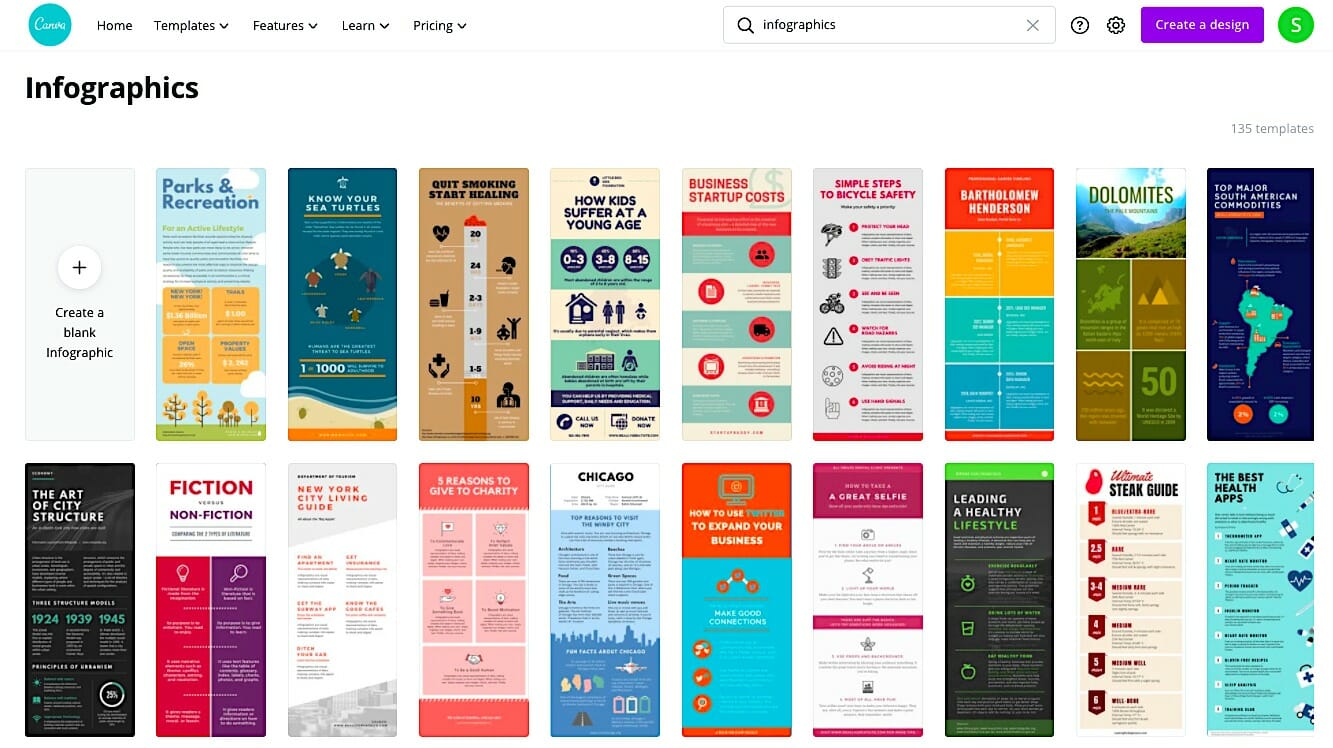
3) Canva
If you are looking for a great solution on a budget, consider using Canva for your infographics:
If you don't have a designer on your team, not to worry! You can easily create an infographic using their beautiful templates:
I use them even just to create images.
The key to success with infographics is to look for the ones that are top-rated and then make a checklist of the successful elements that they share.
When you look at it, the design of it is very professional, but the content of the infographic is almost purely data:
Not only that, but it's easy to read and is focused on a relatively broad topic. These could be useful stats to CRO experts, content experts and many other marketing professionals.
And don't just look at great infographics. Look at crappy infographics, too, and then compare the good ones and the bad ones to learn what to do — and what not to do.
We’ve helped Fortune 500 companies, venture backed startups and companies like yours grow revenues faster. Get A Free Consultation
How to Create a Viral-worthy Infographic
The first step to creating a really good infographic is to make sure you have great data. If you don't have good, complex data that you can simplify, you won't do well.
Here's what I usually do:
Go to Upwork, a large, remote-talent platform for writers, designers, web developers, etc.
Find a researcher to come up with content or topic ideas for an infographic.
Have the researcher outline the infographic copy.
Send it to a designer to create the infographic.
Tips to keep in mind when creating infographics:
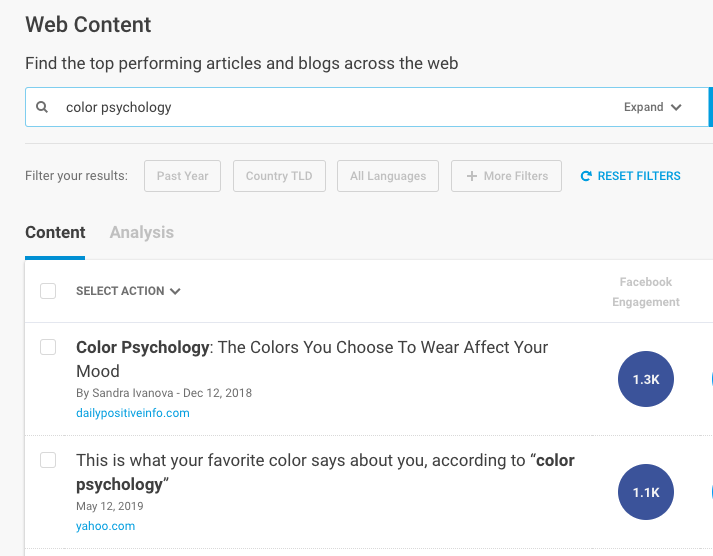
Research high-traffic topics.Buzzsumo is perfect for keyword research in your industry and to find the most trending pieces for any given keyword (consider reaching out to them to share your infographic that goes along with their data).
Don't have more than six main points. Occasionally you'll see an infographic that's about ten yards long, which kind of goes against the purpose of distilling data into an easily consumable visual. Keep your info short and to the point. If your infographic is on how colors affect purchasing, one point could be on the meaning of colors, another on how men perceive colors versus women, one on color and branding, etc.. But make sure that all points flow in a “storyline.”
Cite all sources. As with any article or blog post, you must cite all references. Generally, these are listed at the bottom of the infographic with the URLs printed out in full. Or, if you're creating an interactive infographic, you can also embed clickable links within the content copy.
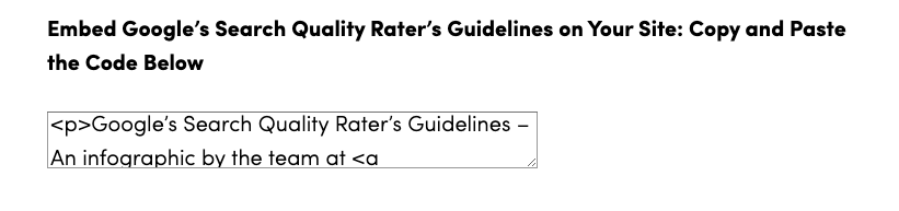
Publish the infographic and give it an embed link. That way, people can easily share it in their own content and you can get backlinks. The embed code generator I use is called WP embed code generator, which creates a copy/paste code like this:
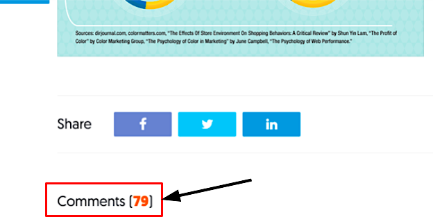
Allow for comments. Comments will create more text, because infographics don't have too much text on a page, which can hurt your overall search rankings. The best part is that infographics generate a significant amount of comments. Also, add those social share buttons!
On average, your costs for an infographic will be higher than for blog posts.
Back in the day, before decent infographic designers started showing up everywhere, you had fewer options. And then lots of infographic design agencies popped up and were charging anywhere from $5,000 to $20,000 per infographic.
Compare that to what we pay for our high-ranking infographics today: about $100 for research on Upwork, and about $200 for design. That’s a lot better than $20,000 for an infographic!
They have a very fast turnaround, you're presented with more than one design, and you only have to pay for the infographic designer that you choose to work with:
We’ve helped Fortune 500 companies, venture backed startups and companies like yours grow revenues faster. Get A Free Consultation
The way to make your high-quality infographic go viral is pretty simple:
Cite your sources and link to those sites.
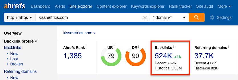
Find out who shared all those original posts on social media. This is a bit harder to do for Facebook, but for Twitter it's easy to see every single person who shared it – just paste the URL into the search bar:
Then take the URLs of those shared articles and put them into Ahrefs, which shows you all the people who linked to those articles in other articles.
Once you have the final list of all the people who shared your infographic and all the people who linked to it, email or Tweet everyone who shared those articles and ask them to share your infographic. Since they shared the original, and yours is even better, it’s an easy win.
Let's say Neil shared the original article. I would go find Neil's email or Twitter handle and say,
“Hey Neil. I know you shared this article on how colors affect purchases. I actually just created an infographic on it, and I think your social media followers would love it. Feel free to share this as well.”
For all the people who linked to the original article, I just use a variation of the same message:
“Hey [name], I noticed that you linked to this article about how colors affect purchases. I actually created an infographic with the same information, plus more. This visual makes it a lot easier to understand how colors affect purchases and which colors you should be using on your website to grow your sales. Feel free to add this link to your blog post if you like it.”
Just by doing these two things, Neil’s Kissmetrics infographics went viral. You don't even need a popular social media account for your company or personal profile to make an infographic go viral because you can piggyback off bigger profiles with more followers.
How to Maximize Infographic ROI
If it sounds like an infographic is a lot of work and has a long turnaround time, you’re right. That’s why you should always think about repurposing your infographics.
There are a lot of different ways to use infographics as repurposable assets. For instance, you can chop up your infographic to make SlideShares or use them in presentations.
Don't think that your hundred- or thousand-dollar infographic is just a one-time-use asset.
Consider using the content sprouting method, in which you turn one asset into as many as 13 pieces of content on five separate channels, with your infographics.
You could also turn your infographic into a YouTube video or you could talk about it in a podcast. The point is that if your infographic does go viral, don’t just sit back contentedly. Take advantage of the virality, and create more content around it.
We’ve helped Fortune 500 companies, venture backed startups and companies like yours grow revenues faster. Get A Free Consultation
Takeaway on Infographics
Infographics still work today!
One last case in point:
Shutterstock, an online marketplace for licensing royalty-free images, created an infographic based on its customers' data about which images they were downloading most often. This one infographic got more than 100 mentions, 6 billion unique site visits, 5,300 social media shares, and more than 11,000 social media engagements.
Remember, the key to a successful infographic is:
Choose a popular topic
Analyze various successful infographics in your industry
Create quality design and content
Distribute it on all your channels
Use the Content Sprouting Method to get even more use out of it
After performing these steps, you’ll have a successful infographic, even in 2021 (and beyond!).
The good news is: Because people are spending so much time in their inboxes, you have an opportunity to make a big impact.
The bad news? More emails = dwindling attention spans.
You’ll need to get creative to break through the clutter of emails that loiter in your subscribers’ inboxes.
We’ll show you how to create an email newsletter that will keep your subscribers interested. Whether you want to improve your current newsletter or are researching ideas for your first one, these tried and true email marketing practices are sure to help.
(The most FUN way to succeed with email marketing? Everyday Email, a FREE email course. You'll get 30 short, easy-to-follow tips sent directly to your inbox for 30 days.)
What makes the best email newsletters?
What are the best email newsletters made of? Captivating copy, engaging visuals, and a clear call-to-action, right? Well, yes, but there’s more to it than that.
The number of emails flooding inboxes these days is staggering. According to DMR, the average person will get 121 emails per day (which is roughly 44,000 emails per year). That’s a lot to read.
Due to the sheer volume of emails people receive daily, it’s crucial to cater to your target audience.
So how do you ensure your emails are the brightest in the inbox? How do you know what newsletter content ideas will get read?
1. Give readers what they didn’t know they needed
The inbox is a sacred space. It’s a direct line into the lives of your audience and potential customers—so whatever you send should be of the highest quality.
Yes, creating an email newsletter free of grammatical errors and broken links is important. But providing actionable, helpful information to readers is also important. Bonus points if you provide knowledge or insight on something they didn’t know they needed. You want to build a relationship with your subscribers with great content — rather than pushing for a sale every single time.
For example: If you’re a business development coach looking to expand your newsletter readership, including extra content that your audience cares about (like a template or eBook or one of these 22 Brilliant Lead Magnets) is a good idea.
2. Encourage communication and request feedback
You wouldn’t walk into someone’s home with a megaphone and start blasting orders. So don’t do it in a subscriber’s inbox, either.
Not only will your subscribers feel as if you are speaking directly to them, but their feedback will be invaluable to your business.
3. Keep readers reading with great newsletter copy and even better design
You can have the best written newsletter copy, but if it’s hard to read, it can be tough to get readers to stick around. We’re not suggesting that bad design mutes stellar copy, but striking a balance between the two is key when creating a quality email newsletter.
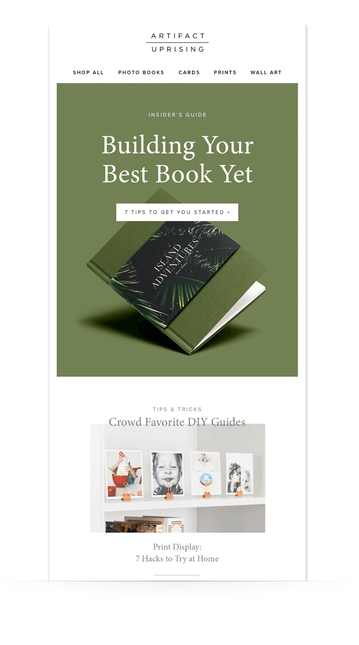
Take photo company Artifact Uprising for example. They're a visual company, which is clearly communicated across all marketing materials. In the example below, they stick with large, eye-catching images and bold, monochromatic colors.
But they don’t rely solely on bold, featured images. The copy, although simple, packs a punch — and it’s hard to resist clicking on the single CTA button to learn how to create your own beautiful photo book.
The copy and images in this example work together to tell a story. This is not a long email newsletter, but it didn’t need to be. It's chock full of value (an "insider's guide" and "tips and tricks"), and that’s what resonates with readers the most.
4. An email that reads well will be well read
Design doesn’t just mean pretty pictures. This is where readability comes into play. If you want readers to digest your content, make it easy to do so.
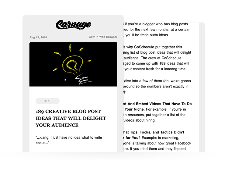
The Daily Carnage is a great example of strong layout and organization when it comes to email. It’s text-heavy, but in the best way. Bullet points, subheadings, and colorful call-to-actions make this email newsletter easy (and enjoyable) to read.
As with any writing, when it comes to the layout of your email newsletter, place the most important information at the top. Dwindling attention spans mean it’s critical to include important information first. The secondary details and other non-essential information come next.
If you see a block of text in the body of an email newsletter, what’s your first reaction? Delete? Scroll past? Chances are if you wouldn’t read it, neither would your subscribers.
Breaking the copy up into digestible paragraphs or bullet points will help your readers understand the message while saving them eye strain. The goal is to make the copy scannable, which is tough to do with large blocks of text.
An easy way to break up chunks of text: Use a zigzag or "z" pattern in your template. This design arrangement helps readers continue to move their way down an email, engaging with the imagery and content along the way. Think of it like a path for your reader to go down. It helps them make it to the end! (Inside AWeber, use the Flat-white and Gibson templates, which have alternating sections built in.)
Not sure what to write in your emails? We created a free course — What to Write in Your Emails — that comes with 45+ email writing templates!
5. Leverage your lists correctly
Segmentation is an excellent way to make your email newsletters more effective and to grow your customer base. According to the DMA, segmented and targeted emails generate 58% of all revenue.
With email segmentation, you can create lists of customers based on specific parameters you set and then customize campaigns for each.
For example, let’s say you want to target customers who have bought from you once but have not been back since that purchase. You can create a list of these customers and deploy an email campaign that works toward a sale conversion goal.
Rewarding customers for past purchases, sharing sale information, or encouraging customers to tell their friends about your brand are a few of the things you can do with a segmented list. Or you can categorize customers based on their email behavior (who opened/didn't open an email). Then, you can target each list differently, either educating them further on your business, or incentivizing them to buy with a unique offer.
Understanding what makes your lists unique is the key to using them effectively and seeing the ROI of your email newsletters over time.
6. Treat your subscribers as individuals — not a nameless, faceless list
Before you send an email, stop and think about your list. No, not the size of your list. But the individuals on your list.
Like Chelsea, who reads your email during her 45-minute train commute to work.
Or Victor, who opens your email while he’s in the grocery store checkout line.
Or Kate, who scrolls through her inbox as her newborn son sleeps on her chest at 2 a.m.
Stop writing to a faceless crowd of subscribers. Instead, write to the individuals on your list. When you write to a single subscriber, they come alive in your mind. Your writing will go from drab to engaging. Generic to targeted. You’ll solve his or her problems. You’ll put the perfect product in front of him or her. You’ll make them want to open your next email.
And all your subscribers will feel as if you personally wrote the email to each of them. This is one of the most effective ways to find success with email marketing over the longterm.
How to best structure your email newsletter
The second your readers open your message, they immediately decide whether your email provides them enough value to act on your call to action or not.
The following three techniques show you how to structure your email newsletters so you provide clear value from the very first second.
1. Make your text scannable
As much as 77% of your subscribers may open your emails on their mobile devices, which means they're looking at your content in the palm of their hand. Long blocks of text that force your readers to scroll and scroll create a bad user experience. That's why you should break up your email copy into shorter, easier-to-read chunks.
Be concise (skip the run-on sentences, wordiness, jargon, buzzwords, and overly-difficult terms)
For multiple articles, include only the first paragraph of each, and then link to the rest of the story
2. Include links for credibility
Adding research, data, studies, and quotes to your content is a compelling way to validate your points. However, you should always link to your reputable sources. If you mention a company or public figure, link to their web site.
Linking when appropriate has several benefits:
your emails earn an extra layer of authority
your readers get the extended value of the linked content
it's a best practice on the web! When someone refers to your business or content, they should link to you, too.
3. Focus on one call to action
Choice is the enemy of conversion. If you give a person too many options, it makes it difficult for them to make a final decision, according to psychologist Barry Schwartz, who named this phenomenon “the paradox of choice.”
Want your readers to take an action inside your email (like sign up for a webinar)? Then point them to that one specific CTA with a large button (all other instances can be hypertext links). You shouldn't try to get them to also redeem a coupon, join your Facebook group, and book an appointment all in the same email. Your content should walk a subscriber down one path — don't give them multiple paths to choose from, or else you'll see little to no success.
When creating an email newsletter, it’s easy to focus on either design or content. But the truth is: Both design and content are equally as important to the success of the campaign.
In fact, if an email includes too many images and not enough text, it can become problematic:
Emails marked “image-only” may end up in the spam folder due to email service providers like Gmail filtering and blocking them.
Subscribers may have disabled image viewing/downloading in their email settings.
Depending on the internet connection and browser version, images can take longer than text to load. Subscribers may delete the email before the images have time to load.
So how can you be sure to strike a healthy balance between design and content in your email newsletter?
Let’s look at a few newsletter examples and break down what works well.
Design & Layout in Email Newsletters
1. Use the template that matches your goal
Are you sending out a discount code to new customers? Launching a new product? Announcing a huge end-of-the-season sale? There are many email templates to choose from, which can feel overwhelming at first. (AWeber has more than 700 mobile-responsive templates that you can use. Create your account today!)
The question is: Which one will be the best for the job?
For example, if you’re an AWeber user who wants to send a new discount code to new subscribers to show your appreciation and to get them to try a product, you might want to select a template that clearly indicates your message. Here's our "announcement" layout that you can customize for your business and brand.
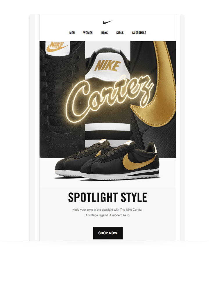
This Nike email does an excellent job of showing readers the detail of a product through visuals and copy:
2. Be bold in your image selection
Images do more than get your brand noticed, they elicit emotion. With images, you are able to set the mood and tone of your email before subscribers even begin reading.
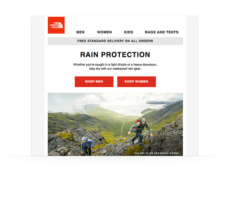
This email from The North Face is a perfect example of stunning imagery at work. Not only does the image showcase the products (waterproof rain gear), but the striking contextual image captures attention immediately:
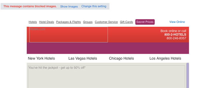
3. Utilize alt text for images
When you include images in your messages, they may or may not always display in the email clients they were sent to. That’s because many email services will disable images in messages that are sent to their users, unless the user actually verifies that they do indeed want to see the images.
Alternative text is helpful in these cases. When an image doesn’t load, a line of text will appear that describes what should be there.
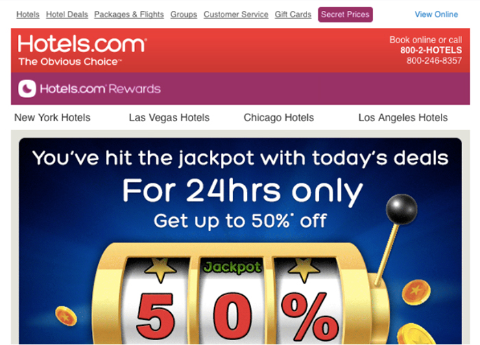
Take a look at this email from Hotels.com where images were blocked, but the use of alt text was implemented.
And here's what it should actually look like:
Now, you may be wondering, “Is including alt text worth my time?”
Absolutely. Forty-eight percent of mobile clients will block images by default, according to the email testing platform called Litmus. If you set up alt text, the description will appear where the images were supposed to go. If you don’t, your reader will only see blank boxes.
Alt text is also important for your subscribers with visual or certain cognitive disabilities. They may have a screen reader that will read the alt text to them so they get a full understanding of what’s included in your message.
If you are using AWeber’s Drag & Drop editor, click here to see how to set up alt text for your images.
Pro Tip: Not all images need alt text. If your image is purely for the aesthetics of the email, be sure to set an empty alt text value for the image.
Be bold with your photos — but also limit how many you use in an email. Text-to-image ratio is how much text there is in comparison to images in your email.
There’s no such thing as the perfect “text-to-image ratio”, but most people stick with 60 percent text and 40 percent images.
Here’s why it’s important not to rely too heavily on images:
“Image-only” emails risk going to the SPAM folder since email service providers like Gmail, Yahoo! and Hotmail tend to filter and block them.
Images may be ‘turned off’ as default by viewers or by their email client, which means that some of your image-based navigation elements or CTAs (like buttons) may not be visible.
Images can take longer than text to load based on browser and internet connection. A subscriber may leave the email before they’ve seen all the content.
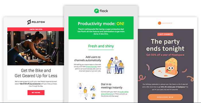
5. Leverage contrast and whitespace
When designing your email, be sure to consider contrast and whitespace.
Images that contrast in color are not only impactful and interesting to look at, but they help ensure readers can see the images, too. Including a healthy balance of whitespace is also a design best practice that can make reading your email easier for subscribers.
Take these newsletter examples from Peloton, Flock, and Headspace. All three newsletter examples use contrasting images and include enough whitespace to make for easy reading.
6. Keep design focused on the end goal
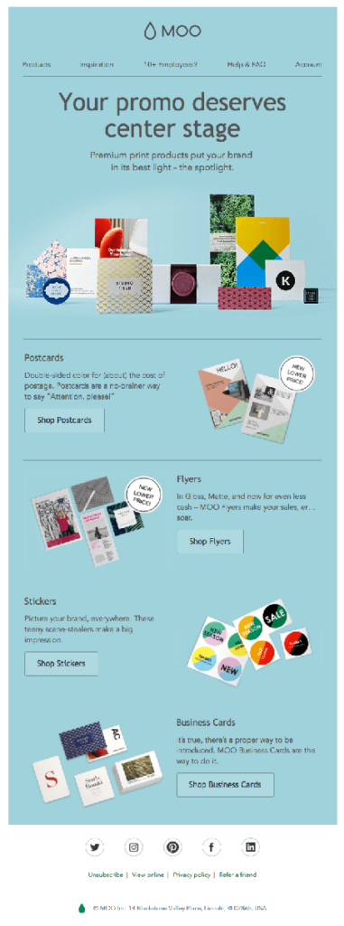
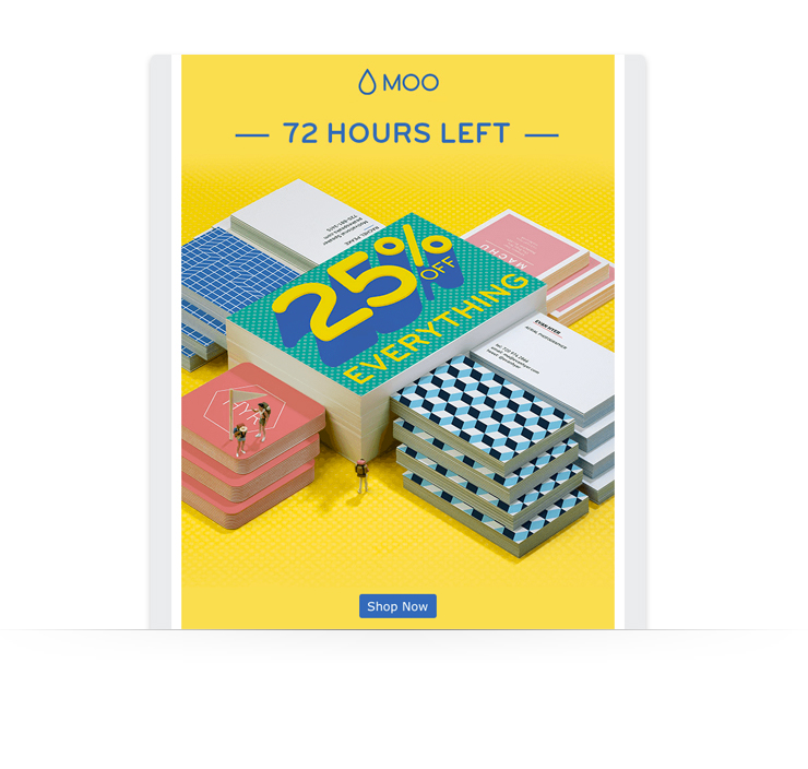
The email design should also be a path that leads the reader toward your ultimate goal (the CTA). To give you an idea, here is an example from Moo, a custom print and design company.
This email design works for converting readers to customers because:
Follows a simple “Z” pattern layout, which means it easily moves your eyes in a zigzag that alternates text and images, and includes a CTA in at each "point" of the pattern.
Consists of minimal elements and concise writing for a streamlined look.
Includes visual examples of each product to minimize the use of long chunks of text and to show off their array of products.
Creates defined sections for each product with the use of thin dividers.
Contains lots of white (or in this case, blue) space to draw your attention to the images.
Incorporates large “call to action” product buttons (i.e.: Shop Postcards) for easy navigation to their website.
7. Use big headlines and header images
You may have the world’s best headline, but if it drowns in a sea of text, no one will notice it. That’s where “visual hierarchy” comes in. You want the most important information in your message to get noticed first. Choose an increased font size and bolded text for your headline. It makes the main message in your email stand out.
Large header images evoke emotion. You’re attempting to make an connection with the viewer in the first few seconds after they open your message. The image sets a mood (happy! sad! angry!) or conveys a state of mind (hunger! relaxation!).
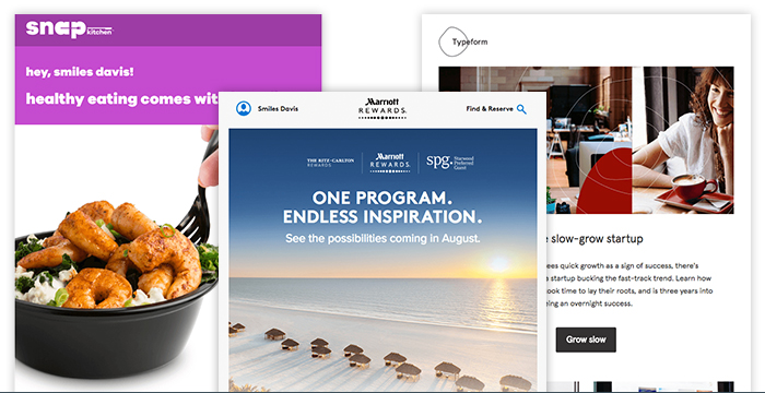
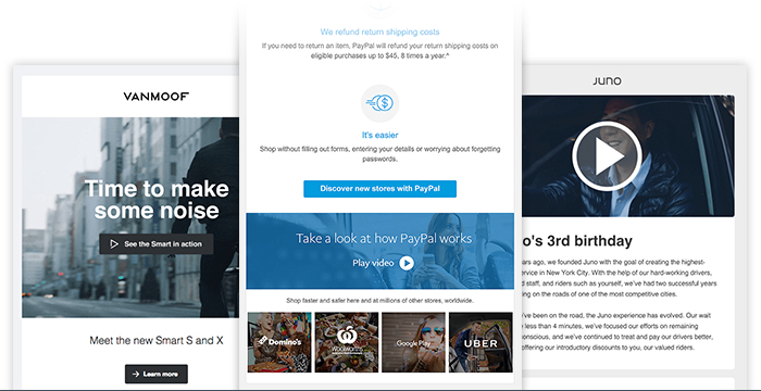
Above are three drastically different emails that give each individual brand a unique feel, predominately through their use of photographic header images. (Inside your AWeber account, use the Breve or Wane template to get started with a large header image.)
Don’t have a big budget or an in-house photographer? Here's how to create amazing custom images for your emails, social posts, ads, and websites on zero budget.
Email Newsletter Content Tips
1.Make it personalized
Customizing your email newsletters per your target audience is the secret to success.
Thanks to email segmentation, we can categorize subscribers with specific parameters and organize them into lists. Every email created should have the audience’s interests and needs at top of mind.
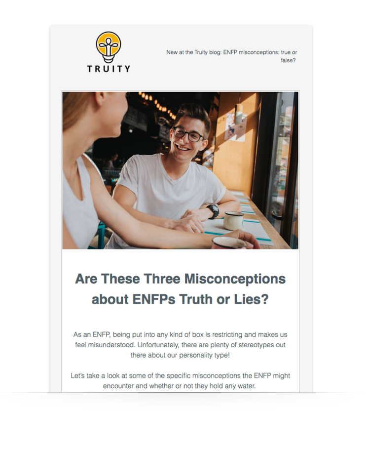
Customizing emails go a long way when done correctly. AWeber user and personality test company Truity has seen increased open rates as a result of their personalization efforts, including personality type-specific messages, like the one below aimed at its a specific personality type — ENFP subscribers. Truity uses the "digest" layout in AWeber's Drag and Drop Email Builder for its newsletters, giving it a streamlined, cohesive look every time it hits your inbox.
One question that marketers hear often is “how long should my email be?” The answer is, there is no right answer. Both can help you accomplish your goal and communicate your message. (Try different formats with your audience to see which ones they prefer through A/B testing.)
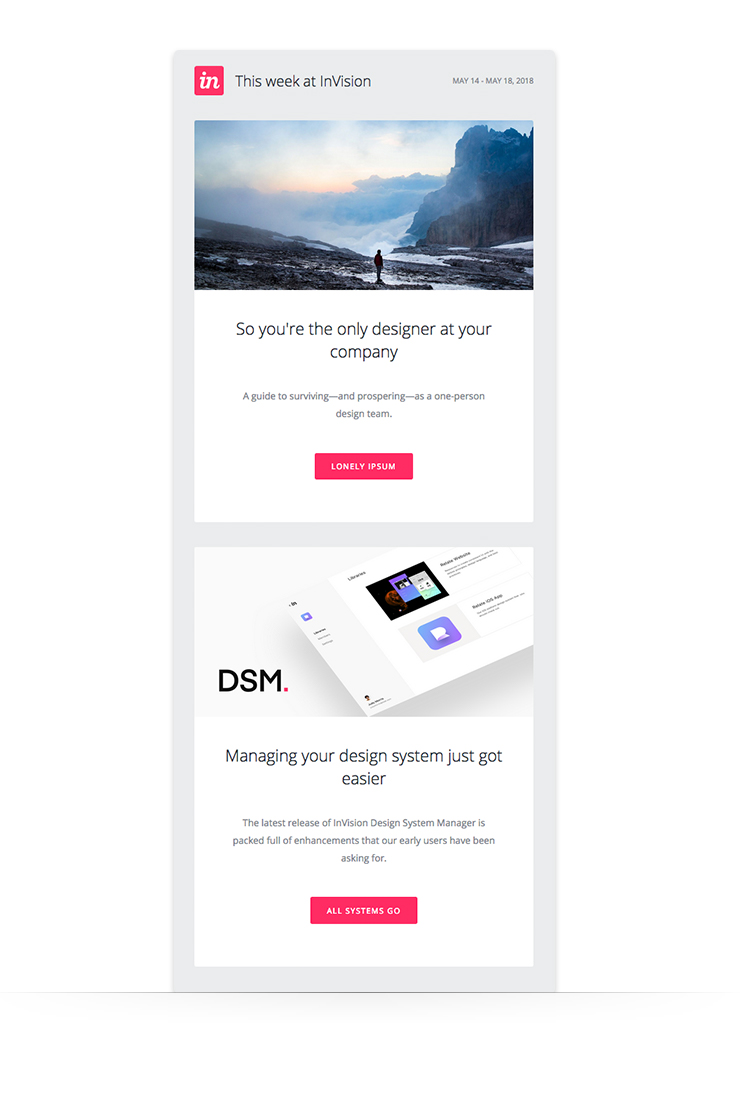
The InVision Weekly Digest is concise writing done right. Punchline copy delivered in an easy-to-read format.
Whether you choose to create an email that’s short and sweet or something long-form, one thing stands true for both: Make it easy to read.
This rings especially true for long-form content. As we mentioned above, having a large block of text in the body of your email doesn’t do anyone any good.
Break things up into short 2-3 sentence paragraphs or use a bullet point format to convey your message.
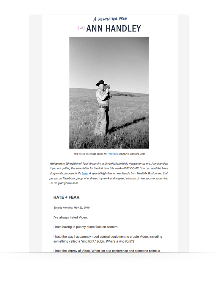
Ann Handley — AWeber customer, author, and founder of Marketing-Profs, sends a bi-weekly email newsletter, Total Annarchy. It always begins with a long story. However, Handley does an excellent job of taking a ton of valuable information and presenting it in a digestible way.
3. Make your emails count
Trust is hard to gain (and easy to lose) when it comes to engaging with your customers. If someone has given you permission to his/her inbox and has opened your newsletter, it’s your time to shine.
Providing value-packed content to your subscribers is a key component in seeing a positive ROI on your email campaigns besides to growing your customer base.
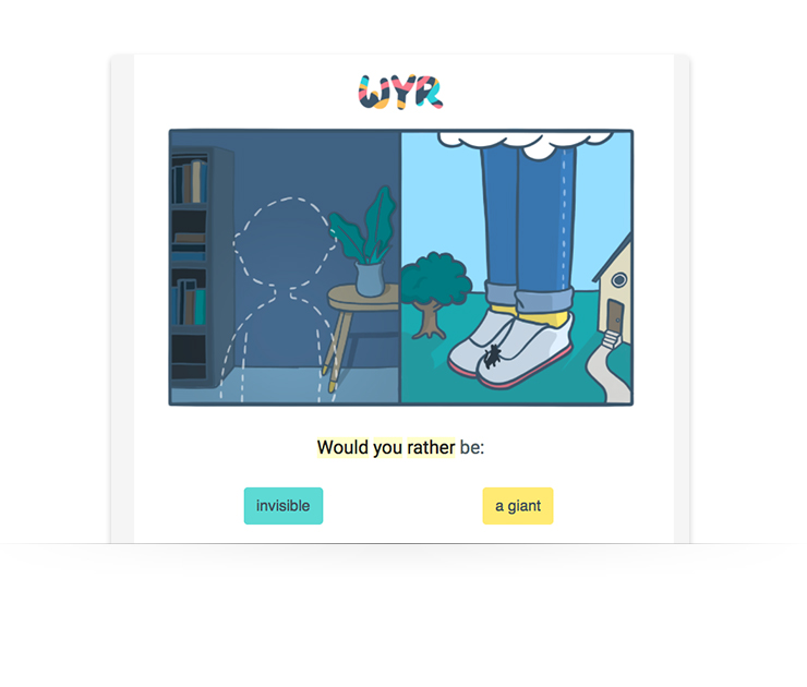
WouldYouRather (WYR), another AWeber customer, does this well by making every email engaging and interactive:
What’s more: WYR follows up with the results every week so subscribers can see what other people on their list chose (who won: compliment or a $100 bill) and why. They ask for the reasoning behind the choices made to share some insight into the human decision-making process.
Bottom line: If your content is not providing subscribers information worth their attention, leave it out of the email.
4. Special offers can lead to purchases, if done correctly
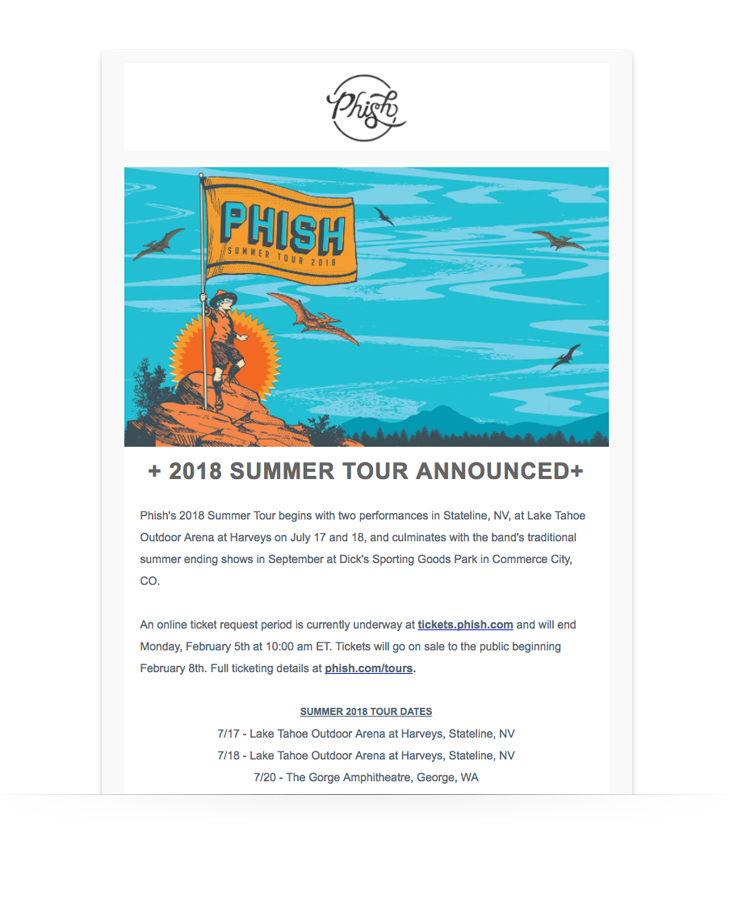
Promotional content can yield successful results, too. This is an integral part of business for those in the eCommerce world, as well as for those promoting events and selling tickets.
We see this executed well in this simple, to-the-point email from AWeber user and the band Phish:
5. Be a stickler for grammar (if you aren’t already)
Mistakes happen, but if grammatical errors are consistently popping up in your email newsletters (or any of your marketing materials for that matter), you run the risk of losing your credibility, customer trust, and money.
Have an editor or a coworker with a trained eye look at the copy before adding it to your campaign. Be sure to have them check it again after you finish building the email.
If you’re an AWeber customer, it’s easy to edit copy even after you’ve entered it into your template.
Email Newsletter Content Ideas
1. Repurpose your best legacy content
Repurposing older, high-performing blog posts in your newsletter is a great way to source content, save time and drive new traffic to your best work. Consider using your evergreen content (the type that isn’t time-sensitive), such as how-to information and answers to frequently asked questions.
If there’s any recent industry news that your post could tie back to, even better. Add that fresh spin to your legacy content in your email newsletter to emphasize its timeliness and importance.
2. Interview an industry thought leader
Interviewing an expert in your field is a great way to entertain, educate, and engage your readers, while adding a fresh perspective to your email newsletters.
Ask the thought leader to promote the interview to their own audience so you can reach new subscribers to add to your email list. Just make sure you add a sign up for your newsletter inside the interview so people know how to join!
3. Feature loyal readers and customers
Just as you can interview and feature high-profile thought leaders within your industry, try doing the same for your loyal readers.
In many cases, your readers might better relate to the success story of a person who doesn’t have as much klout as an influencer. Their success might feel more attainable, even if it’s not on the same scale as an influencer.
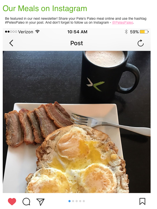
Need a quicker way to feature customers? You might want to consider sharing user-generated content from your subscribers, such as social posts.
In Paleo Pete’s email newsletter, he shares Instagram images tagged by his readers.
4. Add videos and interactive content
Most email clients — like Gmail and Outlook — won’t play video within a message, so you have to link to a hosted video outside of your email.
But you can include links to videos that look like you could play them within the email. It’s a creative way to deliver motion pictures and get your readers to click and watch.
The examples below are grouped by category so you can find what’s most relevant to you.
Newsletter Example: Blogs
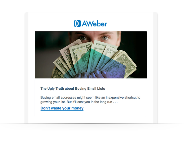
Leading with a strong image and captivating copy is a sure-fire way to keep your subscribers reading. The example (hey, that’s us!) below does just that:
(Gain a competitive edge:Subscribe to AWeber's newsletter. Get essential tips and news about email marketing sent weekly to your inbox.)
Newsletter Example: Local and small businesses
Showcase your products or services with an email template that is visual and text-friendly. This email from Moo does a great job of highlighting a product sale in a colorful way that is not only on-brand but also eye-catching.
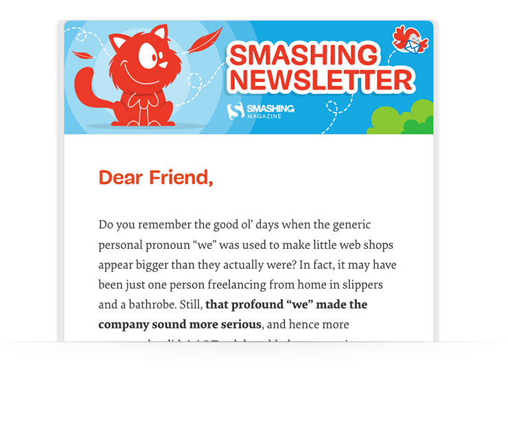
Newsletter Example: Podcasts
Podcasts tend to cover a lot of information during each episode. What better way to create a centralized place where listeners can do further research, learn more, or read up on guests than with a summary email?
This email from Smashing Magazine includes a table of contents that make jumping sections a breeze. With an organized layout and plenty of space for a recap, this format is perfect for podcasts.
Newsletter Example: SaaS and Software Companies
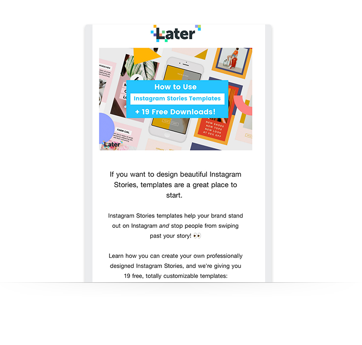
Providing value to your subscribers, in whatever capacity that may be, is crucial to keeping them interested.
Including helpful content like this “How to Use Instagram Stories Templates” guide from Later is a great way to provide value. This also shows subscribers you know what you’re talking about.
Newsletter Example: Non-Profit Organizations
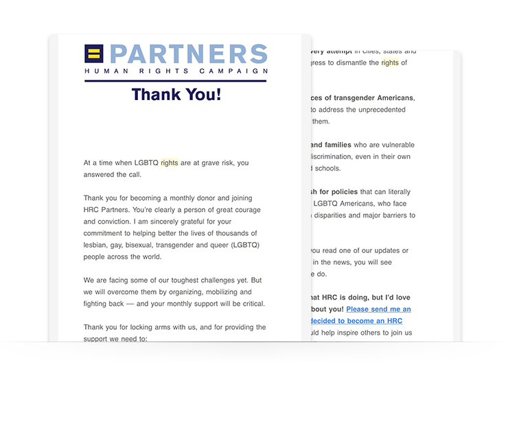
The Human Rights Campaign knows how to welcome new supporters. This email not only includes a thank you note, but it also outlines how supporters can take further steps to help the campaign.
Newsletter Example: Product and eCommerce
Like the SaaS example above, product and eCommerce companies can provide value with actionable content, all while keeping things fun and interesting:
Now it’s your turn
With all this good information, now you’re ready to knock out your next email newsletter. Maybe you’ve selected your template, but aren’t quite sure what to include in each section.
No problem. We’ve broken down what the layout of your email newsletter could look like.
Paragraph 1 - This is a great place to summarize your company and explain why you’re great. Be sure to include the most important information in this section. If you’re sending a welcome note to new subscribers, add details on how often they can expect to receive your newsletter.
Paragraph 2 - Leverage your template by selecting bold imagery that is not only on par with the content of your email but also with your brand.
Paragraph 3 - Time to let your writing chops shine. The goal of your email will most likely determine the length of your copy. It’s important that your email reads the same as the rest of your marketing materials, so keeping your brand style guide close is a good idea.
Building Your Email Newsletters
Your email newsletter is your opportunity to inform, educate, and connect with potential customers. Your subscribers have granted you permission to show up in their inboxes whenever you please — so now it’s time to get to work.
Let’s recap what we just learned:
Providing value-packed content to readers is essential when it comes to the success of your campaign.
Formatting your email for readability will make or break your click-through rates.
Leveraging your segmented email lists correctly through customization will increase your ROI.
Creating an email design that is eye-catching and functional will keep subscribers reading.
Writing attention-grabbing copy that communicates your message goes a long way.
Want to get started on your next email newsletter? Sign up for AWeber Free to get started with email marketing at no cost!