What is kinetic typography?
Kinetic typography is a concept that involves using moving type to express an idea. Some of the most widely known examples of it appear in the opening credits of feature-length films.
Some musicians also use kinetic typography to draw attention to certain phrases, such as those present in the choruses of their hit songs. But kinetic typography is so versatile that it works well for other purposes too, such as video marketing.
Here are 5 tips for applying this technique in meaningful ways to engage your audience and easily communicate your message.
1. Choose an Easy-to-Read, Professional-Looking Font
The best uses of kinetic typography make people feel enthralled and drawn in by the movement on the screen. They also help people remember visual content, but those outcomes won’t likely happen if the font is too hard to read or looks cartoonish. Avoid fonts like Papyrus or Comic Sans MS, and opt for ones that give the video a polished look.
A video for “Breaking Bad” fans gives an excellent example of kinetic typography shown in a font people won’t struggle to read. The words also change back and forth from white on black to black on white as the TV stars in the clip say each word shown on the screen.
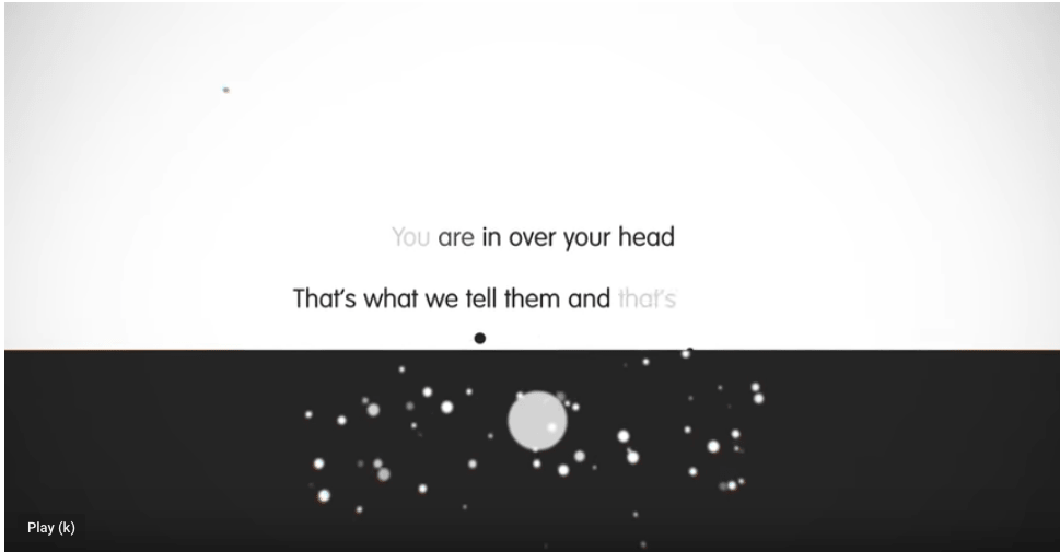
Image Source: https://youtu.be/q9SYfHxljE0
It’s also important to remember that viewers will likely see the video on their smartphones. A study from eMarketer indicates that over 78 percent of worldwide video viewing happens on mobile devices. An ill-chosen font is arguably even more frustrating to watch on a small screen than a large one.
A study from @eMarketer found that over 78% of worldwide video viewing happens on mobile devices.
Click To Tweet
2. Experiment With Constant Motion
When you’re making a video for marketing purposes, what’s said is undoubtedly critical. That doesn’t change when you’re using kinetic typography, but it’s also important to consider how the message of the words on the screen could become even more impactful if they move in strategic ways.
One example of using kinetic typography for things said by Stephen Fry uses orientation and continual movement to draw attention to words and phrases.
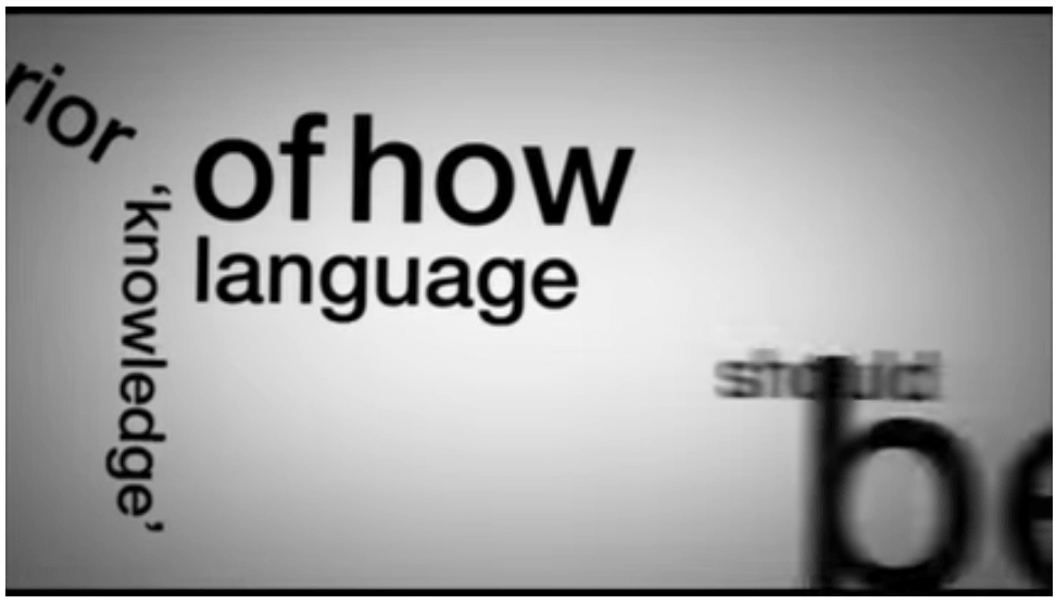
Image source: https://www.youtube.com/watch?v=J7E-aoXLZGY
The pacing of the video also works well because although there’s continual movement, it’s not so fast as to make viewers feel sick or disoriented. Not all videos are appropriate for leveraging motion like this, but it can pay off in the right circumstances.
To make the right decisions for their respective cases, marketers should think about aspects like the attention span of the audience and whether too much movement could sacrifice the meaning and unforgettable nature of the words.
In this example, Stephen Fry himself creates the soundtrack for the video since his voice is in the background and matched to the words. That decision helps solidify the message as people watch the words.
This video is also longer than others here, clocking in at more than six minutes long. Such a length won’t work in all campaigns, but according to a 2018 report from Prezi, marketers don’t have to worry as much as they once did that their videos may not cater to viewers’ short attention spans. The details of the research indicate that the ability to maintain focus has improved over time. Something especially relevant to the topic at hand here is that 79 percent of business executives polled for the study said animated visuals in presentations helped keep audiences engaged.
According to a study by Prezi, 79% of business execs said animated visuals in presentations helped keep audiences engaged.
Click To Tweet
3. Try Combining Words With Shapes
Kinetic typography gives marketers ways to display their creativity through methods that static forms of media don’t offer. They can harness that reality in eye-catching ways by making words combine into a shape that aligns with the content said in the audio soundtrack.
MediaFlex does the work well in a kinetic typography ad for its agency that’s under 20 seconds long. The video begins by posing a couple of questions that probably make people scratch their heads, such as “Why are red onions called red onions when they look more purple?” Then, the video’s narrator admits that the company doesn’t know the answers to the questions posed, but it does know media.
At that point in the clip, the spoken words come together and form a question mark on the screen. It’s worth pointing out that this video also uses the constant motion approach like the one above, but with substantially fewer words. The use of shapes in a marketing video helps hold the audience’s attention if it’s done right.
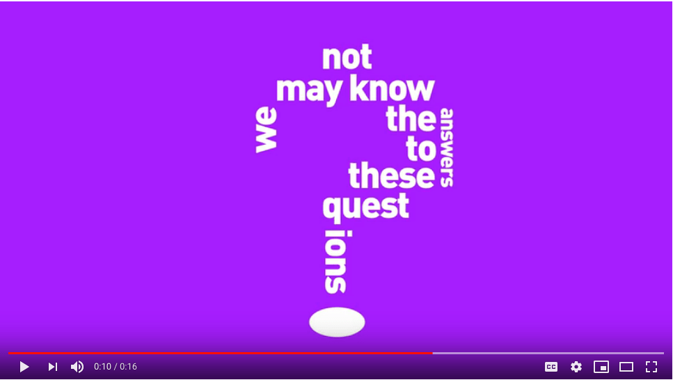
Image source: https://www.youtube.com/watch?v=6Ws1UNXFAbU
This video also proves that if marketers are on modest budgets and cannot afford to make kinetic typography videos that are as long as TV commercials, it’s okay — even short messages can get the point across.
4. Think About Using Words and Images Together
Flow is something that makes excellent kinetic typography examples stand out from the back. It’s not enough to make the text move on the screen just for the sake of it. The movement should complement the rest of the content and add an element that makes kinetic typography worthwhile for a campaign.
One student made a kinetic typography video as a class assignment and used Starbucks as the featured brand. In it, the bottom part of the letter Y in the word “You” extends down and becomes coffee pouring into a Starbucks cup.
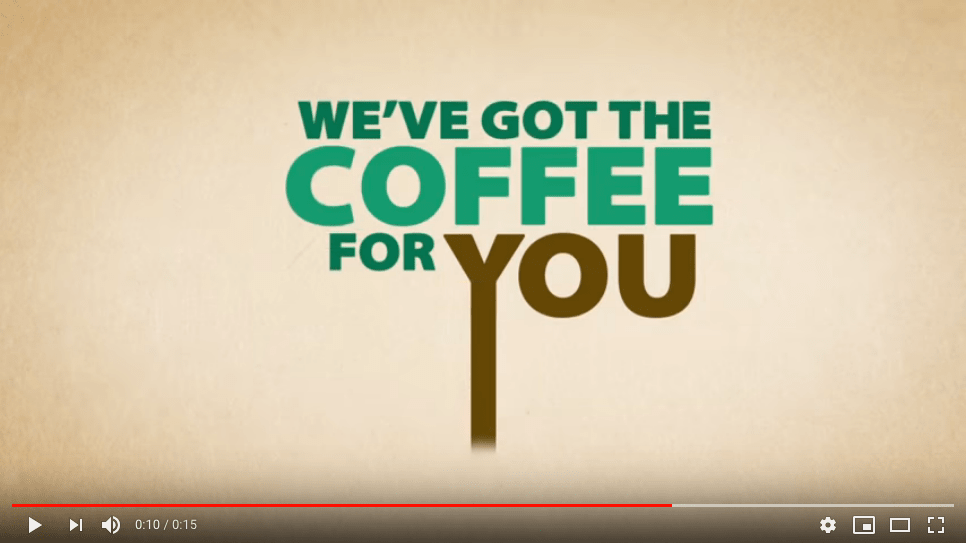
Image source: https://www.youtube.com/watch?v=YRLG1uLN7mY

This use of visuals pays off in the clip because it supports the theme of the video and demonstrates how to incorporate motion and make it consistent with a broader aim. In this case, the overall goal is to sell coffee. Making the letter become a stream of coffee helps capture and hold the viewer’s attention.
5. Rely on Contrast to Show Opposing Views or Feelings
Marketers can help their kinetic typography videos resonate with audiences if they take all-encompassing approaches to how the visuals can support two points of view. ChildLine provides counseling to children in the United Kingdom, and the company released a video using kinetic typography to convey the dialogue that may happen between a young abuse survivor and a counselor.
The font, motion and content of the child’s words emphasize feelings of fear, uncertainty and an initial unwillingness to talk about what happened. The messages on the screen associated with the counselor’s words are clear and straightforward throughout the clip, reflecting the stability a person could expect from using the service.
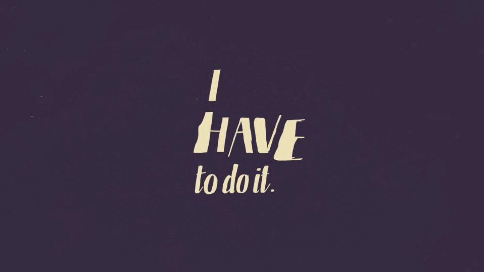
Image source: https://ift.tt/10MgzfO
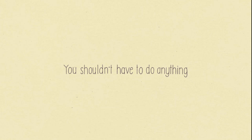
The counselor validates the person’s feelings and lets them know that the distress they’re feeling is understandable. The words also mention that it’s okay to talk and that everything said remains confidential.
As the video progresses, the chaos associated with the child’s words calms down as the font becomes easier to read and the surrounding motion slows. Those changes make sense since the young person eventually confides that the counseling is helping them cope even though the abuse is still happening.
This example is an outstanding way to let motion express the distinctive feelings two people have. The result tells a strong story that keeps the organization’s message intact. Marketers should use it for inspiration, especially if they want to help viewers keep track of what’s going on. Plus, the clip proves that kinetic typography can suit tough topics as well as lighthearted ones.
Kinetic Typography Can Solidify Messages
Kinetic typography is something marketers must implement carefully. Using it haphazardly could cause the message to get lost, making any marketing efforts fall short.
However, these examples and tips show that it’s possible to let motion strengthen the meaning of the text and amaze viewers in the process.
The post 5 Tips for Unlocking the Power of Kinetic Typography in Your Video Marketing Campaigns appeared first on Convince and Convert: Social Media Consulting and Content Marketing Consulting.
from Convince and Convert: Social Media Consulting and Content Marketing Consulting https://ift.tt/2TwQTdV

No comments:
Post a Comment