Facebook is the most effective marketing channel — according to 67% of social advertisers.
This is because Facebook video ads can generate:
- 25% more views
- 480% more clicks
- 270% more leads
As a result, your ROI will be higher. But most people shy away from creating Facebook video ads because the idea of making videos from scratch can seem daunting. Rather than avoid this ads format altogether, what you need is help.
So to make it easy for you to create highly successful video ads, I have made a list of the tools that simplify the process even if you are a newbie. This includes tools for creating the ad itself and also the rest of the funnel.
9 Tools for Creating Effective Facebook Video Ads that Convert
Tool #1: InVideo
The biggest fear people have while running a Facebook video ad is creating a video that is optimized for this purpose. It can sound like a complicated task if you have never made a video before.
Fortunately, a tool like InVideo can simplify the video creation process. It's as easy as signing up for an account and choosing a template.
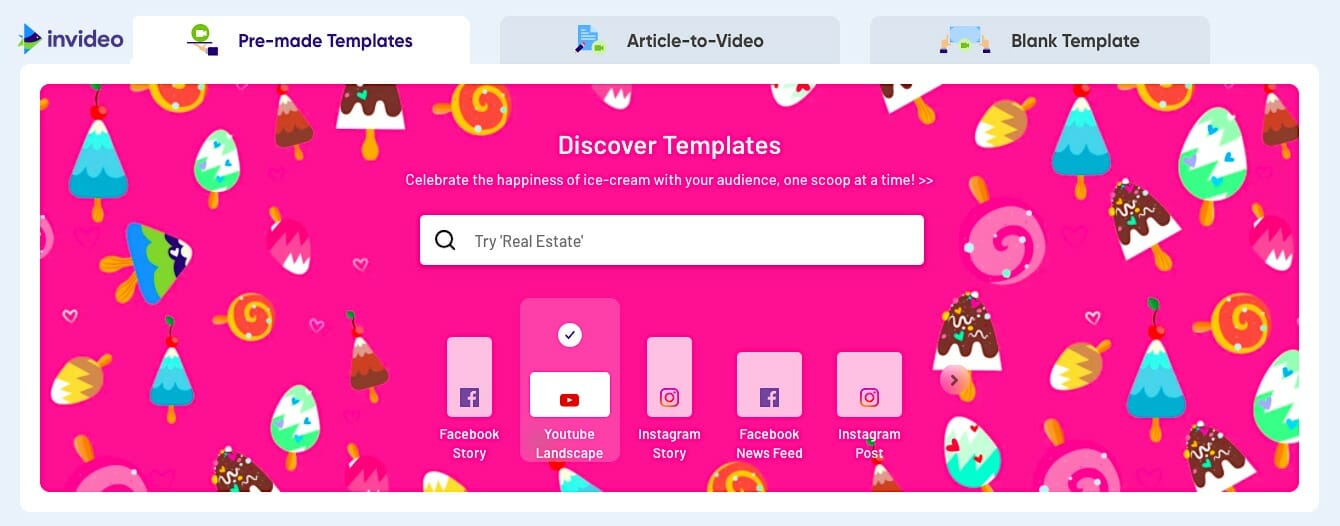
You will notice that at the top that you can filter templates based on whether you are creating an in-feed post or a story post. Don’t choose this option as it will show you the templates for all types of posts whether they are ads or organic.
Instead, scroll a little lower and click on the ‘Video Ads’ option:
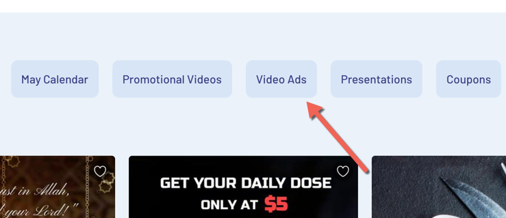
This will show you the different templates they have for just video ads. And they will be separated based on the dimensions (wide, vertical, etc.):
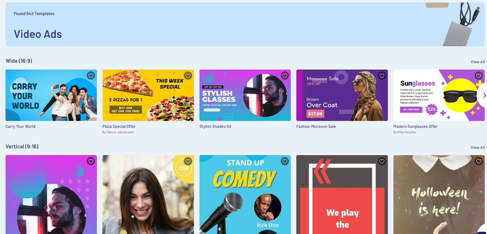
Video ad templates that have the aspect ratio of 16:9 work best for in-feed ads, while templates with a ratio of 9:16 are best for story ads.
If you like a template, just click on it. This will let you preview it. If you want to use it, just click on ‘Use this template’:
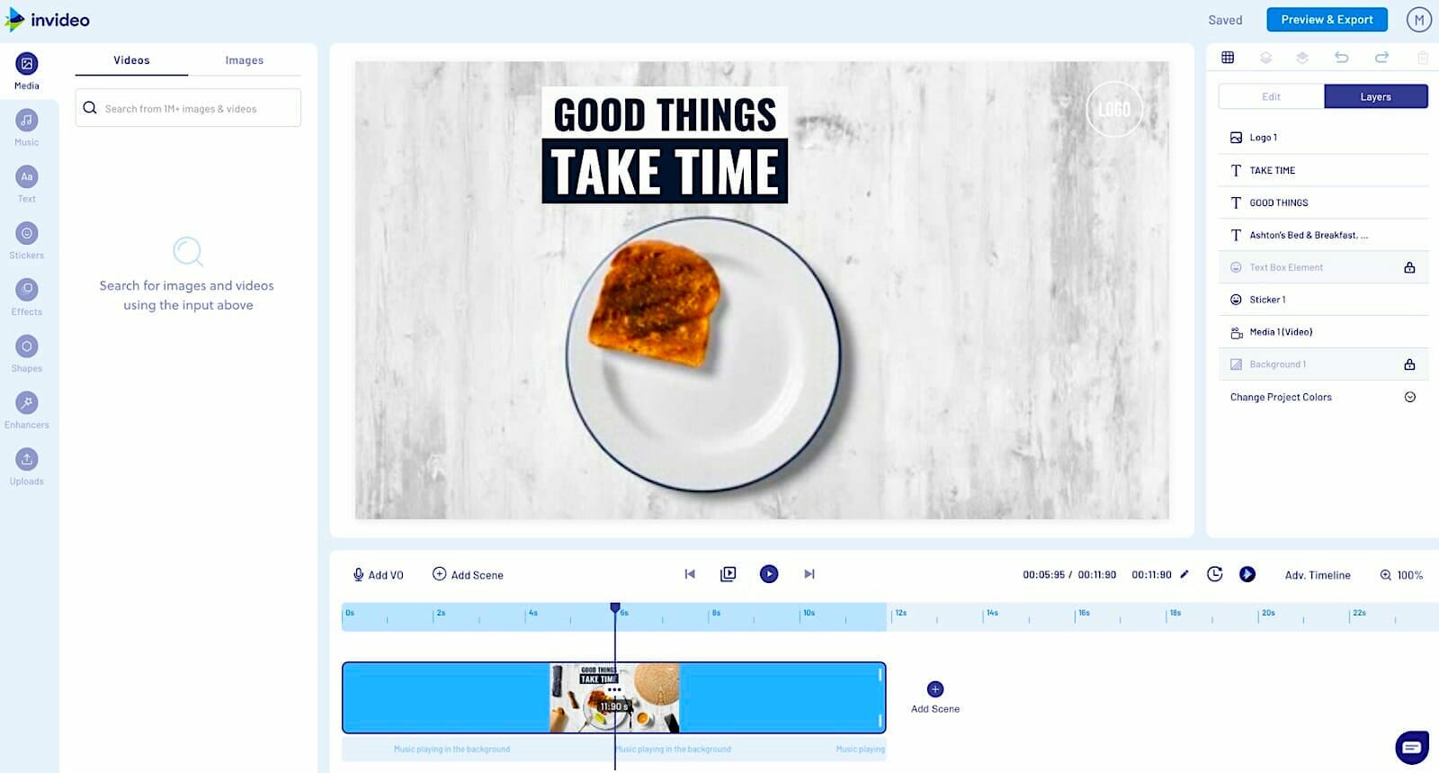
After that, you can modify it using their editor. Start off by creating the thumbnail first. Then you can add more videos and photos to it — take advantage of their library of a million photos and videos or upload your own:
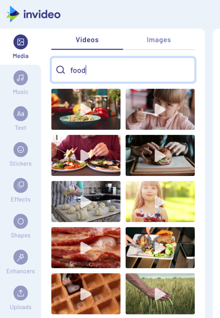
I prefer uploading unique videos of the product because a simple video with your product in action will be the best promotion for it. Keep a few parameters in mind for your video:
- Facebook says ads that are 6 seconds long tend to convert better, so keep your video short.
- Add subtitles as overlay text using InVideo’s editor, because 92% of people will watch with the sound off on mobile devices.
- 80% of consumers are more likely to watch an entire video when captions are available.
End the video with a call to action using overlay text again (if you are creating ads that are longer than the recommended six seconds, you might want to place the call to action in the middle).
I also recommend that you create many versions of your ad and split test (aka A/B test) them to see which version converts best.
An example of a good video ad is this one from SEMRush. It's very simple: It’s 15 seconds long, the CTA appears early on and most of the promotion is mainly done through overlay text. Anyone can create an ad like this!

More Facebook Video Ads Content:
* How to Produce Paid Facebook Video Ads for Mobile Like a Pro
* Why It’s Crucial to Choose the Right Objective for Your Facebook Video Ad
* How to Create a Facebook Video Ad that Gets Attention
* The Types of Videos to Use at Each Stage of the Marketing Funnel
Tool #2: Madgicx
It’s almost impossible to create the best version of your ad in your first attempt. After creating their first ad, most media buyers will go back and create more versions of the ads. They will test different video lengths, ad copy, CTA placements, and many more elements. This can take some time and it can seem complicated if you haven’t done it before.
If you find this overwhelming you can use a tool like Madgicx. It’s an AI-based Facebook ad automation tool that uses historic data to make it easy to create ads that convert better.
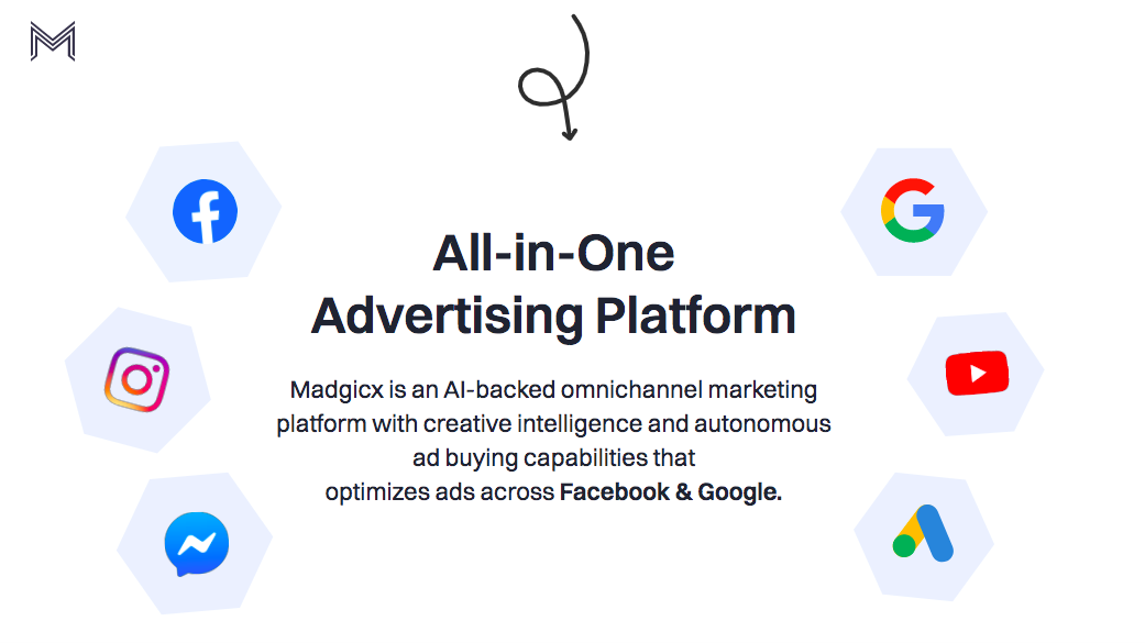
All you need to do is choose your KPIs, your ad targets and your target audience, and the platform will help you optimize your ads.
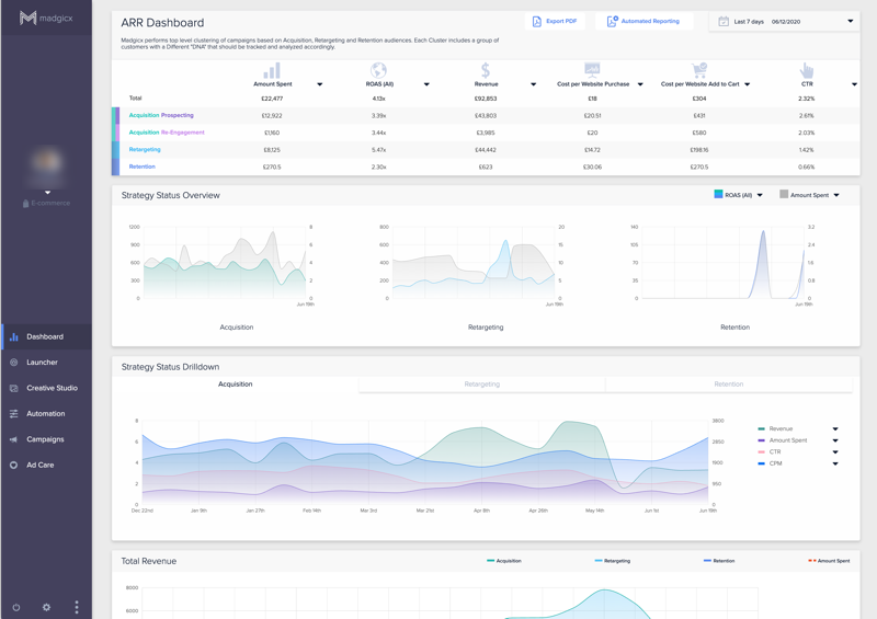
Once you've signed up for an account, Magicx will analyze your ad account and open up all your ad and conversion metrics on your dashboard. This will help you understand which ads and strategies are working best for you:
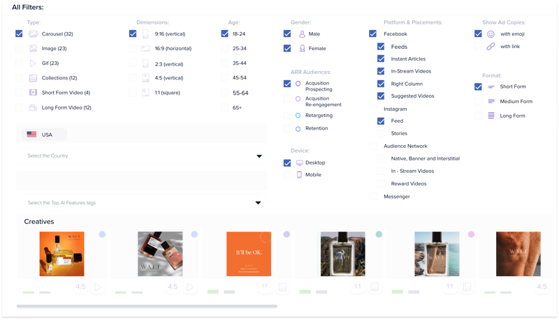
To get even more insights on what type of ads are doing better, you can go into their Creative Studio. This will give you a detailed analysis on which videos and copy are working for you. You will be able to see which ads got you the highest CTR (click-through rate), ROAS (return on ad spend), and purchases:
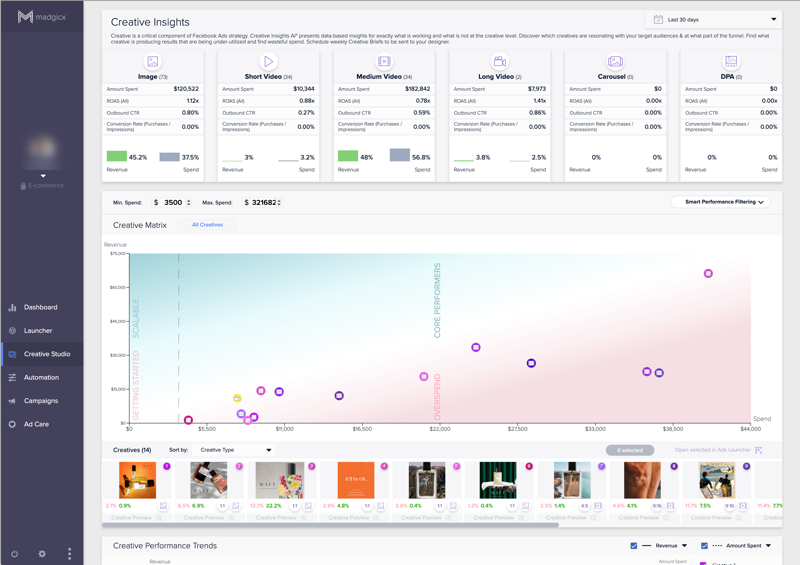
You can filter the data based on location, gender, placement, device, KPI, etc., and use this data to either pick the best ads you already have or create new ones:
Next, you can go into the ad launcher to select your audience (including AI audiences). One of the things I like about this tool is that they have pre-built audiences that I can quickly pick:
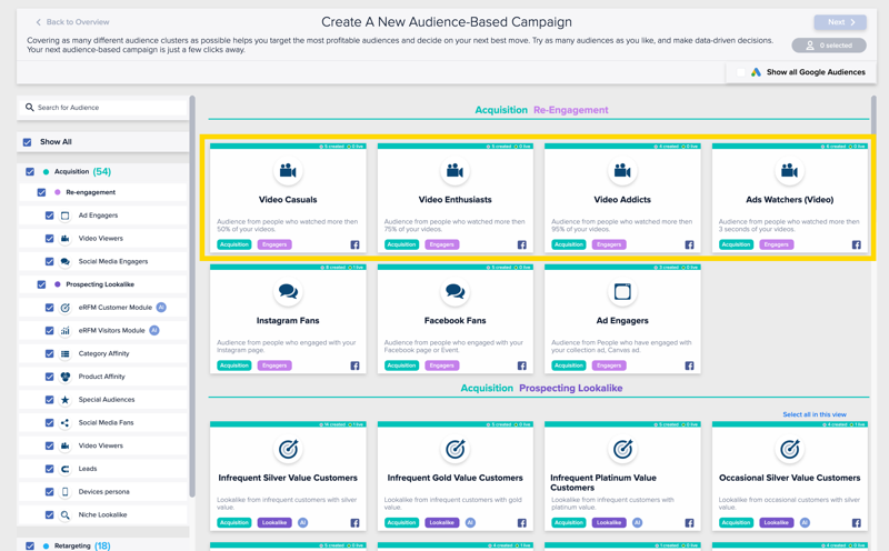
They have custom audiences like video casuals, video enthusiasts, video addicts, and ads watchers that make it easy to target people who like watching videos. There are many more audiences you can add that are relevant to your ads, so be sure to take the time to go through them.
Once you pick your audience, you select your budget and then launch your ad.
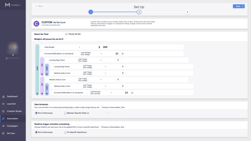
After that, you can go into the automations section of Madgicx and choose a framework that can help you better automate your ads and ensure that it functions optimally. This will automatically pause poor-performing ads and increase the budgets of those that are performing better:
Tool #3: PromoRepublic
An important component of the Facebook video ad is the thumbnail, since many Facebook users will have autoplay turned off. To get more of these people to click the play button, you should create a highly persuasive thumbnail image.
Of course, you will make one when you create the video with InVideo, but that one thumbnail won’t be sufficient. This is because you should treat your thumbnail just like you treat a title while writing an article: You usually write multiple headlines and pick the best. So if you want to get more plays and generate the highest ROI, you should create multiple thumbnails and then A/B test them to see which one performs best.
To come up with thumbnail ideas you can use the data from Madgicx, but to create thumbnails, you can use a tool like PromoRepublic. They have a library of over 10,000 Facebook Ads templates:
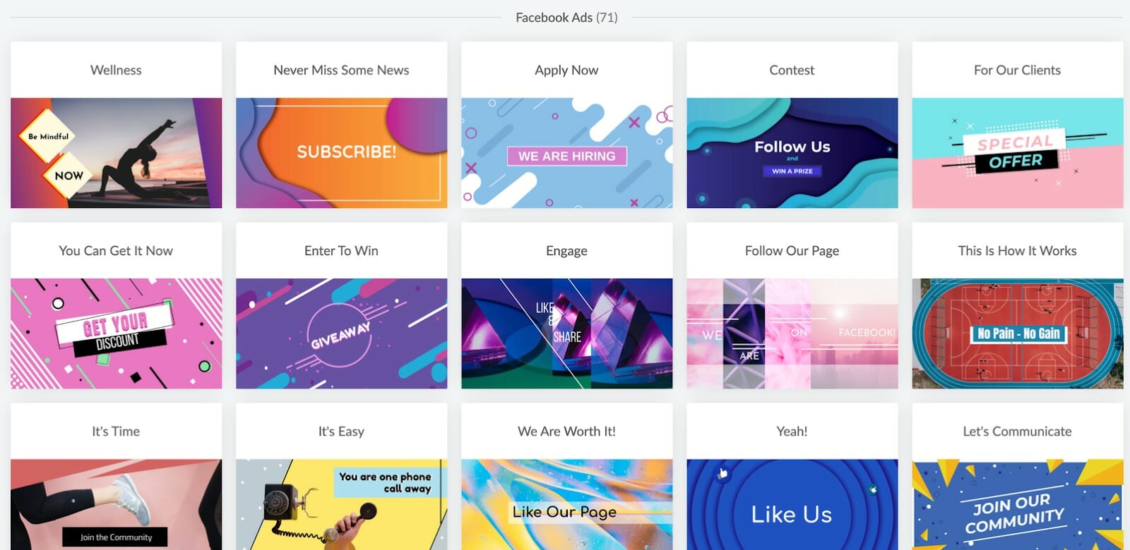
You can pick a few and create several variations of your thumbnail with their image editor:
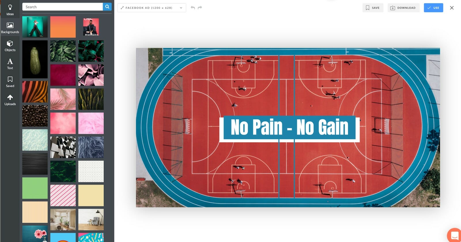
Then attach them to different ad videos and split test things like: font size, overlay elements, font style, colors, text percentage, number of characters, etc. You can track these results with the above mentioned Madgicx.
Another way to experiment with design styles is by creating several ‘quote images’ or infographics and then publishing them organically in bulk using a good Facebook publishing tool (like Buffer or CoSchedule). This will help you check what types of images work for you without spending anything on advertising just yet.
Tool #4: Facebook Grid Image Checker
While creating your thumbnails, you should also use the Facebook grid image checker tool to make sure that your image has less than 20% text (Facebook will not approve your ad if you have more than 20% text in the thumbnail):
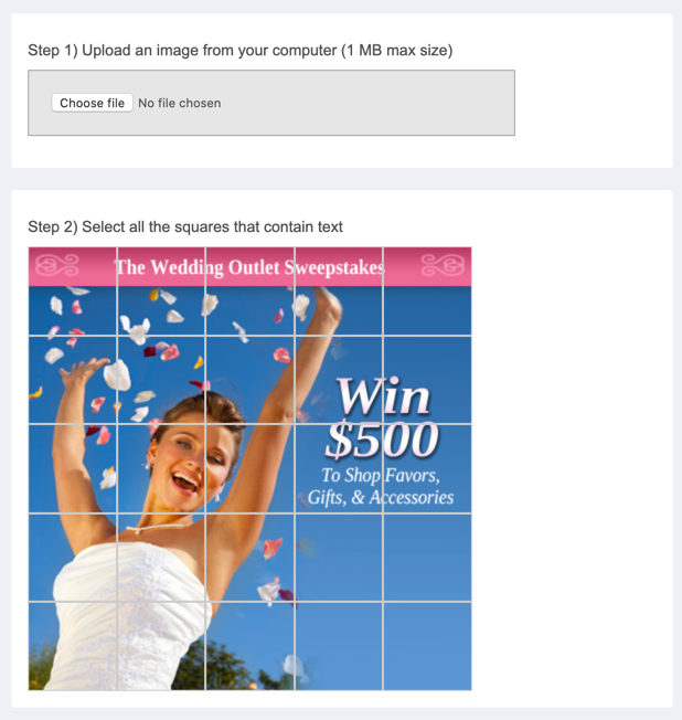
Many people frown upon this rule, but Facebook found that images with less than 20% text perform best. I can understand why. It’s because when you include less information, people get more curious and they click on the link or the play button to learn more. It’s the same reason why short video ads do well on Facebook. Less content in the videos convinces people to visit the landing page to learn more.
So upload the thumbnail you create onto the grid checker and see if it has less than 20% text:
If all the text on the image fits inside five squares/rectangles or less, it shows that the text occupies less than 20% of the entire image. You can click on the squares/rectangles on the image to check:
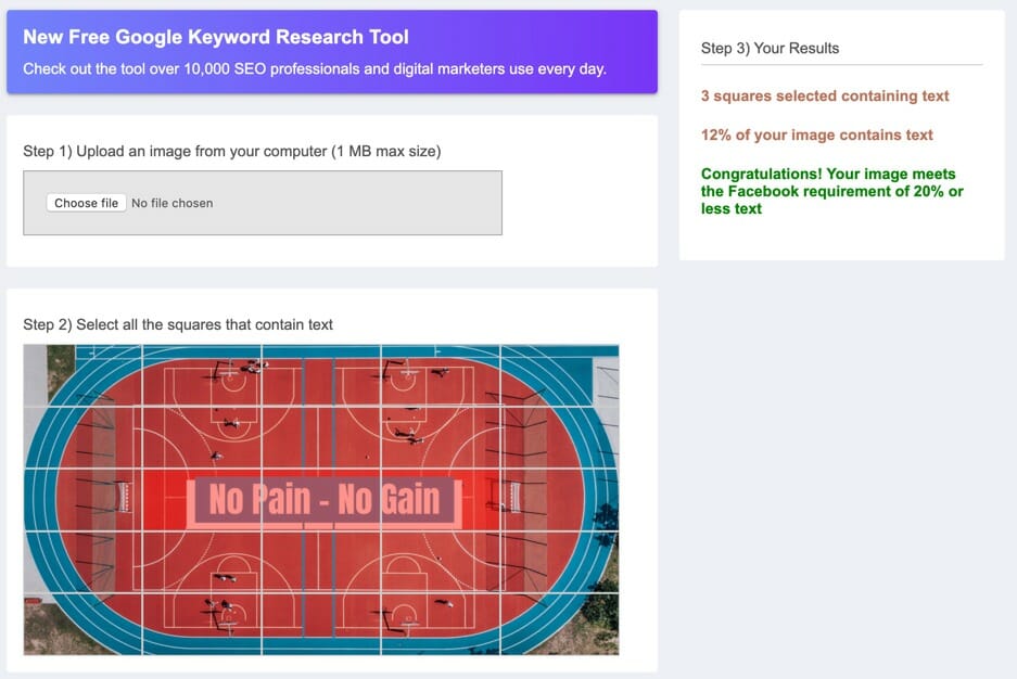
If it exceeds this, you will need to reduce the copy on the image and check it again. This will ensure that your ads reach more people and you generate a higher ROAS.
Dive Deeper:
* How to Create Better-Converting In-Content Calls to Action (CTAs)
* 8 Facebook Ad Copywriting Tricks to Maximize Conversions
* 11 Ways to Improve Your Facebook Ads Relevance Score
Tool #5: Unbounce
Your landing page for your video ad should also be optimized. One way to go about this is by making your landing page design similar to the video. By that, I mean that the design style (colors palette, call to actions, ad copy, etc.) you use in your video should be used on the landing page, too.
When the copy and design of the landing page is similar to that on the video, it gives visitors a sense of familiarity, especially to cold visitors who are checking out your website for the first time. This comfort can boost conversion rates further.
A good example is this landing page from SEMRush’s Marketplace:

This video ad (that I shared earlier) leads to the above landing page: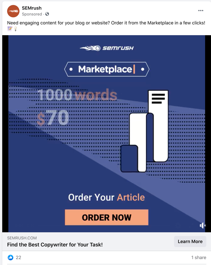
You will notice that the landing page looks very similar to the video ad. It has the same ‘Marketplace’ logo, color palette (background color, call to action button color, etc.), font, and so on. When people visit the landing page via the ad, they will feel certain that they are in the right place.
You can set up your landing page with a highly customizable landing page builder like Unbounce:
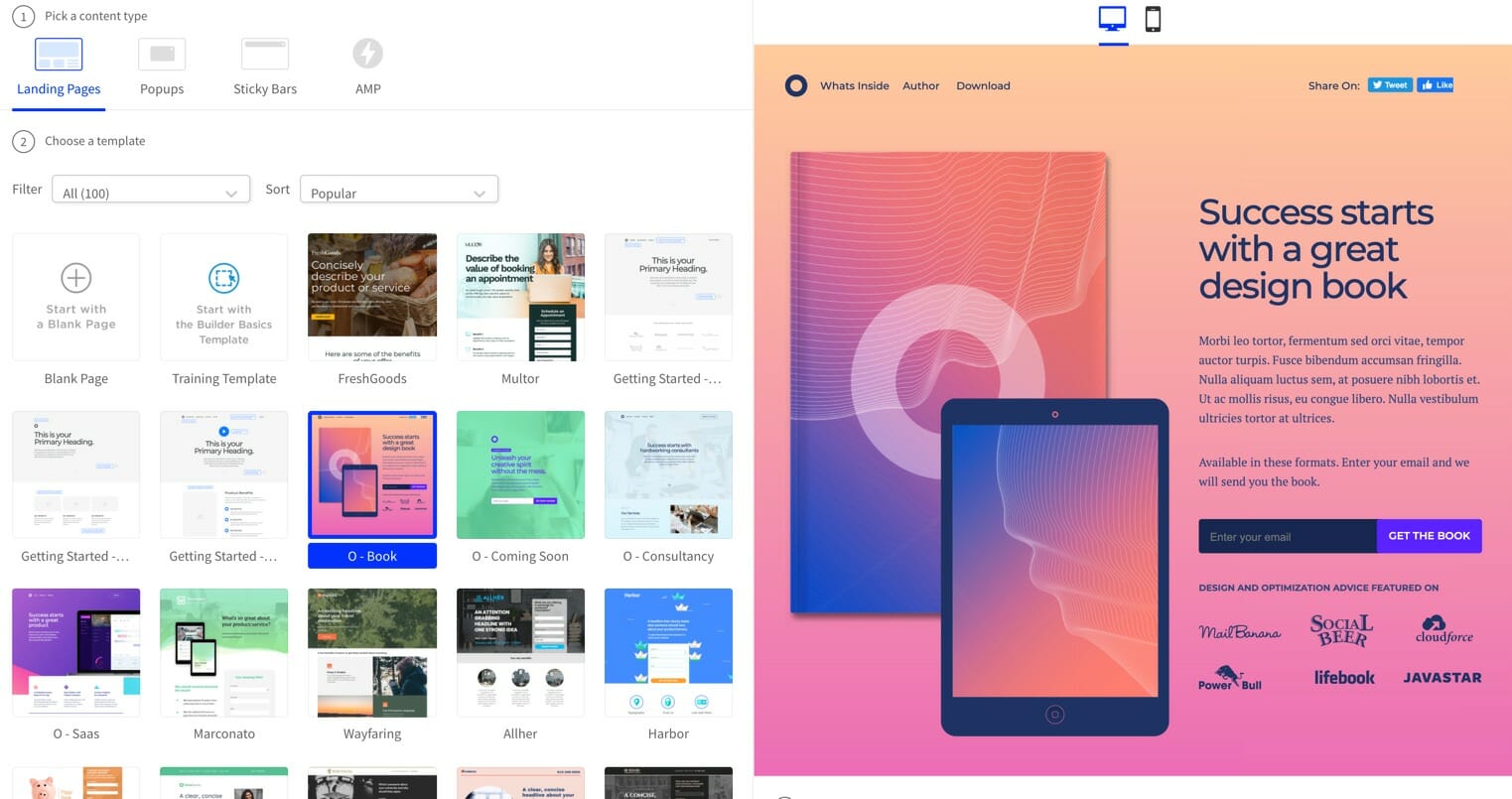
They have several templates that make it easy to quickly set up a landing page that looks just like your video.
If you want to make your landing page look even more familiar, I recommend that you embed the video you used in the ad or even a longer version of it right at the top of the landing page.
Videos can increase the conversion rate of your landing page by 80%.
Unbounce has a video widget that makes it easy to add a video to your landing page. You just upload the video onto a separate host, add the video widget and then copy and paste the code.
Use a good platform like Wistia to host your video, as they provide detailed analytics watch time:
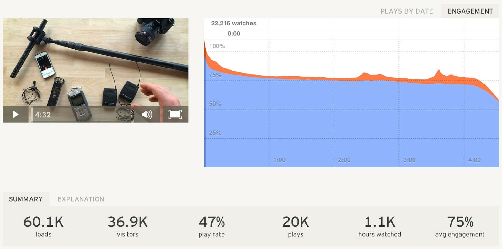
This data can not only be used to improve the video on the landing page, but also the video in the ad.
Another great landing page builder for creating high converting pages is Leadpages.
And if you are running an e-commerce store, there are e-commerce landing page builders like BigCommerce and 3dcart that make it easy to set up high-converting e-commerce landing pages.
Tool #6: KyLeads
The above tactics can help improve your video ad and landing page conversion rates significantly. But even then, most people who visit your landing page won’t convert.
The average landing page converts at 4.02%, and even in the highest-converting industry, the conversion rate is 6.1%:
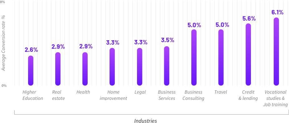
This means that for every 100 visits, just 6 people will convert and 94 others won’t. The majority might not buy for a number of reasons, ranging from getting distracted to not having enough money to not trusting your brand enough.
The important point to remember here is that they might not buy now, but they might in the future. This is why you should have a backup plan to stay in touch with them, build trust, and convince them to buy whenever they are ready. You can do this by converting them to email subscribers by setting up an exit-intent opt-in form with a tool like KyLeads:
This tool lets you create a popup that appears when people move their cursor out of the browser, so you can display a popup that promotes a relevant lead magnet like a discount code.
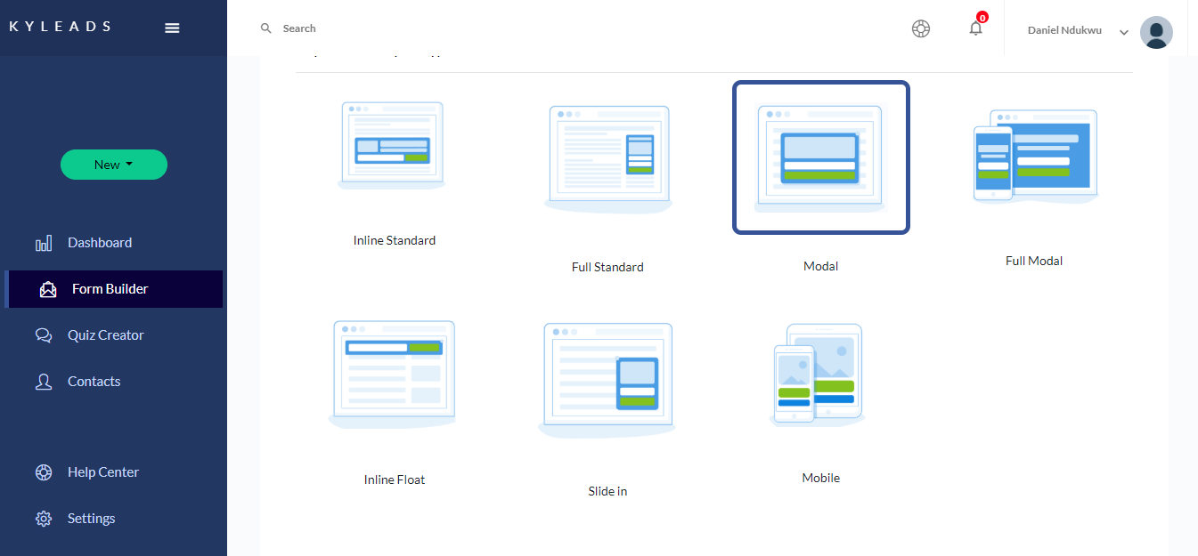
To create a popup with KYLeads you should sign up for an account, start a new form and customize it to suit the theme of your landing page:
After that, you can adjust the settings to ensure that it appears only when people are about to exit:
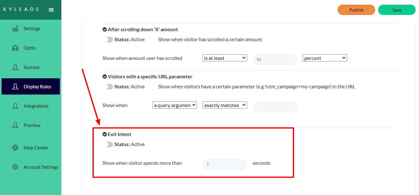
This will get you a lot of sign ups. You can also try and set the popup to appear after a time delay. But make sure you choose this time based on how long it takes the average person to order or leave without ordering.
You can see an example of this type of popup on Society6:

This popup appears after a time delay and asks people to sign up in exchange for a discount. After signing up, they send you a welcome email with a discount. They can then follow up with you through newsletter emails, offer emails, etc., and get you to convert later.
Another way to stay in touch with people who visit your landing page but leave without purchasing is through the Facebook pixel. When you install the pixel on your landing page, all the people who visited it will be tagged and you can retarget them later with a highly relevant ad.
As these ads reach a warm audience, they perform a lot better than regular ads that target cold traffic. In fact:
3 out of 4 people notice retargeted ads and they are 76% more likely to get clicks.
Tool #7: Sendpulse Chatbot
Some visitors will exit your landing page without buying anything because the page didn't answer all their questions.
This is why you should set up a chatbot that answers all those questions. The best type of chatbot you can create is a Facebook chatbot because anyone who visited your website through a Facebook ad is already logged into Facebook.
You can create a Facebook chatbot using Sendpulse chatbot builder: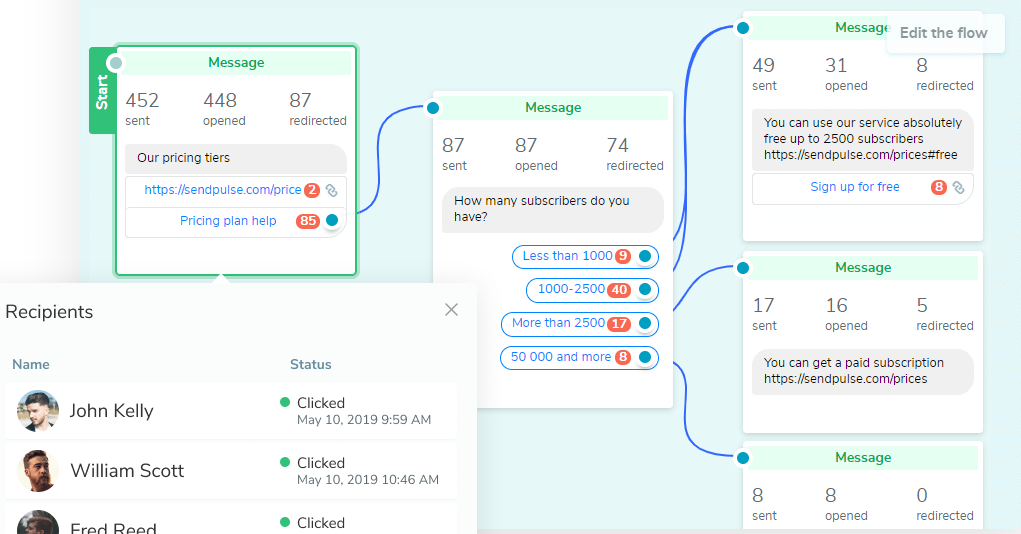
This will help answer many of the questions that your visitors have. And if they ask a question that the chatbot can’t answer, you can set it up to alert the human support team.
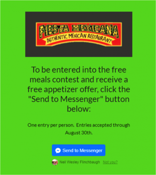
You can also use the Facebook chatbot for lead-generation campaigns where you get people to sign up through Facebook messenger. Again, as people are already logged in, they can easily sign up with a couple of clicks.
You can generate leads for a lot cheaper with this method like Charly Wigstrom did. He was able to generate leads for 85 cents each with Facebook ads by getting people to sign up through Messenger:
Dive Deeper:
* How to Easily Set Up a High-Conversion Facebook Retargeting Campaign
* 13 Messages Your Chatbot Should Be Saying to Prospects
* The Ultimate Guide to Creating a High-Converting Landing Page in 2020
* Here’s How Targeting Cold, Warm & Hot Traffic Builds Successful Customer Relationships
Tool #8: Rebrandly
As aforementioned, retargeting is extremely effective. One way of doing this is by retargeting people who recently visited your website from an ad or another traffic source.
But there’s a way to boost your retargeting reach even before they visit your website: by using a link retargeting tool like Rebrandly.
Rebrandly is a link-shortening tool that lets you attach the Facebook and Google ad pixels to your shortened links. So when you share an article using a link shortened with Rebrandly and a user clicks on the link, the pixel will tag them and you can retarget them with relevant ads. This is a great way to expand your reach with retargeting.
You can set this up by first creating a shortened URL. After that, you need to attach the pixel to the branded URL and save your settings:
![]()
Now every time you shorten a URL with Rebrandly and someone clicks on it, they will be tagged.
But in order to get the most out of this, you need to be careful with what you share. This will only work if you consistently post top-quality content on a very specific niche. It should be relevant to the products that you promote in your ads.
Also, you should make sure you run your ads on the same account where you share organic posts. Because people will likely have read the content shared by this account, they will be more likely to respond to ads promoted by it.
An example of a company that sticks to a proper content-curating plan is RightInbox. If you check out their Twitter account, you will notice that they share a lot of blog posts and other forms of content. But you will find that they are very focused in terms of what they share — most of their posts are on topics such as productivity, content marketing, email marketing, sales, etc.:
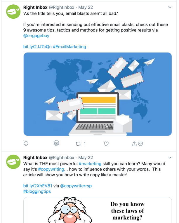
They share content on these topics as they are an email tool that mainly helps businesses improve their sales and productivity. If they run retargeting ads targeting people who clicked on their links, they will reach a very relevant audience who will be interested in their product.
So, be sure to post only relevant content on your social media accounts and use your link-retargeting URL on other places such as forums.
Tool #9: Databox
Keeping track of all the data on the above tools can be a lot of work. Jumping from one to the next will take up a lot of time. This is why you should use a dashboard tool like Databox that makes it easy to observe all your data in one place:
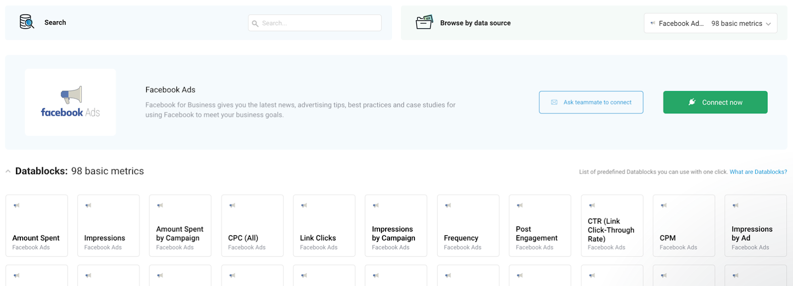
Databox integrates with Facebook pages, Facebook ads, Google Analytics, landing page builders, e-commerce platforms, WordPress, project management tools, video hosting platforms, etc.
This makes it easy to view all the data from your ads in one place and make the necessary improvements to increase conversions and generate more ROI from your ads.
Final Thoughts on Tools for Creating Facebook Video Ads that Convert
These nine tools will allow you to easily and effortlessly run successful Facebook video ads — especially when it comes to time-consuming processes like creating the video and landing page, split testing ads, offering customer support, etc.
It might be a bit overwhelming to wade through all these tools, so start out by choosing just one or two, and once you've gotten the hang of them — and seen how well they work! — then you can add on more.
And as I mentioned in the last section, you don’t have to maneuver through all the tools on a regular basis; you can simply view everything you need on one dashboard tool.
The post 9 Tools for Creating Effective Facebook Video Ads that Convert appeared first on Single Grain.
from Single Grain https://ift.tt/3hvZIxi



No comments:
Post a Comment