A wise Abigail Adams once said, “Learning is not attained by chance, it must be sought for with ardor and diligence.”
You don’t succeed at Facebook advertising by chance; it requires hard work. You must research and experiment, and when you fail, you must try again. One part of the research you can do is look at successful Facebook ads to see what works, why, and how you can emulate those successful ads.
But before we dive into it, let’s first look at some stats and information about why Facebook advertising is so effective, and what qualities make up a winning ad.
Let’s Start with Crucial Facebook Stats
If you’re not confident that Facebook advertising is the way to go, it helps to consider some facts about the platform.
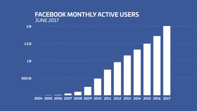
- First and foremost, you should know that Facebook has over 2 billion monthly active users and 1 billion daily active users as of June 2017. That’s a massive customer base to reach.
- Second, users are on Facebook for an average of 35 minutes daily, accessing the platform 8 times a day. That’s time during which you can be delivering ads to your target audience.
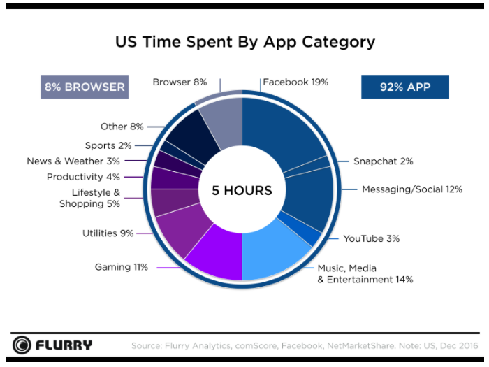
- Finally, people spend an average of 5 hours daily on their smartphones and 19% of those hours are spent on Facebook. That percentage window allows you to reach users wherever they are, as everyone carries a phone with them these days.
Qualities of a Good Facebook Ad
A good Facebook ad usually contains a mix of the following qualities:
- It educates
- It entertains
- It engages (i.e. compels users to comment, like or share)
- It has value proposition
- It has social proof
- It evokes an emotion
- Its image is high quality
- Its image/video features the product
- Its image/video incorporates good branding
- Its video is optimized for mobile
To give you a better idea of what these qualities look like, we’re going to analyze 30 winning Facebook ads that nail it. By the end of this article, you will have mastered knowledge of what makes a Facebook ad effective!
Learn More:
- How to Create a Facebook Video Ad that Gets Attention
- How to Increase Your SaaS Trials with a Facebook Ads Funnel
- How to Build a List of Messenger Subscribers with Facebook Comment-to-Messenger Ads
- Beginner’s Guide to Facebook Marketing
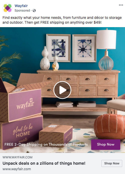
1) Wayfair
Wayfair is an online store and app that sells furniture, home decor, housewares, appliances, etc. at competitive prices. There are several good things going for this Wayfair video ad:
- It entertains, with objects in the video moving in stop motion animation, making it playful and fun to watch.
- It has value proposition by offering free shipping on purchases over $49, as well as by promoting “zillions of things home.”
- The ad evokes excitement, tapping into our combined desires to beautify our home and save money.
The ad also succeeds in technical aspects:
- For one, the video is high quality, meaning it looks professionally made and crisp.
- We also see good branding in this ad, with the color scheme in the video matching the Wayfair logo and “Wayfair” strategically displayed on one of the boxes, right above a box that reads “glad to be HOME.”
- Finally, the ad is properly optimized for mobile so users don’t have to rotate their screens to watch the video clearly.
2) HubSpot

HubSpot is a platform that offers inbound marketing and sales software products. This ad meets four of the qualities of an effective Facebook ad:
- The first and most prominent quality is that it presents a value proposition. Specifically, it offers a free demo, which helps establish trust because it gives customers the chance to try it first before deciding to make the buy.
- Second, the ad uses social proof to tell the audience that others have trusted HubSpot. The ad gives an approximate number (37,450+) to give weight to that social proof.
- HubSpot also uses a high-quality image for this ad. The photo looks professionally taken and smartly portrays a customer using the HubSpot product.
- Finally, this ad incorporates good branding, using the orange overlay color in the photo to match the HubSpot logo. The image itself also includes the word “HubSpot.”
3) ThirdLove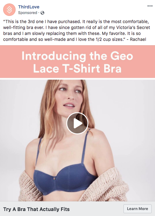
ThirdLove sells customized bras for women who have a hard time finding a bra that’s just the right size. In addition to its mobile-optimized format, this ad uses social proof, features the product, and offers a value proposition.
- First, in the post text above the video, we get a testimonial from a ThirdLove customer, which establishes social proof.
- Next, the video shows different angles of the bra, highlighting its best features and color choices.
- Lastly, we get a value proposition where the ad reads “Try A Bra That Actually Fits,” appealing to audiences who struggle with the frustration of finding a bra that fits comfortably.
4) Daily Burn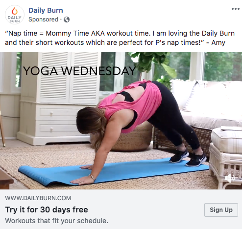
Daily Burn is a fitness program that offers extensive workout routines to help people reach their health goals. This video ad uses entertainment to offer value propositions and social proof.
- In a video that is sped up for amusement, this ad goes through each day of the week, showing a different workout at home for each day to show how easy it can be.
- The ad uses social proof by using a customer testimonial by a mother who uses Daily Burn to get her regular workout in during her busy week.
- There are also two value propositions offered in this ad: easy workouts that fit your schedule and a 30-day free trial.
5) Bath & Body Works
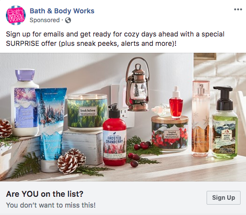
Bath & Body Works is both a physical and online store for scented bath and body products, with store locations across the U.S. This Facebook ad evokes a sense of urgency and excitement, and also features some of the business’s popular products.
- Bath & Body Works encourages its audience to sign up for its email list in exchange for a surprise offer and sneak peek (i.e. value proposition).
- By using words like “surprise” and “sneak peek,” the ad gets customers excited. And with “Are YOU on the list” and “You don’t want to miss this,” Bath & Body Works creates a sense of urgency, causing customers to want to act now so they don’t miss out.
- In addition, the ad also tosses in the word “cozy” and uses a holiday-themed image to make the message timely and relevant. It’s very difficult to scroll past this ad without wanting to sign up for the holiday perks.
6) Care/of
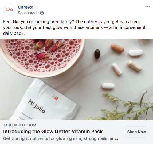
Care/of offers customized vitamin packs that help individuals get the nutrition they need. In this ad, Care/of educates the audience, as well as offers value proposition and employs good branding.
- First, the ad talks about the importance of nutrients in affecting your look.
- Next, it offers the value propositions of “your best glow” and a “convenient daily pack.”
- The ad also incorporates good branding, using a sophisticated color palette with a hint of the same pink used in the logo.
Learn More:
- How E-commerce Companies Can Drive Sales with Facebook Messenger Chatbots
- 6 Tactics to Show Up in a Facebook Feed without PPC
- How to Build a Facebook Chatbot Marketing Funnel
- How to Use Live Video (Facebook & Instagram) to Grow Your Business
7) Lemonade

Lemonade promotes its quick-and-easy insurance options at convenient prices.
- The brand dabs into education by informing its audience about the frequency at which people buy Lemonade insurance (“Every 90 seconds”).
- It then evokes curiosity with “Find out why” and a “Learn More” call-to-action.
- The “Protect the stuff you love in seconds” line serves as the value proposition.
- To top it all off, the pink outline and “Lemonade” stamp at the top right of the image serve as good branding in this ad.
8) Apartment List

Apartment List is an online site and app for apartment hunters. This ad gets right to the point and keeps the message simple while still offering value proposition.
- In the post text, the ad lists three value propositions customers might find in their dream apartment when they use Apartment List: “Short Commute,” “Hardwood Floors,” and “Within Budget.”
- Each benefit is followed by a checkmark, showing how you can find each of these desired items when you use the site.
- Apartment List wraps up the message with a simple headline: “Moving Soon? We Can Help You Find Your Next Apartment!”
9) Kohl’s
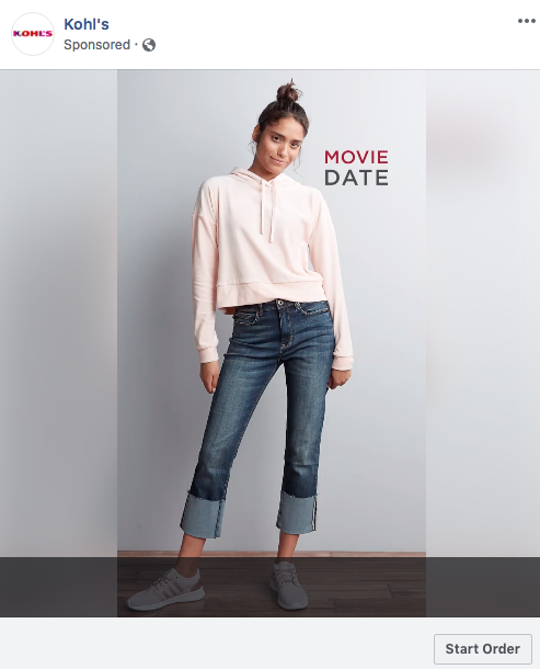
Kohl’s is a popular department store with both offline and online shopping options. The store doesn’t need a lot of words to give this ad impact. In the first clip of the video, Kohl’s displays a box containing the text: “Women’s Essential Sale.” What follows is a series of static clips of models wearing Kohl’s outfits with the type of date for which one might wear the shown ensemble. “Coffee Date,” “Movie Date,” and “Dinner Date” are the outfit variations shown in the ad.
- With this particular strategy, Kohl’s is able to entertain and elicit interest in the sale.
- The ad also uses high-quality images, much like those you might find in a magazine, and is optimized for mobile.
- Overall, this ad is easy to understand, straight-to-the-point, and fun to watch.
10) Dove
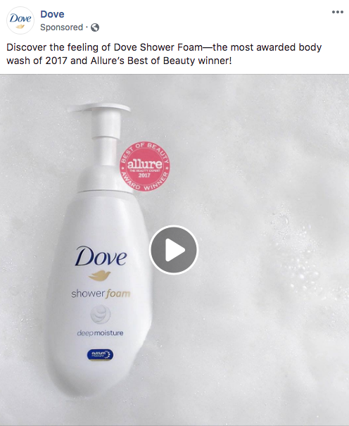
Dove is famous for its soaps and beauty products. In this video ad, Dove focuses on the foamy suds with close-ups, eliciting that light and clean feeling one gets when they shower with the product.
- In addition to featuring the product in a high-quality video, showing the product in action and remaining consistent in the white Dove branding, this ad uses social proof to highlight the product.
- Specifically, the ad refers to the Allure recognition for “Best of Beauty,” giving you reason to perceive the product as trustworthy.
11) Tropicana
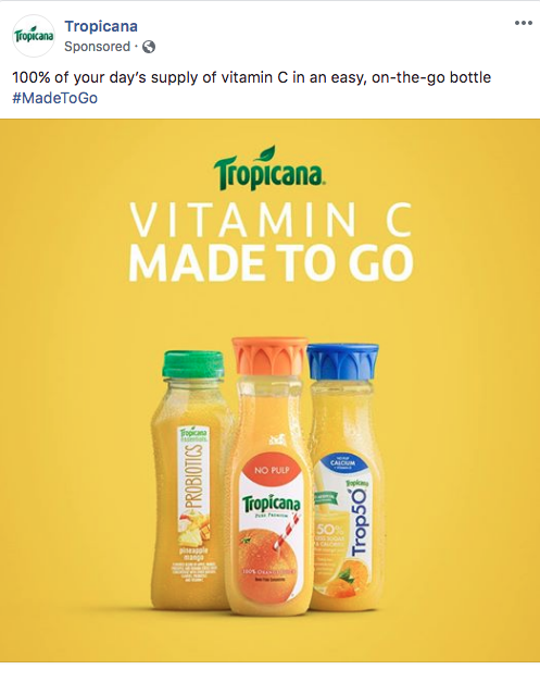
Tropicana is a beverage brand, best known for its orange juice.
- This mobile-optimized ad demonstrates excellent branding. The background is all orange, with three of Tropicana’s juice products front and center and the Tropicana logo at the top.
- The ad also uses value proposition, promising a full day’s supply of vitamin C in an “easy, on-the-go bottle,” using the quippy #MadeToGo hashtag to emphasize convenience.
12) Chili’s Grill & Bar
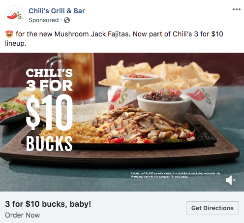
Chili’s is a well-acclaimed restaurant chain with a tasty array of entrees.
- The chain elicits hunger in this video, using close-ups of the new Mushroom Jack Fajitas dish.
- The ad also entertains with its casual use of an emoji and laidback language (“3 for $10 bucks, baby!”).
- Last but not least, the ad offers a value proposition with the “3 for $10” promotional message.
13) Estée Lauder
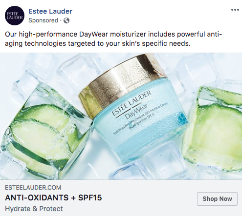
Estée Lauder is a major beauty brand that sells skincare, makeup, and fragrance products.
- This particular ad stands out because of its educational angle.
- It details how the brand’s DayWear moisturizer contains “powerful anti-aging technologies,” which gives you the value proposition.
- It also informs the audience that the product contains antioxidants and SPF 15, which both help to hydrate and protect your skin.
14) Walmart
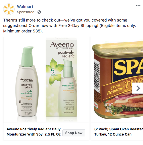
Walmart is a popular retail chain across the globe. With an endless stock of all kinds of items, Walmart uses the Carousel format to display “some suggestions,” which helps intrigue the audience.
- The company uses high-quality photos of their products.
- The ad contains a “Shop Now” call-to-action to prompt shoppers to buy.
- It effectively incorporates value proposition with its offer of free 2-day shipping
- And finally, it creates a sense of urgency with the “Order now” encouragement.
15) Arby’s
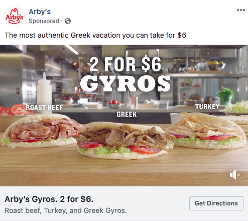
Arby’s is a fast food chain known for its roast beef sandwiches. The chain is also known for its humorous advertisements, and this Facebook ad is a great example of that.
- The video includes a voiceover that says “Now at Arby’s, you can get 30 gyros for $90. Or for those who aren’t trying to cater a Greek family reunion, they’re 2 for $6.”
- This humor is coupled with high-quality production close-ups of the gyros to make your mouth water.
- You also get a value proposition with the “2 for $6” deal.
Learn More:
- How to Get 1,000 True Fans with Facebook Video Retargeting
- How To Optimize Your Facebook Page For Local Searches
- How to Easily Set Up a High-Conversion Facebook Retargeting Campaign
- What Facebook’s Algorithm Update Means for Brands & How to Take Advantage of the Shift
16) Airbnb
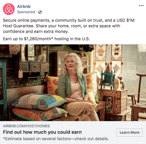
Airbnb is a service for travelers that provides places to stay to keep the adventures going. In order to run the service, Airbnb relies on homeowners who are willing to open up their houses to strangers.
- In this ad, Airbnb lists the biggest value propositions homeowners can benefit from by sharing their home as a temporary place to stay.
- It elicits interest by giving an approximate figure, $1,280/month, that these homeowners could make.
- Airbnb then educates its audience further with the “Learn More” call-to-action.
- The words “trust” and “confidence” serve to evoke emotion as well.
17) Vincero Watches
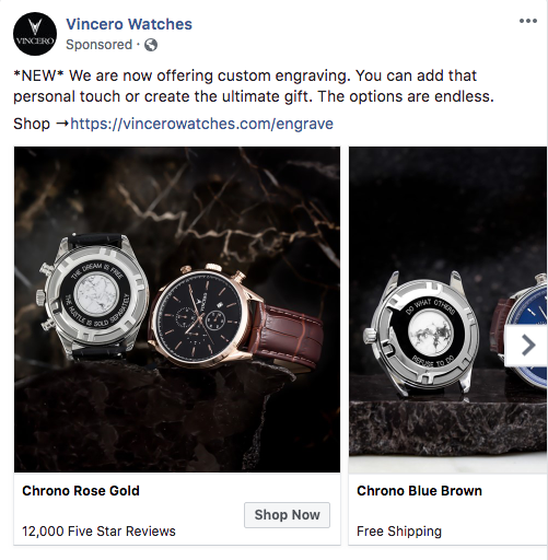
Vincero Watches is a luxury watch brand.
- With this carousel ad featuring the brand’s various watches in sophisticated images, Vincero uses relevance and value proposition, offering custom engraved watches as potential gifts.
- The ad also uses urgency with the “NEW” capitalization to evoke excitement.
18) Chase Bank
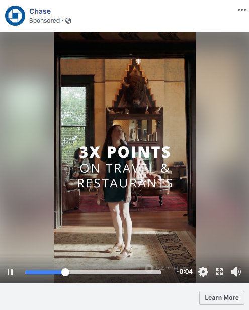
Chase is a country-wide bank with a wide array of financial services. Much like the Kohl’s example, this ad doesn’t need a lot of words to be effective.
- Chase uses a simple video that’s optimized for mobile, beginning with text overlay that communicates the value proposition straight away: “3x points on travel and restaurants.”
- The video also uses upbeat music to elicit emotion and to retain interest in the idea of travel while showing a Chase member reaping the travel benefits.
- The ad concludes with a close-up of the card Chase is promoting, the Sapphire Reserve.
19) Primary.com
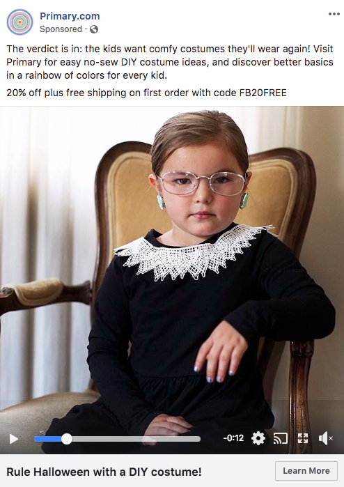
Primary is a brand for premium child and baby clothing, unique in that its products don’t contain logos, slogans or sequins. In addition to a few other great qualities, this Halloween ad is strongest in its images.
- The video cuts to various children wearing adorable costumes. One cannot help but melt at the cuteness, an effective strategy for evoking emotional responses.
- On top of that, the ad offers value propositions. Specifically, Primary promises comfy costumes that can be reused time and time again as well as easy costume ideas.
- And, finally, this ad offers 20% off and free shipping on first orders.
20) Origins
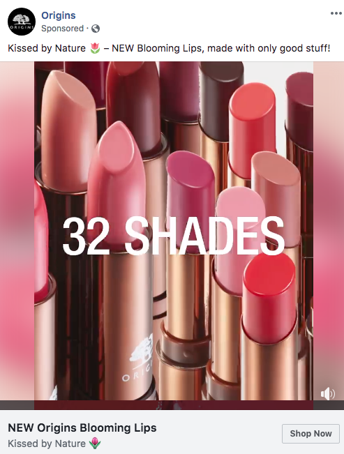
Origins is a U.S. skincare and cosmetics brand whose products are formulated with plant ingredients.
- The most prominent qualities in this ad come from its use of stunning color. From close-ups of flowers and bright red lips to a pan of the lipstick selection with upbeat music, this ad gets you excited about the new Blooming Lips shades.
- Knowing that most people have short attention spans, this ad is short, simple and very effective.
21) Thread Wallets
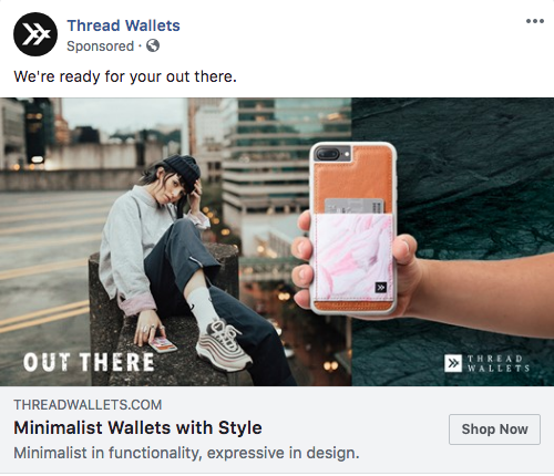
Thread Wallets is a wallet and accessory brand whose success comes from its creativity.
- This ad is a perfect example of that creativity, using the catch phrase “We’re ready for your out there” to appeal to your individuality.
- Using very few words, this ad shows one of its wallets in a close-up, contrasting with an adjacent wide shot of a model clearly enjoying her unique style. Thread Wallets essentially triggers the sense of style in each of us to draw us in.
22) GEICO
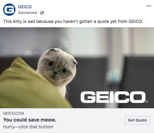
GEICO is a home and auto insurance company best known for its gecko (lizard) character.
- The company clearly has a flare for value propositions.
- Insurance is typically dry and/or frustrating, but this ad employs humor to make you laugh and say, “Aw, look at the kitty!”
- Overall, you’re left with a positive association with the company, which is something everyone wants when it comes to insurance.
23) Pottery Barn
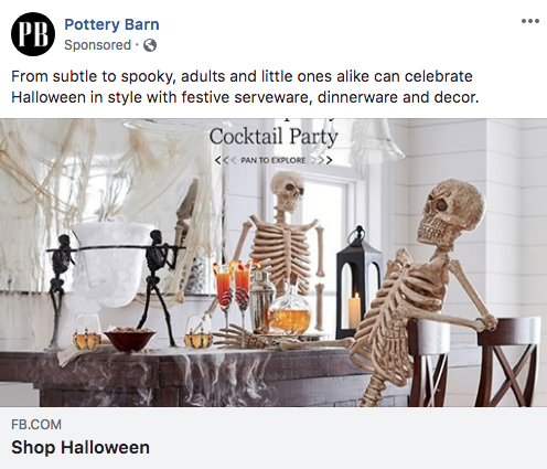
Pottery Barn is a home department store with high-end furniture and home decor.
- Tapping into the Halloween spirit, this Pottery Barn ad is relevant to the season without straying from the promotional message for the store’s products.
- It also uses humor, captioning the image as “Cocktail Party,” with skeletons as the “life” of the party. It’s just enough to make you chuckle as you click on the ad.
24) Absolut
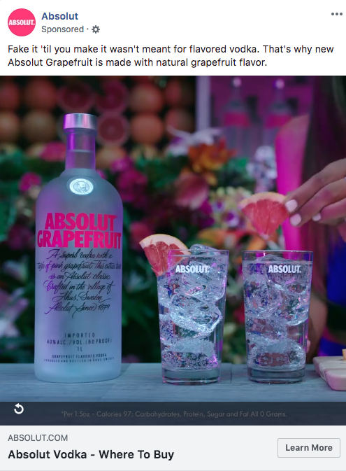
Absolut is a sophisticated, Swedish vodka brand.
- The brand cleverly promotes its grapefruit vodka by taking a popular saying — “Fake it ‘til you make it” — and pointing out that it doesn’t apply to its naturally flavored vodka.
- The ad uses a beautifully lit image as a video GIF, with a pink sunset hue to match the logo for its grapefruit vodka.
- To prompt action, the ad directs you to its “Learn More” call-to-action by teasing “Where To Buy.” After looking at this creative ad, how to buy the product is clearly the next logical step.
25) Century 21 Department Store
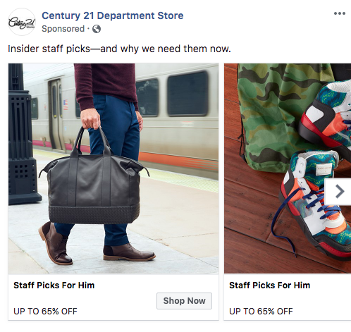
Century 21 is an iconic New York City store that promotes designer brands at reasonable prices. This carousel ad doesn’t do what most carousel ads do, which is simply feature a catalog of products.
- The ad shows products that are actually in use in high-quality photos.
- The language in the ad also evokes emotion first by relating to the audience with “Insider staff picks,” and then by creating urgency with, “why we need them now.” Looking at this ad, you feel included, part of the club.
26) Inkkas
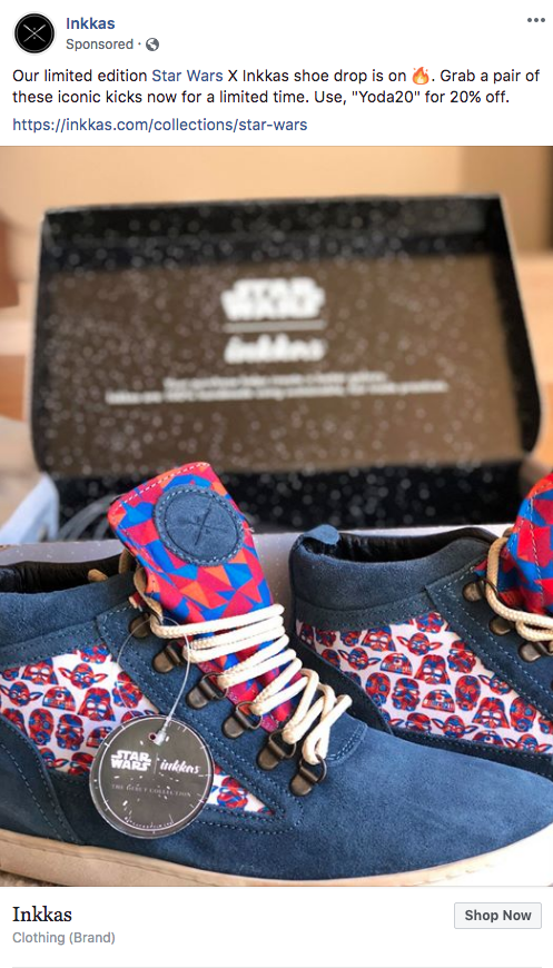
Inkkas, a New York City shoe retailer, sells shoes that are handcrafted in Peru.
- It’s all about urgency in this ad, as we see with the dual use of the word “limited.”
- In addition, Inkkas uses a close-up, professional photo of a pair of its shoes, strategically planting the Star Wars logo both in the background on the box and in the foreground on the shoe tag.
- You get good dose of value proposition as well, with the 20% offer and the promise of “iconic kicks.”
27) Birchbox
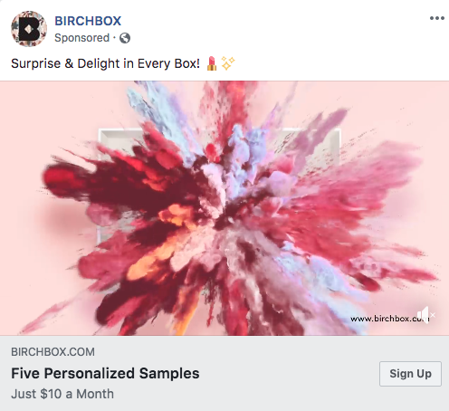
Birchbox is a beauty brand that offers a monthly subscription for personalized product samples.
- To play up the colorful surprises you get with a subscription, this video ad literally has bursts of colors erupt out of Birchbox boxes in various different textures to highlight all the different types of products you can be surprised with.
- Also, the brand highlights the value propositions of the personalization and inexpensive cost. What’s not to be excited about?
28) Pillsbury
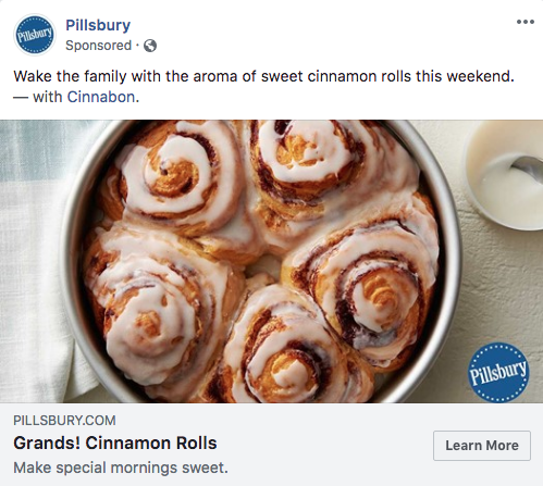
Pillsbury is a food brand for tasty, fresh dough products. Pairing the visual of warm, tasty cinnamon rolls with the imagined visual of family breakfast on the weekend, you feel cozy and comfortable. Is it Sunday yet?
Learn More:
- How to Produce Paid Facebook Video Ads for Mobile Like a Pro
- How E-commerce Companies Can Boost Sales with Facebook Ads
- How Small Businesses Can Take Advantage of Facebook Audience Insights to Get More Leads
- How to Get the Cheapest Facebook Ads Without Sacrificing Quality
29) Nestle Toll House
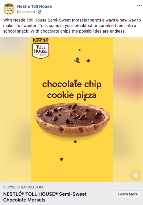
Nestle Toll House is a baking brand best known for its chocolate chips and cookie dough.
- Using a mobile-optimized video ad and skilled branding incorporation (e.g. yellow background, a chocolate chip bag, the logo in the top corner), Nestle brings out the child in all of us.
- It also uses a downward motion, captivating your eye down the screen through each possible use of the brand’s classic chocolate chips. This disguised tactic serves as the value proposition of the versatility you get with the chocolatey treat.
30) Target
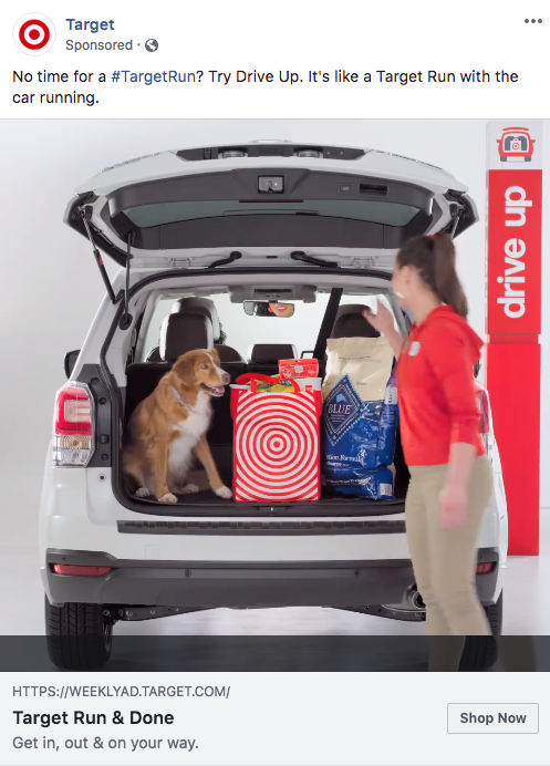
Target is a reasonably priced department store that offers a variety of quality products in home, clothing, technology, and more.
- This particular ad, which is optimized for mobile, is just one great example of branding in a Facebook ad. In almost every part of the video, you get the red and white Target colors as well as the Target logo.
- The ad is simple and to the point, using upbeat music to really get you into it. You feel easy and breezy watching this ad, which is exactly the point.
Conclusion
Now that you have a clearer understanding of what good Facebook ads look like, you’re ready to create your own ad! By using these 30 examples as a map, you are guaranteed to come up with the most effective ad for your Facebook campaign. Good luck!
The post 30 Winning Facebook Ads and Why They’re so Effective appeared first on Single Grain.
from Single Grain https://ift.tt/2zqTv1V



No comments:
Post a Comment