Last week you likely saw a ton of news about Google Chrome’s Ad Blocker going into effect Feb 15, 2018. And nobody could blame you if you took one look at some of the reports and thought, “Oh no! Popups are dead. Google just outlawed them, and I have to take down the 35 I’m using across my web properties that are generating 12,000 leads per month”.
Well, fortunately, after combing through the details, I’m happy to tell you that — from our early interpretation — this doesn’t seem to be true.
You can still confidently use popups and sticky bars on your website and landing pages, and today I’ll take you through the news with a bit more nuance to explain why (and how to do so without compromising your user experience).
As I wrote in Technology isn’t the Problem, We Are. An Essay on Popups there’s a reason why bad marketing practices exist (spoiler alert, it’s bad marketers), and we all need to play a part in reversing these bad practices because frankly, we all deserve a better internet.
Here at Unbounce, we welcome this defense of higher internet standards by Google. But we do need to unpack the announcement to see what the potential impact could be on your marketing activities.
What is the Google Chrome Ad Blocker and Why Are We Talking About It?
On February 15th 2018, Google officially introduced an ad blocker to the Google Chrome browser that will screen for (and eventually block) what they deem to be “intrusive” ad experiences. This is further to Google’s partnership with the Coalition for Better Ads they announced previously with the January 10th 2017 change re: Mobile ad experiences.
In short, while it seemed like news last week, it’s an initiative that’s been in the works for some time.
The Coalition for Better Ad Standards
The Coalition for Better Ad Standards (CBA) is a group made up of trade associations and companies involved in online media. Their mission is to improve consumers’ experiences with online advertising and includes a set of global standards that address consumer expectations with online advertising.
As part of this mission, they performed a research study of 25,000 consumers to identify the ad experiences most likely to make those consumers install ad blocking software.
The study presents a range of user experience factors to discover which ones ranked worst. But before we get into the ads raising concerns, we should first address what constitutes an ad.
What is an Ad (In the Eyes of The Better Ad Standards Coalition)?
This is where things start to get a little vague. As per the Better Ads Standards website:
An “ad” is promotional content displayed on the web as the result of a commercial transaction with a third party.
In our interpretation, the above refers to a paid ad (such as Google AdSense) that appears on your website, not a popup containing your own marketing materials such as an e-commerce discount, a newsletter subscription, or a time-sensitive offer. The third party being an ad network and the ad being what’s delivered to the website.
If this is the correct interpretation it makes sense, because ads such as this are not related to the marketing efforts of the host website. They’re the result of the host website trying to generate ad revenue and presenting incongruent and somewhat random display ads.
However, at this time, it’s admittedly difficult to determine exactly what the coalition is considering an ad. To ensure we get you the best answer possible, we contacted Better Ad Standards directly to clarify whether our early interpretation of their definition is correct.
My main question is concerned with how the two parties will be evaluating the ads. Is it the content or is it the delivery mechanism? In other words, are Chrome and the Better Ad Standards coalition concerned with the interaction method of the message delivery? Or the content of the message? Or a combination of both?
My gut says it’s a combination, where the content must be considered an “ad” and the delivery mechanism falls into a few specific categories of interaction that are deemed as bad experiences.
Update from the Coalition for Better Ads
We got a response back from the CBA pretty quickly which was awesome. Unfortunately, the response didn’t really add any extra clarity to the original definition.
Here’s a portion of my question:
Are you able to confirm whether an ad in this instance includes website popups (or sticky bars) for our own business, placed on our own website? For example a newsletter subscription popup on our blog, or a discount popup on our pricing page.
Or are you referring to paid ads from an ad service such as Google AdSense that appear on a website, but are not part of that website’s business? For example, an ad for hair products that shows up on the New York Times.
And a portion of their response:
You should direct any questions about the Chrome browser and its plans to Google.
The Coalition does not currently provide specific evaluative guidance on questions of interpretation relating to the current Better Ads Standards. However, in conjunction with the Better Ads Experience Program, this service may be offered to participating companies in the future.
The Coalition for Better Ads plans to release additional details about its Better Ads Experience Program in the coming months. The Program will certify web publishers that agree not to use the most disruptive ads identified in the Better Ads Standards and will accredit browsers and other advertising technology companies that will assess publishers’ compliance with the Standards and filter digital ads based on the Standards. If compliance issues arise, certified companies will be notified and have an opportunity to address violations or to pursue review by an independent dispute resolution mechanism available through the Program.
The opening of enrollment for publishers that wish to certify their compliance with the Better Ads Standards and participate in the Program’s register was recently announced. Interested publishers can follow this link to learn more about the Program and the registration process. The Program expects to introduce an independent dispute resolution mechanism in the second quarter of this year.
Further updates on the Better Ads Experience Program are forthcoming, so please continue to monitor the Coalition for Better Ads’ blog and press releases page for updates. All Coalition initiatives and authoritative guidance are first published on the CBA website.
Based on this, I’m still not entirely sure if our interpretation is right or wrong.
If we are wrong, then it’s more important than ever to be creating the best possible experiences, and the easiest way for you to do that is with advanced targeting and triggers. You will find 8 examples of proactive great experience creation at the end of the post.
Here are some smart ways to do the right thing if you want to skip ahead to some implementation ideas:
- Campaign Scheduling
- Cookie Targeting
- Referrer URL Targeting
- Location Targeting
- Click Triggers
- Mobile Scroll Up Trigger
- Frequency
- Super Advanced Multi-Option Targeting
Which types of ad experience are raising a concern?
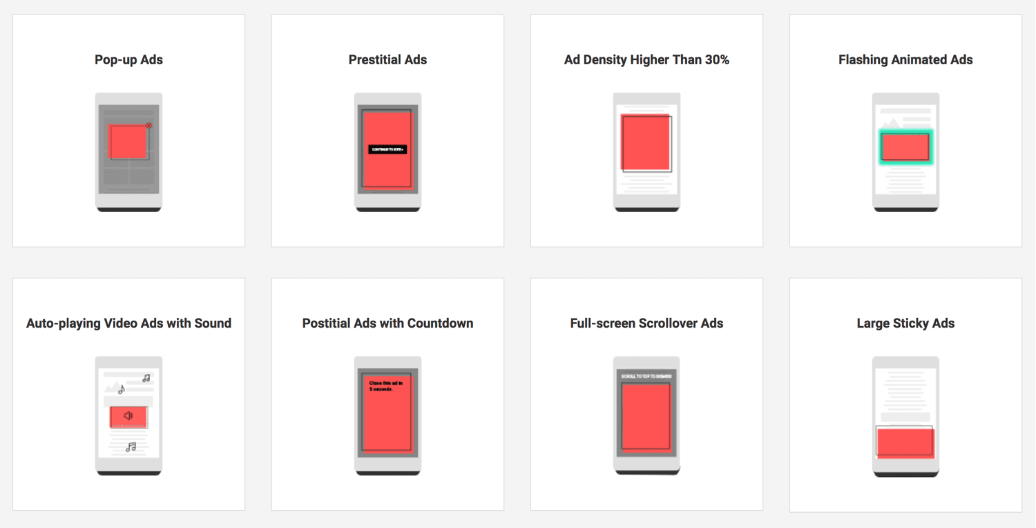
On desktop they refer to the following four ad experiences:
And mobile has an even larger set:
Again, while the images above could be alarming to anyone running popups, based on our early interpretation of the definition above I don’t think these are popups or sticky bars that you place on your own website with your own marketing content in them. I think we’ll end up finding as time goes on that the standards are targeting at neutralizing bad behavior with respect to third-party ads.
Does this mean you should ignore these guidelines if you’re not using third-party ads?
Not entirely, no. Conscientious targeting and triggering still reign supreme. You can continue to present popups and sticky bars to visitors on your website, but you should use the guidelines to do everything you can to deliver great experiences.
To help avoid getting warnings now that the standards are in place, Google offers a tool which can help you to determine if they consider your website to be infringing on the guidelines or not.
How to Check Your Website For Adherence Using The Google Ad Experience Report
The Ad Experience Report is designed to identify ad experiences that violate the Better Ads Standards, and you can check it for both desktop and mobile inside Webmaster Tools (now simply called Web Tools).
You can find the Google Ad Experience Report here.
When you choose your web property from the drop-down on that page, you will see this:
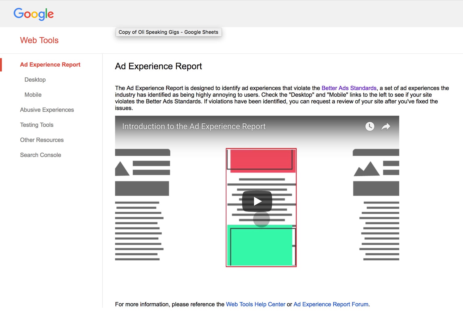
The video explains how it all works, and if you click desktop or mobile in the left navigation, you’ll instantly get a report like this one for unbounce.com:
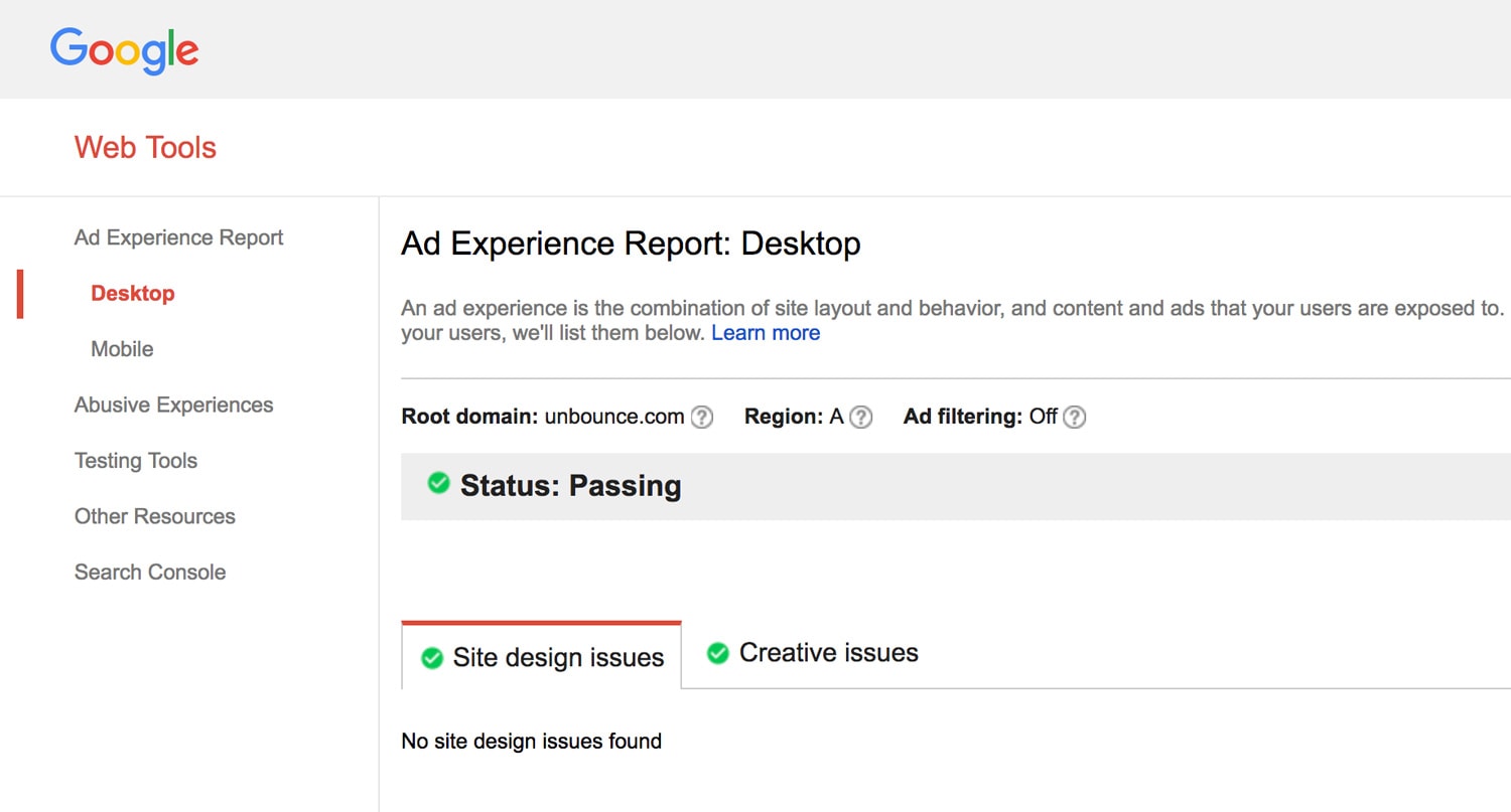
If you receive any warnings you can make changes and request a fresh site review.
From Google:
Violations of the Standards are reported to sites via the Ad Experience Report, and site owners can submit their site for re-review once the violations have been fixed. Starting on February 15, in line with the Coalition’s guidelines, Chrome will remove all ads from sites that have a “failing” status in the Ad Experience Report for more than 30 days. All of this information can be found in the Ad Experience Report Help Center, and our product forums are available to help address any questions or feedback.
What Else Can You Do to Create Better Popup Experiences?
I fully embrace this news and the mission of the Coalition for Better Ads because it gives me the opportunity to broach the topic of popup misuse. As a platform offering popups, sticky bars (and landing pages of course) it’s incumbent upon Unbounce to take a stance and work hard to help marketers deliver especially respectful and responsible web experiences.
Popup misuse typically falls into the following categories:
- Interaction modes that prevent control of the experience by the visitor (such as easy and obvious close and bypass mechanisms).
- Manipulative copywriting that uses psychological means to coerce visitors into taking an action, such as the manipulative confirm shaming styles like this: [ Get Your Ebook ] [ No ebook for me. I prefer to kill kittens! ]
- Overly persistent frequency rules where you show the popup every time someone arrives.
- Multiple popups on the same page, at the same time.
To provide a method of evaluating popup experiences and to help combat bad behavior I created The Popup Delight Equation.
Essentially the equation reverse engineers an excellent popup experience and allows you to generate a percentage score by analyzing seven principles: clarity, control, creativity, relevance, charm, value, and respect.
I’d also recommend you read Stop Making These Common Mistakes with Your Website Popups (Includes Examples and Quick Fixes) which has some great ideas on the topic.
What is Unbounce Doing to Help Customers Avoid Ad Blocker Warnings?
Fabulous question! I asked Cole Derochie, one of Unbounce’s product owners, to elaborate on how we’re approaching the news and what it means for our customers.
“Unbounce respects this policy, and shares Google’s concern for ensuring users are able to easily access content — regardless of device.
Our goal with popups and sticky bars is to help our customers make offers that are relevant and valuable, and thereby increase their conversion rates, without harming the user experience.”
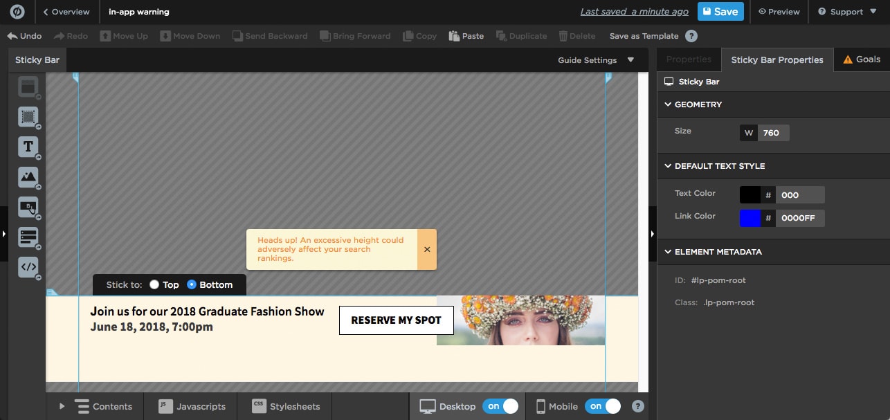
As I mentioned earlier, it does seem the news pertains to third-party ads, but having said that, we are determined to help marketers adhere to great internet standards. One way we’re doing that is by creating tips and warnings inside the Unbounce builder to help prevent some of the design methods that Google considers bothersome, in particular for the mobile experience.
For instance, in the screenshot below, a warning appears if you try to increase the height of the sticky bar beyond 100px:
Despite our belief that this announcement (and the general concerns of Google and the Coalition for Better Ads) isn’t specifically directed at regular popups and sticky bars, it does still represent an opportunity to take an honest look at the ways we’re all presenting our marketing, and step away from some of the more blatant behaviors mentioned in the research.
One of the best ways to ensure a quality experience is to use some of the more advanced targeting, trigger, and frequency settings that Unbounce provides to give your visitors a respectful interaction that’s as relevant as possible.
Using Targeting, Triggers, and Frequency to Improve Popup and Sticky Bar Experiences
From a high-level philosophical perspective, we should be thinking beyond surface level conversion metrics to focus on quality rather than quantity. I’m referring to tactics like showing popups on every visit, which in my mind is just a little desperate, and destined to not be delightful.
Here are some ways you can deliver a better user experience and stay on Google’s good side:
Method #1 – Campaign Scheduling
If you’re running a time-sensitive campaign, it’s important to only show your offer when it’s actually valid. I’m sure you’ve seen those “live” chat windows that tell you nobody is home. If nobody is home, don’t show the live chat box dummies! Similarly, you don’t want to show a discount or special offer when it’s already expired.
In Unbounce you can set your campaign schedule down to the minute.

Method #2 – Cookie Targeting
Cookies are a great way to create more personalized experiences, basing the display of you offer on previous visitation or behavior tracking. But they are equally as powerful when you use them as an exclusion mechanism.
Let’s say you have an offer for a discount on your SaaS product to encourage people abandoning your website, but you don’t want existing customers to see it (it could make them jealous or upset that they didn’t get the discount).
If you are able to set a cookie within your app somewhere to label a customer as a customer, you can then use the “Don’t Show” cookie targeting to make sure they are not shown the offer.
Bazinga!

Method #3 – Referrer URL Targeting
Context is king when it comes to communicating your message quickly, and if you target your popups and sticky bars using the referrer URL option you can present content that’s highly relevant to where the visitor just came from. This is especially effective for co-marketing where your popup or sticky bar can showcase both brands by including the partner’s logo, creating a more powerful connection between the two experiences.

Here’s another really interesting use case that uses the “Don’t Show” setting.
I’m in the middle of a reboot of our landing page course, and I’m running some popups containing Typeform surveys for the purposes of research.
The problem though is that the homepage of the course is a landing page on a subdomain of the primary course domain – and I’m running the survey on both the homepage and the internal pages of the microsite.
Course homepage URL: do.thelandingpagecourse.com
Internal course page URLs: thelandingpagecourse.com/*
There’s a lot of organic traffic coming to the homepage and also the internal pages. But I don’t want to show it to a visitor to the homepage, and then show it again when they click through to start part one of the course.
To solve this problem, I set a “Don’t Show” setting on the Referrer targeting like this:

Which means that none of the internal course pages will show the popup if the visitor got there via the course homepage. This is a brilliantly simple way of solving what would otherwise require a bit of complex coding to resolve.
Even better is the fact that you can add as many “Show” and “Don’t Show” targeting rules as you like.
Method #4 – Location Targeting
Unbounce location targeting allows you to drill all the way down to the city level, and all the way up the the continent level. Personally, I’d be stoked if someone from the Antarctic saw one of my popups, but there are times when you do need to hide your marketing from certain locations, or target it specifically to a location or locations.
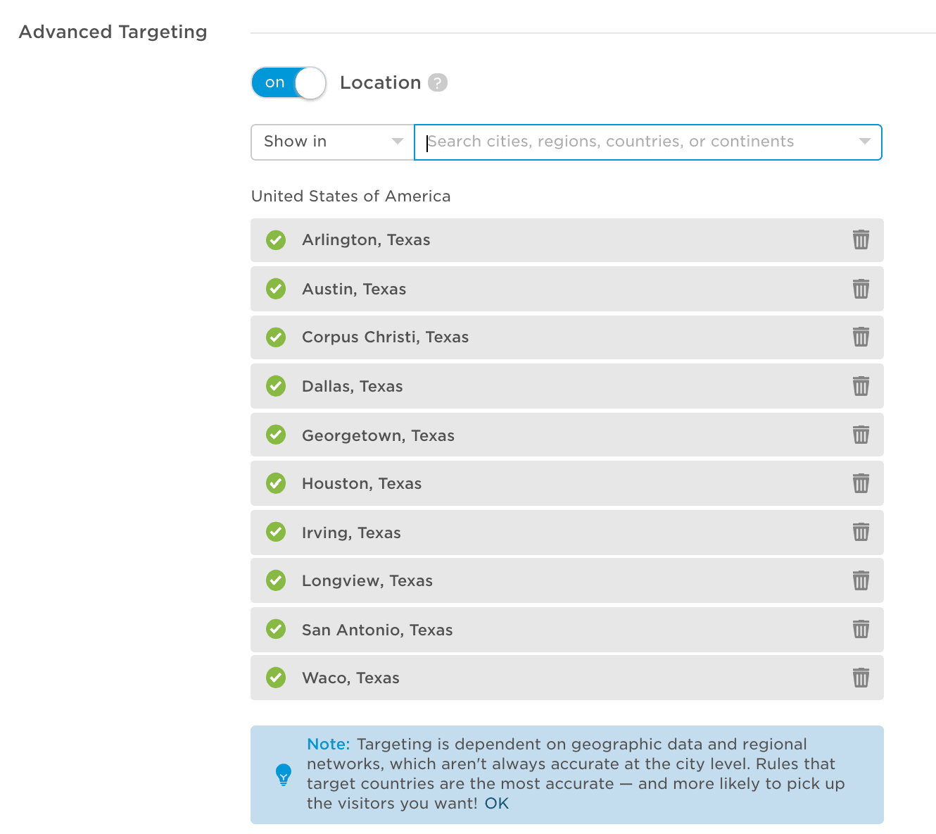
Just like in #3, the great thing is that you can add as many rules in here as you like, so you could set it up like the image below to target every major city in Texas, avoiding rural areas if that so happens to not be your target audience. Or reverse it to target all rural areas and avoid the cities. YUSS!
Method #5 – Click Trigger
Undoubtedly the best trigger type is the click trigger. Why? Because it’s entirely user-driven. A great use case for this option is two-step opt-in forms where your popup with a form only shows up when requested. The conversion rates are typically very high because the initial click declares intent making the contents of the popup desirable.

With Unbounce you can set the click trigger to work on any page element by using the CSS id, or you can even apply it to a CSS class which could make multiple page elements interactive.
Method #6 – Mobile Scroll Up Trigger
Google has expressed discontent for certain types of popup that appear on entry, on mobile devices. For this reason we created the “Scroll Up” trigger. It works a little like an “Exit Trigger” on desktop as it may signal that someone is leaving the page. If you use this, and keep the size of your Sticky Bar to 100px in height or below, you can create a nice experience that’s not too interruptive, doesn’t prevent the visitor from leaving, and lets you notify them of something important.

Method #7 – Frequency Settings
What’s the frequency, Kenneth? If you don’t get that reference then either you’re really young or I’m really old. Either way, frequency matters. And when you get it wrong it hertz. << Please tell me you got that one.
When in doubt, the first option (“Show once per visitor”) is the best. Show it once, and go cry in your soup if it didn’t convert. Do NOT pester people over and over again. If they want it they’ll say yes. If they don’t, well that’s a lesson (in the form of a poor conversion rate) you can use to better understand your audience.
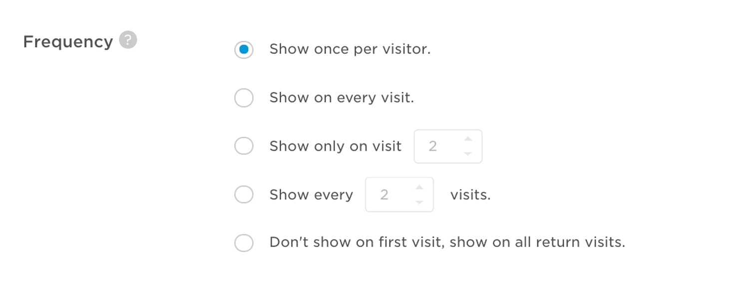
For the other options, if you wanna be super respectful and let people check out your site without any distractions, think about using the “Show only on visit x” option. Typically the x would be the number 2. Show it the second time they are there. That way they’ve had the chance to get to know you and your offer will seem more relevant.
For example, there’s nothing more annoying on a blog than when you get an entrance popup saying “Love this content! Subscribe for more!!!!!”. No, I don’t love this content cos I just got here, dammit! Whereas if you show it on the second visit, you know they liked you enough to come back. Done.
Method #8 – Super Advanced Multi-Option Targeting
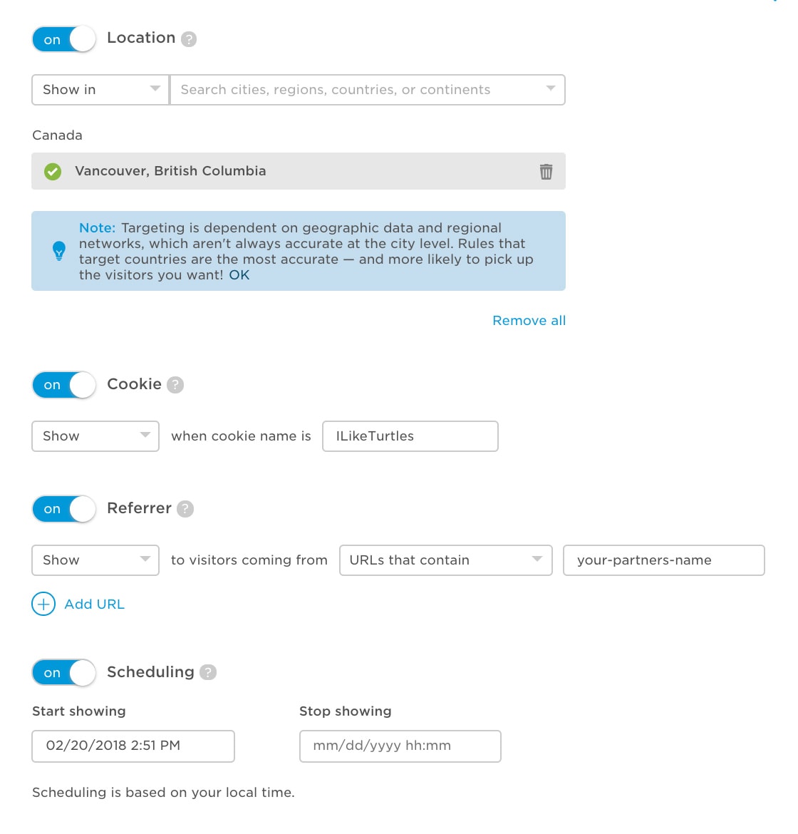
How about this idea for some extreme relevance! You can use all four advanced targeting rules at the same time to get hyper-personalized. In the example below I’m targeting people in Vancouver, Canada who’ve got a cookie called “ILikeTurtles” who are coming from my partner’s site during the dates of my campaign. SICK!
In Conclusion: What Should You Do Now?
Well for starters I recommend that you go make 50 popups with “Every visit” targeting and a frequency of 100 times per visit.
Wait. Don’t do that.
Do what a thoughtful marketer would do and spend some time thinking about your visitors, and about the really cool things you can do when you combine triggers, frequency, scheduling, and advanced targeting rules.
The combinations are literally limitless. I’m not sure on my math there, so there may be some finite limit to what you can do, but whatever it is, it’s huge!
This is a hot and contentious topic, with much to discuss, particularly because of how hard it is to interpret some of the communications surrounding it, so please add comments with any intel or different perspectives you have.
We’re committed to staying on top of the situation as it continues to unfold, and will bring you more details and ideas as soon as they become apparent.
Here’s to better marketing standards, and better marketing in general.
Cheers
Oli Gardner
from Unbounce http://ift.tt/2osbKxI





No comments:
Post a Comment