Contrary to popular belief, building a website and creating its content is not as easy as it seems. Aside from careful planning, coming up with the perfect wireframes and design that will give life to it all, and ensuring a user-friendly interface and overall good user experience is something that you need to keep in mind.
You need to be able to map out your users’ journey first in order to come up with a stellar conversion rate for your website.
Click To Tweet
What is conversion rate optimization and why do you need it? This is a process where you follow certain steps to increase the percentage of visitors who complete a particular website goal. This process is focused on being able to get your customers to take the actions that will allow you to achieve your desired outcome, such as:
- purchase a product
- sign up for a newsletter
- hire a service
- download a free e-book
- fill out a ‘contact’ us form
On that note, here are 15 fast and easy ways to optimize your website’s conversion rate.
1) Focus on Ads/Landing Page Relevancy
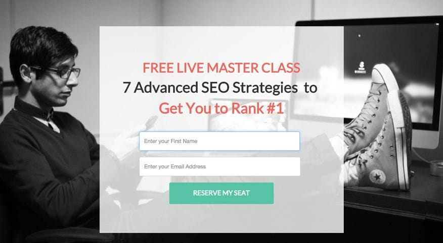
You need to be able to maintain strict relevance between your ads and your landing page. This means that what you say on your ads must be exactly what is on your landing page, as expected by your customers. Interesting bit of trivia: Customers decide within 5 seconds of arriving on your site whether the content is relevant to them or not.
So you need to make every. single. word. count! Like this landing page:
Related Content: How to Increase Your Conversions with Online Customer Engagement
2) Have a Compelling & Clear Value Proposition
A value proposition is the main reason why customers should buy from you.
Click To Tweet
This is something you need to make crystal clear on your website and it needs to have a certain sense of urgency so that your customers will feel compelled to purchase your product or service.
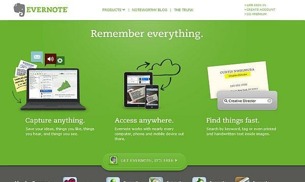
To make sure that your value proposition works, pinpoint the benefits your customers will receive (i.e. how will your product/service make their lives better), what problem you intend to solve, and how customers will differentiate you from your competitors.
This Evernote page does all this with three short points:
3) Match Your Content Reading Level to Your Audience
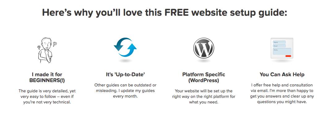
This means that you should use content that will suit your target audience. Be mindful of the language or tone you are using. Your content may seem coherent and rich, but if you’re not getting conversions, perhaps your wording is overwhelming and superfluous for your target audience. Or it could be that you are writing too casually and using inappropriate slang. For Spotify that’s great, for a law firm that’s off-putting.
Use a tool such as Readability Score to test your content. On the homepage of WebsiteSetup, they make it clear that their guide is for beginners.
4) Write an Attention-Grabbing Headline
This is something we cannot stress enough. The headline is the first thing that your visitors will see so you need to create an excellent first impression. That means your blog, ad or landing page title needs to be concise, appealing and promise something great.
Buffer has compiled a list of eight compelling headline formulas:
- Surprise – “This Is Not a Perfect Blog Post (But It Could’ve Been)”
- Questions – “Do You Know How to Create the Perfect Blog Post?”
- Curiosity gap – “10 Ingredients in a Perfect Blog Post. Number 9 Is Impossible!”
- Negatives – “Never Write a Boring Blog Post Again”
- How to – “How to Create a Perfect Blog Post”
- Numbers – “10 Tips to Creating a Perfect Blog Post”
- Audience referencing – “For People on the Verge of Writing the Perfect Blog Post”
- Specificity – “The 6-Part Process to Getting Twice the Traffic to Your Blog Post”
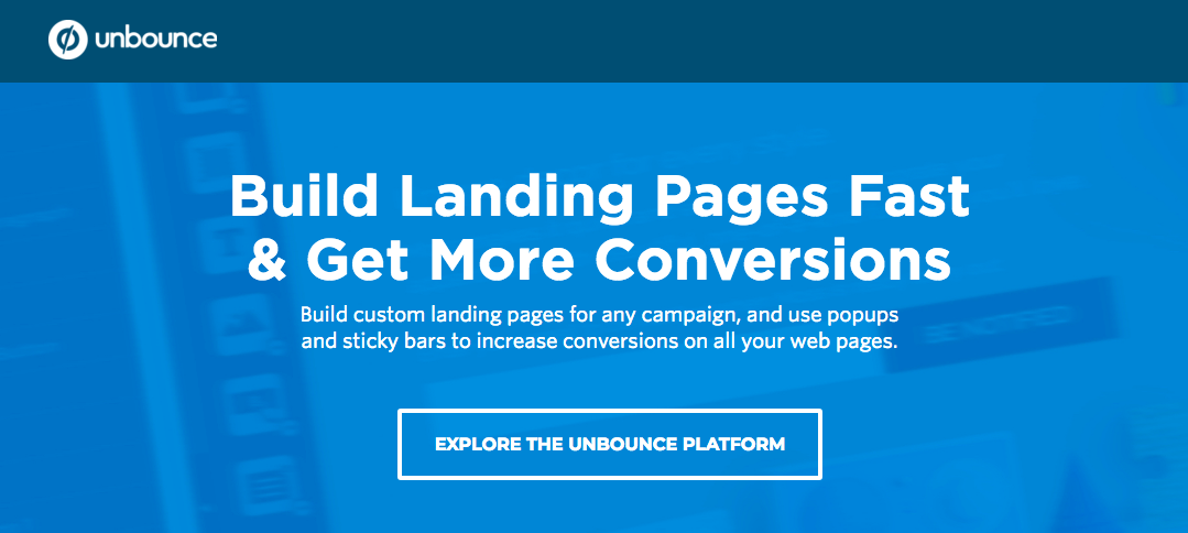
Think of what would catch the attention of your particular customer. If they’re looking to learn something, then a “How to” might work best. Can you incorporate the question that your customer is asking the most into a headline? Whatever it is, it should be something that will make them want to say yes to your proposition – which is your call to action, like this landing page from Unbounce.
Learn More: Copywriting Hacks: How to Build Trust With Your Audience
5) Establish Credibility with Reviews & Testimonials
Testimonials and reviews are vital when it comes to gaining credibility in the eyes of your visitors – especially first timers to your site. Understand that social proof – the psychological phenomenon that makes a person believe that their behavior is “correct” based on the actions of the people around them – is fundamental to converting your leads.
In fact, not only do 92% of online consumers read reviews, but 88% trust online reviews as much as personal recommendations!
So make sure that you use genuine reviews and utilize only credible review sites.
For B2C companies, make sure that you’re visible on review sites relevant to your business, such as:
For B2B companies, have reviews up on sites like:
This is all about trust, and you need to be able to bridge that trust-gap with your potential customers, like this burger joint that displays its customer reviews.

6) Establish Trust Elements on Your Site
As it is one major reason why people will buy from you, you also need to add trust elements on your website. A few trust signals you need to have are:
- Contact information (e.g. contact page, e-mail, phone number, live chat)
- Social profiles
- Payment assurances (e.g. various payment methods, trust badges, certifications, SSL)
You can also build your blog and share your organization’s expertise. However, when writing content, do keep in mind that 43% of readers dislike blatant self-promotional content. To remedy this, focus on providing value to your target audience by addressing their needs, answering their top questions, or writing about your two cents’ on a recent news or industry trend.

7) Be Straightforward with Your Products & Services
Today’s consumers are very smart and they can detect BS a mile away. This is why you need to be transparent and straightforward.
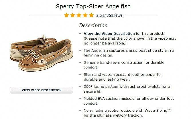
When providing descriptions for your product, be honest with its dimensions and features. While a compelling copy would help sell it, make sure that you are providing a 300-word description of how the product would improve their lives; not 300 words of superfluous content that makes readers question what you are selling exactly.
Not only does this earn the trust of your customers, it also helps Google index your page.
8) Make Your Calls to Action “Unmissable”
Simply put, your Call to Action needs to be the magnet that captures your visitors. When creating your CTA buttons, split testing is key to finding out which copy and which placement works best.
For instance, you can either use a strong verb to describe the action they should take (e.g. “Download now!”) or make it more results oriented (e.g. “Show me how to boost my conversion rate”). Always use the active voice rather than the passive voice and make good use of power words to strike at your market’s emotions and nudge them to click.
While traditional optimization practice says CTA buttons should be above the fold, plenty of successful businesses prove otherwise. When it comes to placement, perform extensive A/B testing to find out the most effective location of your buttons on your blog posts, home page, or landing pages.
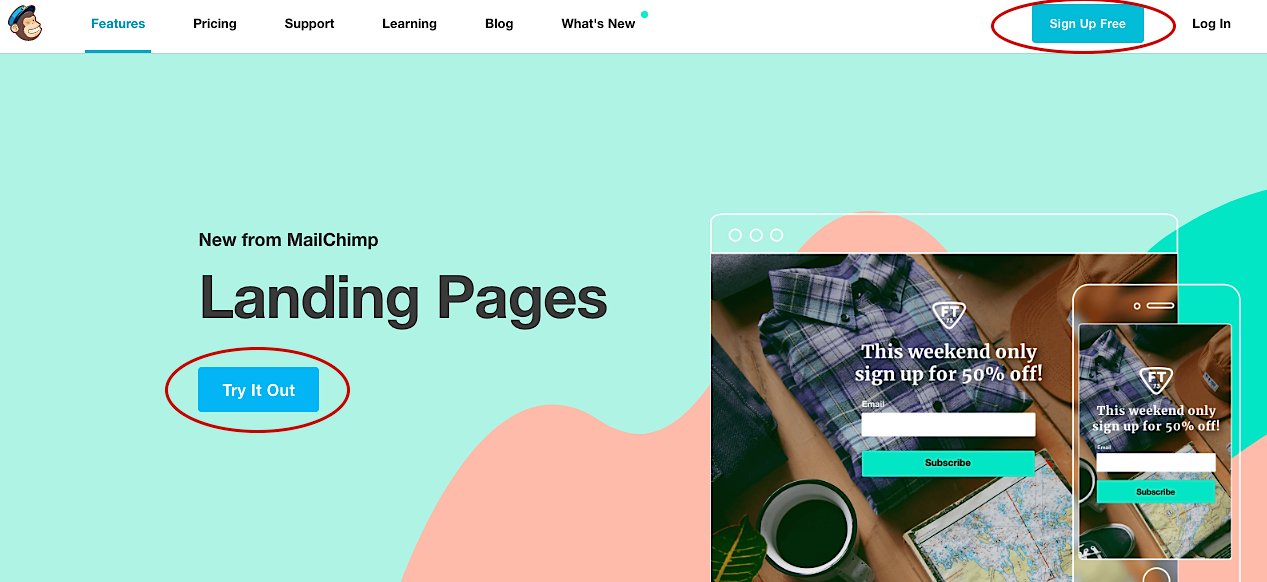
This MailChimp page shows that you can even use two CTA buttons.
9) Compelling Buttons Are also a Must
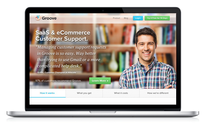
While the copy and placement for CTA buttons are important, you also need to take into consideration its visual appeal.
As with other aspects of marketing, psychology plays a huge role in creating CTA buttons. The psychology of color is a subtle yet powerful way to make your customers convert. To find out the best color for your buttons, this again goes back to performing extensive A/B tests.
Refer to your buyer persona to find out which color affects your audience in a positive way. For instance:
- different genders favor different colors
- red can be a deterrent to performance but can also induce excitement
- purple is often associated with sophistication
Learn More: How To Create CTAs that Actually Cause Action
10) Use High-Quality Images to Break Up Text
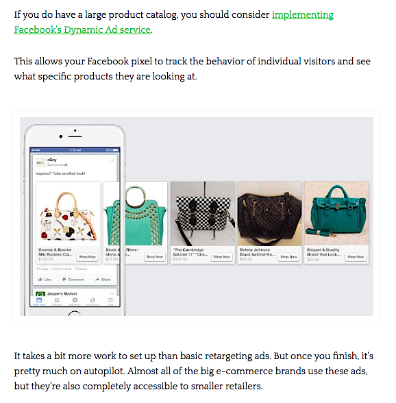
Nowadays, people’s attention spans are getting shorter and shorter. And this is where visual communication comes in: studies show that people process visuals 60,000 times faster than text.
So instead of just providing a text-heavy blog posts, web pages or landing pages, break up that wall of text with images, videos or helpful screen grabs to keep your reader engaged until the end of your post.
11) Chat Tools Are Your Friend
The good thing about today’s technology is that there are a lot of available chat tools that are very affordable. Offering this feature allows the customer easy access to you so that they can get their questions answered instantly, which would then build more trust. (If you’ve ever pressed one for this, pressed two for that, waited on hold for ten minutes, and then spoke to someone who couldn’t answer your question, you know frustrating this is!)
The chat tool is always available but unobtrusive on Single Grain’s website:
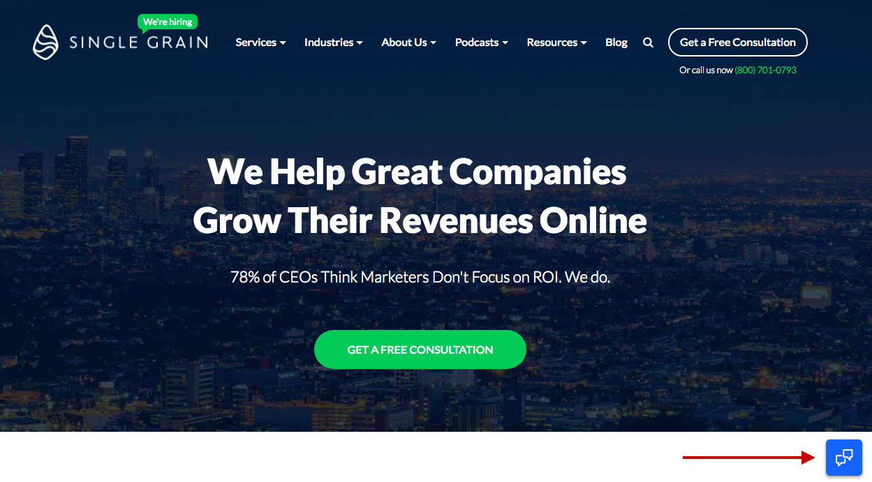
Clicking on the chat tool opens it up: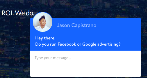
Learn More: How E-commerce Companies Can Drive Sales with Facebook Messenger Chatbots
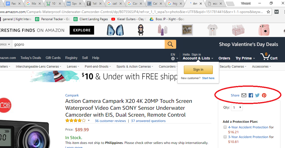
12) Provide Social Sharing Buttons
Including social sharing buttons on your product pages is a doubled-edged sword. On the one hand, it can boost the credibility of your product or blog post, as per the social proof phenomenon. However, if it does not have many shares, it can backfire and give the impression that your content is not trustworthy (i.e. negative social proof).
To find out if this is the case for you, conduct an A/B test. Make sure that you only provide social sharing buttons for platform-appropriate content (e.g. Pinterest for images, Twitter for quotes or snippets, Facebook for blog sharing). Also, the buttons should not distract from the main CTA button, as this could decrease your conversions.
13) Offer Various Payment Options
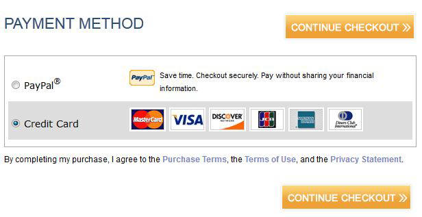
You need to cover all bases when it comes to payment, since not everyone has a credit card. Other systems include PayPal, Google Wallet, and Amazon Payments. By providing alternatives, you are decreasing cart abandonment issues due to failed payments.
14) Improve Your E-mail Marketing Campaign
Your e-mail list is one of the best ways to nurture your leads and drive them further down the funnel. In fact, 80% of marketing professionals say that e-mail marketing boosts customer acquisition and retention.
There are plenty of ways to keep growing your e-mail list. You could host a free webinar and offer the recording as an opt-in incentive, offer a subscriber-only discount and, of course, making it clear what the benefits are for signing up (e.g. valuable content, exclusive promos). Or you could go the traditional route and put out a sign-up sheet at a trade show or event.
The key here is to figure out which strategies would work best for your business model and apply them.
Learn More: 14 Ways to Kickstart Your Mobile Email Marketing Campaign
15) Do Not Require Registration in Order to Buy
Some successful e-commerce sites are ones that offer express check-out to expedite the buying process, instead of adding another step, like creating an account first. In fact, a long, complicated process is the third reason why customers abandon their cart. Moreover, 25% of shoppers leave their carts when prompted to create an account.
While there are definite advantages to having your customer details (e.g. faster shopping in the future, track deliveries, access to exclusive promos, etc.), there are ways to include a registration page without being disruptive.
For one, you can make it an optional step for buyers. You can also highlight the benefits of being registered on your website (e.g. promos, exclusive content). Or you can go by User Interface Engineering’s route and change the “Register” button into a “Continue” button which generated them $300 million in revenue.
Final Thoughts
A testament to how significant e-commerce is in the retail industry is that in 2016, 41% of all retail sales growth was accounted to e-commerce. As technology is fast becoming an aid to making e-commerce much better globally, more and more consumers turn to the Internet to make purchases. This is something you cannot ignore and if you are not yet part of it, you need to get on board.
Try these 15 tips to improve your conversions and tell us all about your success in converting your visitors!
Get your FREE bonus download to learn 8 Effective Online Marketing Tactics that have generated up to 1,545%+ ROI for our customers! Click below to get it right away:
The post 15 Fast and Easy Ways to Improve Your Site’s Conversion Rate appeared first on Single Grain.
from Single Grain http://ift.tt/2GxdLA2



Enjoyed reading the article above , really explais everything in detail,the article is very interesting and effective.Thank you and good luck for the upcoming articlesn Thanks & Regards,
ReplyDeleteFrom ivrs software.