
Your confirmation emails have a new design
We recently rolled out a modern, super-clean HTML design for your confirmation email a.k.a. the first email your new subscribers will see when they join your list.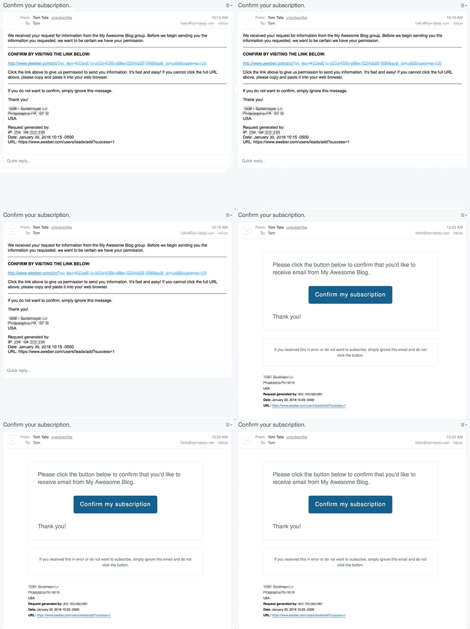 What you need to know:
- Your message will look great on desktops and mobile devices since it's an HTML design. 📱
- We replaced that long opt-in link with a simple blue button that says "Confirm my subscription." 👈
- We tested this new design and have seen opt-in rates — the number of subscribers saying "YES! I want to join your list!" — jump up significantly. 🚀
- You don’t have to do anything! All confirmation emails sent from AWeber now use this new design.
- If you have any visual references to the old design, such as on your thank you pages, or within any videos, we recommend that you update to display the new email. Contact us by phone, chat, or email if you have any questions.
The drag-and-drop editor is better than ever
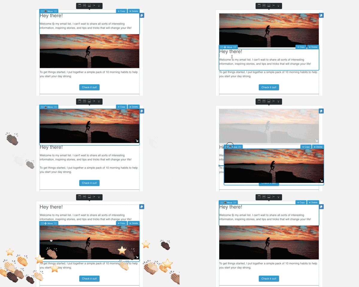
Creating a beautiful and engaging email should be simple and enjoyable. After all, your crafting a message that hundreds or thousands of people might read. We listened closely to customer feedback about our drag-and-drop message editor and made some tweaks to significantly improve your creation process. What you need to know:- We improved one of the key features of any drag-and-drop editor . . . the dragging and dropping! Look for a new indicator to show you exactly where the selected element will drop as you move its location. Indicator code name: the dog bone! 🍖
- When moving elements around, your entire layout used to shift immediately, which was jarring. In fact, it was easy to forget where your element started before you moved it! We fixed this by maintaining your email's layout until you actually drop the element where you want it.
- There’s also a faded placeholder where the element began. That way, if you change your mind and decide to put it back, you’ll know right where to drop it. Code name: ghosting. 👻
 How to take advantage of this feature:
- Drop into the drag-and-drop editor today, select one our new templates or one of your own, and have some fun crafting a new message.
It's now easier to personalize your email content
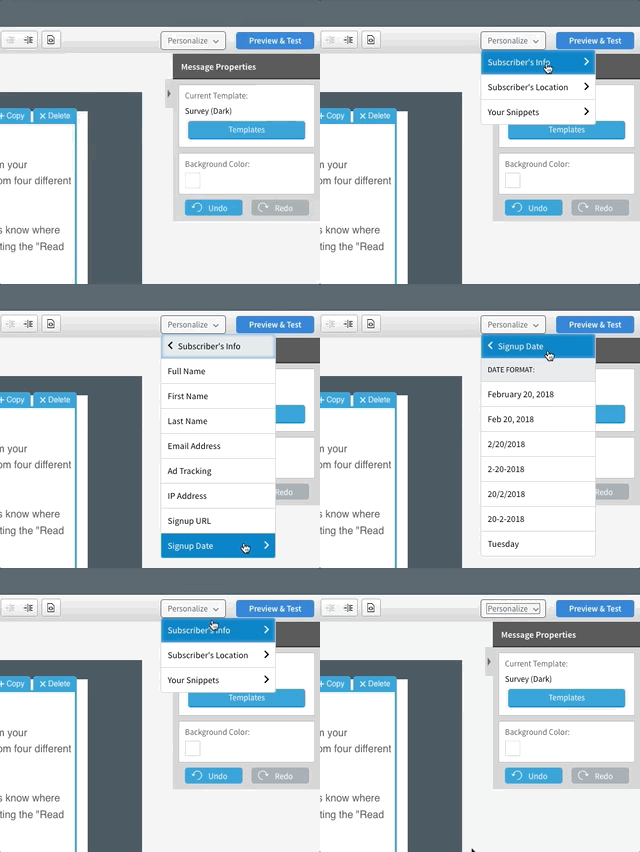
Using personalized contextual content in your emails is key to sending engaging campaigns. You can insert your subscribers' first names, or the URL where they signed up. You can also insert things like the current date, your signature, or an unsubscribe URL. There’s plenty to explore. So we completely revamped the dropdown menu. What you need to know:- Easily select variables based on their category using this menu. You can also create your own custom snippets in list settings, which will appear in this menu.
 How to take advantage of this feature:
- Include relevant and personal subscriber snippets when appropriate to build a stronger connection with your audience.
- New to personalization? Here’s a quick Knowledge Base article to help you get started.
Survey your audience with a new interactive email template
This new template release can truly change the way the your interact with your audience. We wanted to know what our subscribers thought of our emails, so we developed our own handy sentiment widget. This inspired us to do even more surveying within emails, and we’ve constructed a template so YOU can do the same.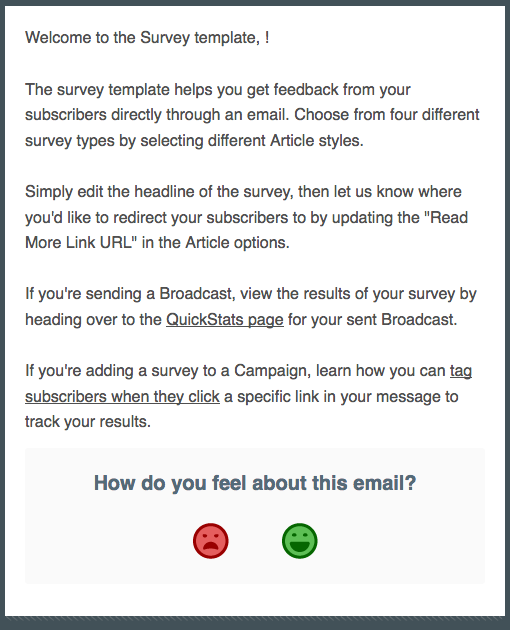 What you need to know:
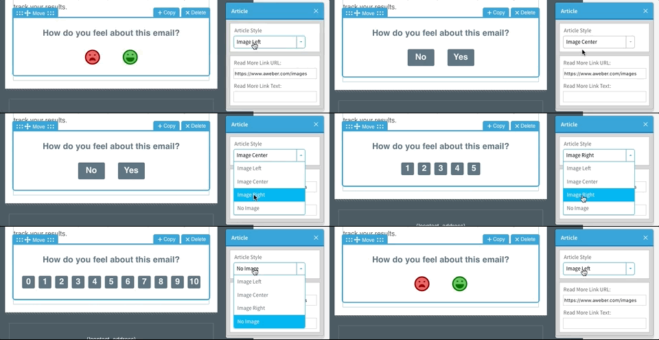
- Using the brand-new survey template, you can utilize 4 different survey types directly within your emails. ☑
- Gauge the sentiment of your audience by asking them to click simple happy/sad faces, yes or no questions, a five-point scale, or by using the Net Promoter Score method.
- View your results through QuickStats and create smart segments based on your subscribers’ responses.
- This robust Knowledge Base article will help you get started with our new survey template.
- Watch the GIF below to see your survey options in action.
Create, edit, and send messages from your mobile device
Our mobile app Curate is the perfect way to create and send a message from your mobile device, whether you're on-the-go or you just prefer to work on your phone or tablet. With Curate, you can collect and share content from around the web, or draft your own content using a simple editor. We’ve spent the past month making some design and usability improvements, including the ability to schedule your messages in advance.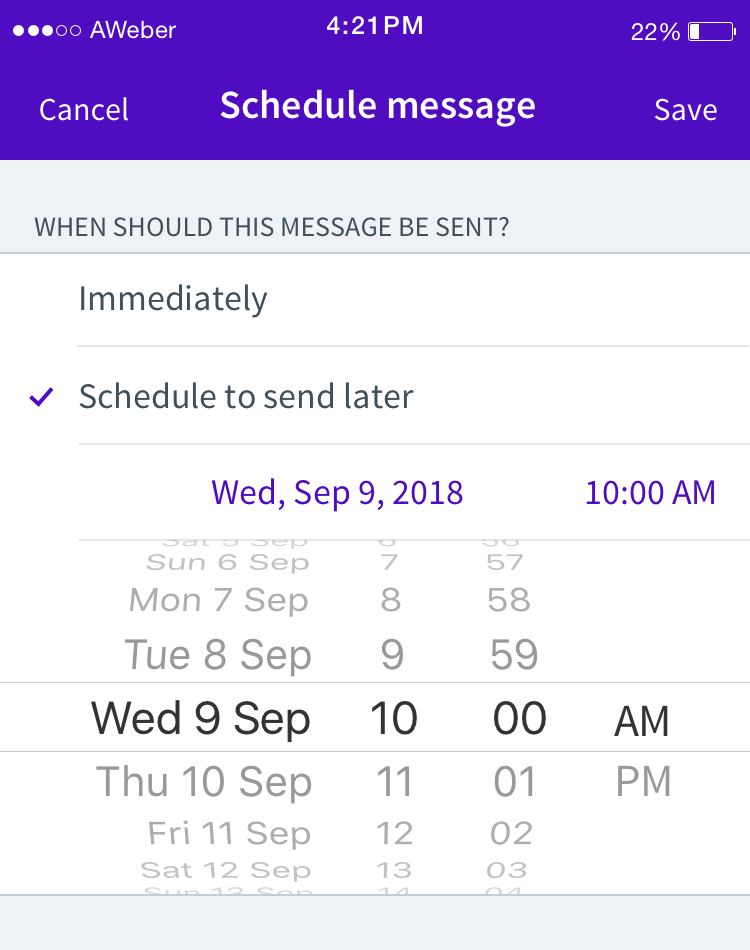 What you need to know:
- Using AWeber’s Curate app for Android and iOS, you can now create an email on your mobile device and schedule it to be sent at a later time. 📅
- When you schedule a message to be sent, you can even review it on your desktop by signing into AWeber.com. You can modify or cancel the message, as needed. 📝
- If you haven’t checked out Curate, download it today for your Android or iOS device.
- Check out our Knowledge Base article to learn more about curating content and scheduling your emails.
Getting started with AWeber
We're just getting started. Our roadmap for 2018 is filled with innovative new functionality to help your business take off. We can’t wait to roll out more updates in the coming months. Ready to start growing and engaging your audience? Log in today to start using these features. Have questions? Give us a call, or start a live chat! Not using AWeber? Join the fun! Start building your email list with AWeber today.The post Exciting News! 5 NEW Features Have Hit Your AWeber Account appeared first on Email Marketing Tips.
from Email Marketing Tips http://ift.tt/2Cb79Jf


No comments:
Post a Comment