Does beauty matter? Well, when it comes to landing page design, it can definitely influence how your offer is perceived. Ultimately, if your landing pages don’t look good—or follow some best-practices—your conversions can suffer.
Landing pages that are well designed often convert better than those that aren’t, and the difference can be dramatic. Done right, design should support the text on your page and work with all other elements to prompt visitors to take action.
But first: What are some design best practices?
Below we’ve rounded up tons of examples of amazing landing page design from Unbounce customers. But before we share them, let’s review some of the characteristics we typically see on great pages:
They’re Super Focused
A good landing page has only one objective: prompting visitors to do the one action you want them to do and convert. This is why many landing pages don’t have menus or a ton of external links—you want your visitor to complete the call to action, not navigate away or get distracted.
They Keep Scrolling to a Minimum
It can be great to include additional information about your offer on a page, but visitors should have everything they need—including the CTA button—without scrolling for days. While long-form landing pages can convert in the case of complex offers, consider using lightboxes to showcase extra info instead of adding tons of page sections.
They Use Relevant, Engaging Visuals
Amazing design requires striking images. No matter how technical your offer (see the Panoply example below), you need something to break up the text. Your images should be engaging, relevant, and consistent with your brand. They should also encourage visitors’ eyes to scan the landing page and settle on the CTA button.
They Maintain Consistent Branding
Your landing page design should be consistent with your overall look so visitors can instantly recognize and associate it with your brand. This typically means using the same color scheme and design elements from your general website. It can be a tough line to walk, though, because landing pages should look different from your overall website—they’re generally simpler and don’t include navigation, for example. Nonetheless, the branding and colors will often remain the same.
They Use F or Z Patterns
Research shows that most people’s eyes move around a website in an F or Z pattern. The best landing page design usually takes these patterns into account. For instance, having a vertical visual on the left with the header on the top right and the CTA button a little lower on the right allows visitors to follow an F pattern—and end up with their eyes right on your CTA.
It also goes without saying that beauty is not the only thing to consider when evaluating landing page design. You want pages to look good, but they should also convert. Always combine good looks with some research about how your visitors behave to create especially effective pages.
This is where testing comes in. Depending on your industry, we’ve actually seen incredibly simple and understated pages perform crazy well—no design overhauls necessary.
And with that, let’s check out some beautiful designs!
The Best Landing Page Design Examples
1. Indochino
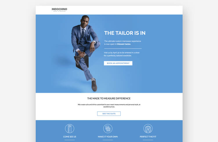
If you’re creating a good-looking landing page, it helps to have an attractive product, which Indochino has covered. The Unbounce-built page above is an example of how Indochino provides not just tailored suits, but also handsome, tailored landing pages.
Here’s what we think makes this landing page design awesome:
- Great visuals: If you’ve got an attractive product, show it off. We get to see Indochino’s suits modeled here—and the dynamic pose helps visitors see how suave the product looks in the context of use.
- Use of space: Just as importantly, visitors have all the information they need without a ton of scrolling. The CTA button is prominent and focused. This page’s design is simple and understated, but it gets the job done.
- On-brand: The header text here is in a font that looks similar to the company logo, which helps create a feeling of brand consistency.
The page we see here is specifically created for men in Calgary—and designed to encourage them to take an offline action. (OK, first to book an appointment online, but then to physically visit the new showroom.) Part of successful landing page design is making offers specific to a certain audience, something that Indochino has mastered.
This landing page is actually so tailored that the fine details don’t really make sense to someone who doesn’t live in Calgary. You might miss that Chinook Centre is a shopping mall, for example, but the page is designed for those who know this already.
2. Zola
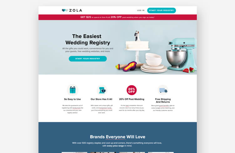
If you’re in the wedding industry, like online retailer/gift registry Zola, you know that design matters. The example page above showcases the company’s design savvy by serving up a simple, elegant landing page for brides and grooms-to-be.
Here’s what makes Zola’s page attractive:
- Consistent branding: It’s not immediately apparent if you’re a first-time visitor, but Zola’s branding uses shades of bluish-grey (see the hearts in the company logo). The backdrop maintains those colors while also providing excellent contrast for the images—that white wedding cake needs a contrasting background to pop.
- Simplicity: Zola’s main ecommerce site is pretty busy. If the landing page included any of the standard navigation, visitors might get distracted by clicking around instead of starting their registry, which is the page’s goal. Keeping it simple means more visitors will complete the action instead of wandering aimlessly through the website. This page is perfect for directing their paid ads to as a way to lower cost-per-click.
3. Lujo
This Z-pattern landing page designed for Lujo by the conversion gurus at digital agency KlientBoost manages to provide a ton of context while not being overwhelming. You could argue that there are two CTAs here—shopping the collection and watching the video. Lujo gets away with it because the video is presented so discreetly, as an extension of the product photos. It’s clear that the most important CTA on this page is checking out the collection of loungers.
Here’s what we love about this page:
- Stunning (and consistent) visuals: Not only is the product photography excellent, but it supports the Z pattern of landing page design while reinforcing the brand’s messaging. Lujo’s tagline is “put life on pause,” and everything about the visuals in this landing page reinforces that branding—from the sunhat resting on the video box to the deck shoes and the iced tea. Design should work hand-in-hand with messaging so that the text and the images combine to create an overall experience that makes sense. Lujo does that well in this landing page.
- Obvious USP: Right below the photos, Lujo articulates—with both text and design elements—three unique selling points: free shipping, a five-year warranty, and New Zealand craftsmanship. Finding a way to subtly work those three ideas into the design means the visitor might not need to keep exploring before clicking that CTA button—they see these major benefits and that could seal the deal.
4. Panoply
Unlike some of the other examples, data analytics tool Panoply doesn’t have an especially visually attractive product to show off—I mean, at the end of the day, it’s analytics software and not a snazzy suit. But Panoply’s landing page (designed by Directive Consulting) stands as a gorgeous testament to the fact that design and beauty are important even for technical B2B products and services.
This is what we think makes this a beautiful (and effective) landing page:
- Clever visuals: Creatively showing off Panoply’s user interface in a subtle (but clear) way is one of the biggest wins of this landing page. Interesting visuals are always important, even when the product doesn’t lend itself to photography.
- Social proof: Including industry awards and a testimonial from GoDaddy above the fold—and doing so in a way that matches the overall design—is another great touch. A visitor doesn’t need to go anywhere else on the landing page to know that industry experts trust Panoply.
5. Daily Harvest
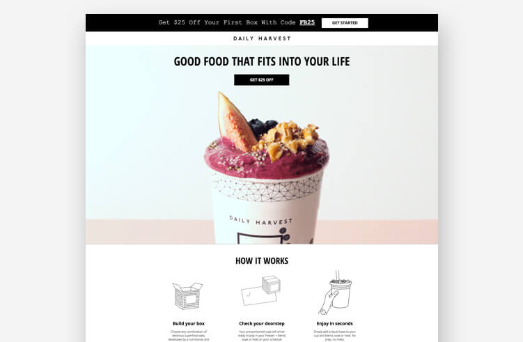
Using imagery to evoke a strong emotional reaction might not be easier with any product than food. (People just need one look to tell whether or not they want to put something in their mouths.) Fortunately, Daily Harvest has a great-looking line of healthy snacks, and they’ve made strong design choices to help showcase that on this landing page.
Here’s what we love about this page:
- Animated visuals: It would have been easy for Daily Harvest to use a static image of one of their smoothies here, but the brand takes it one step further. This animated hero shot is engaging—the smoothie looks like something I could have right now, if it weren’t for this darn computer screen—and the how-to GIFs help me immediately understand how this service works.
- Product examples: The rest of the landing page is arranged with loads of lovely product images. It’s one thing to tell me you’ve got a huge catalog of nutritious treats—it’s another to show me actual examples of the meals I can order after I sign up.
6. Greats
Fashion is all about social identity, and it’s essential for brands to exhibit attributes that consumers want to ascribe to themselves: things like authenticity, quality, and cool. This landing page for footwear brand Greats (built by Agency Within) does a beautiful job of brand-building through design while still driving visitors to convert.
Here’s why we think this is a (oh no, don’t say it) “great” example of landing page design:
- Amazing video: This whole landing page is pretty sleek, but what really knocks it out of the park is the video just below the fold. Not only does the stop animation style look awesome, but it also gives Greats a chance to elaborate on their unique selling proposition—one stitch at a time. Check it out on YouTube below.
- Rule of three: Greats applies the rule of three throughout this layout, making the benefit statements both visually striking and easily digestible.
- Mobile-responsive: This landing page looks just as good on mobile as it does on desktop. Considering that mobile is projected to account for 54% of all ecommerce sales by 2021, it’s never been more critical to make on-the-go consumers a priority.
7. Unbounce
If we do say so ourselves, this recent landing page from our brand is great at showing, not telling. We’ve all been to slow websites and navigated away immediately—but what does that mean for marketers? Sure, we could explain with a bunch of text, but the animation on the right side of this page really makes it clear why fast-loading landing pages are a must. This landing page’s design follows an effective F pattern—and it’s hard to take your eyes off the dropping conversion rate in the animation.
Here’s what we think looks great here:
- Animation: Landing page load time isn’t the easiest thing to show in a static image (as we found), but it’s obvious once you add in an animation.
- Visual hierarchy: Fitting the most important information in this animation into an overall F layout helps keep visitors reading. The animation—and the visuals it contains—helps make what could otherwise be a pretty boring landing page more dynamic and engaging.
- Text features: We jam-packed this landing page with stats to back up our claims about slow loading pages, and we want those numbers to pop so they’re often bolded. When there’s a fair amount of text on your landing page, break it up by using separate paragraphs and putting the essential information in bold. This makes it easier for visitors to scan—and take action.
At the end of the day, when it comes to creating beautiful, effective landing pages, it’s about combining a sense of design with an understanding of how people behave when browsing the web. When you’re designing your next landing page, get the best of both worlds by watching your CTA placement, sourcing product photos and visuals, balancing header text, and ensuring your design elements both look good and drive conversions.
from Unbounce http://bit.ly/2sUBiWG


No comments:
Post a Comment