A lot of websites have a confusing structure. Content is often haphazardly linked together and the user journey is full of dead ends and strange pathways. This can be frustrating for your visitors and difficult for Google to index.
Today I will walk you through a strategy to improve your website structure, which can help you improve your search rankings and increase revenue from the same number of visitors. If you’re serious about growing your business, read on!
An Introduction to User Flow and Site Structure
User flow and website structure are closely related to each other.
Your website structure is like the architectural plan of a building. It provides an outline of how your posts and pages are linked together. It also factors in the links you place in your menu. When Google indexes a site, it follows these links to create a map of your site.
The animated graphic below shows a simple website structure. You can see how the structure of your site can support your SEO strategy by applying a concept known as content clustering. This is something I’ll cover in a bit more depth later on.
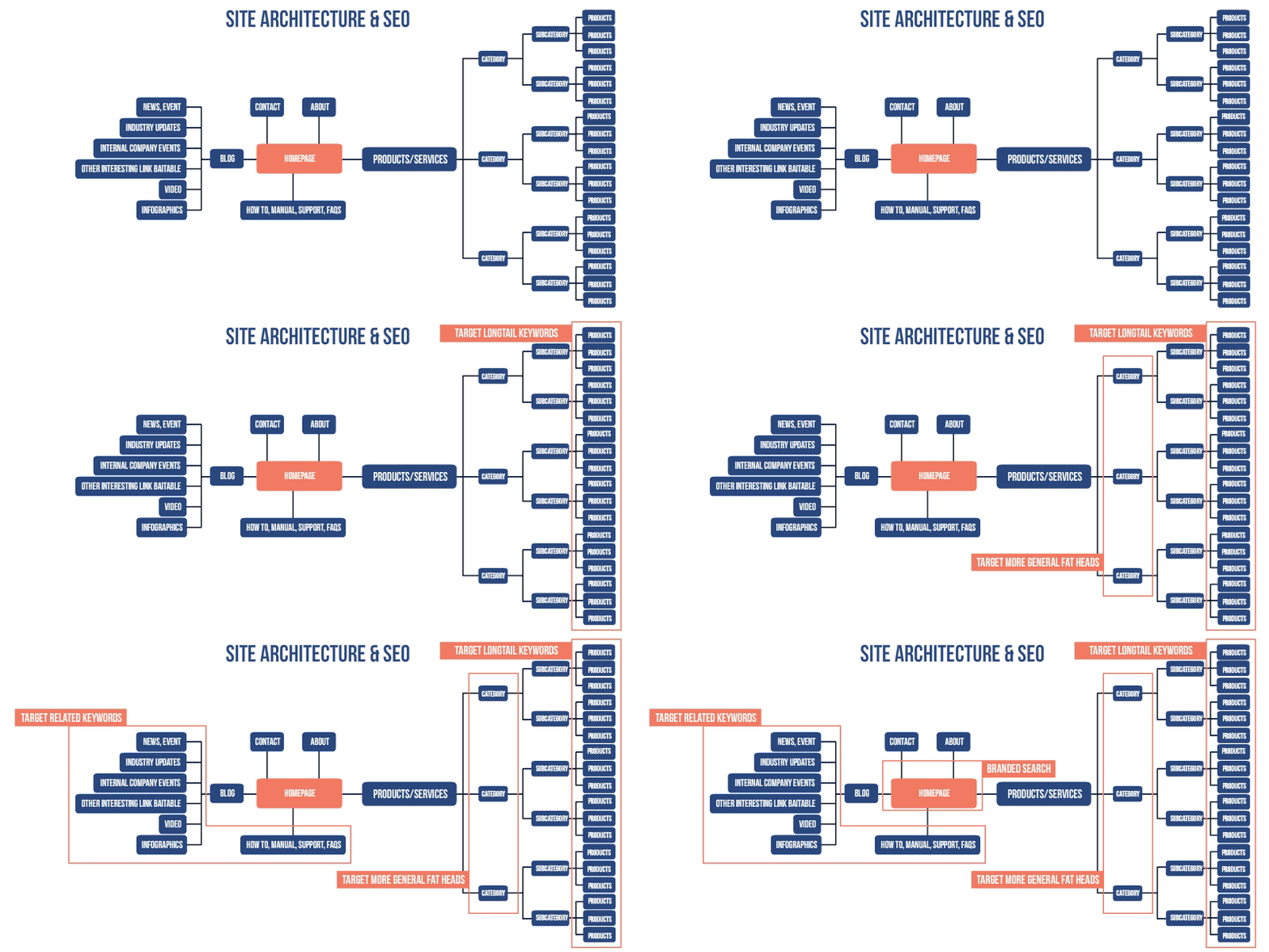
User flow, on the other hand, is about how people get around your site. Your website structure will play a huge part in this. Other factors like how you signpost those links and the quality of your content also come into play.
Dive Deeper: How (and Why) to Create an Effective Content Structure for Better Ranking
3 Key Elements of Your Website
Unfortunately, most sites aren’t this well organized. Instead, they look more like a yarn of wool that has been attacked by a kitten. Content often doesn’t support the SEO strategy, and people visiting the site often struggle to access the resources they would find valuable.
To improve the structure of a website, you normally have to do one or more of the following things:
- Make improvements to the website menu
- Change how and where you place links in your blog posts and pages
- Review the links in the website footer
Optimizing your menu is the easiest way of improving user flow. The reason is rather obvious – people use the menu to navigate your site. Your menu is also one of the first things Google crawls when it indexes a page.
Then there's your content. To improve user flow, you will need to cluster related content together, then optimize where you place the links in the content. While this will take a long time, optimizing the user flow across your content is one of the most effective ways of increasing revenue from your site. The reason for this is that people reading your content are already engaged with your site.
Finally, you have the website footer. Think of this as a final call to action on your site. It’s easy to optimize the links here, and it does have an impact on website structure.
Dive Deeper: 9 Effective SEO Techniques to Drive Organic Traffic in 2019
The Best Tools For Analyzing Your Site
Before implementing any major changes to your site structure you should review how people are already using your site. There are two sets of tools that you can use to do this:
- Google Analytics for analyzing user flow
- Heatmap tools for analyzing what people are clicking on
Google Analytics makes it easy for you to track the user flow across your website. You just need to click on Behavior, then Behavior Flow to access the relevant information:
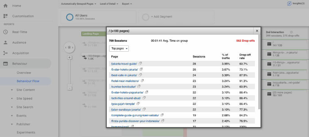 The data provided is comprehensive but, unfortunately, it can be complicated to understand.
You might find it easier to use heatmap software that shows you what visitors do on your website. Heatmap tools are useful for showing you where people click on your site. Some tools will even provide you with video recordings of what an individual visiting your site actually did.
You can use the information from these tools to identify issues with user flow across your site as well as user experience. For example, if your bounce rate is high you should review what content you are linking to from the page and the calls to action you use. A heatmap that reveals how far people scroll down a page will help identify the best place to insert a call to action.
Dive Deeper: 7 Mistakes in UI and UX That Are Costing You Engagement
How to Optimize Your Website Menu
The website menu should include links to your most important content. For most websites, the site menu will link to content around some or all of the following topics:
- Your main products or services
- Case studies about those products or services
- Contextual website information (about page, contact page, etc.)
The number of links on a homepage is normally proportional to the way the site makes money. Many e-commerce sites have a lot of links in the menu. Amazon is a good example:
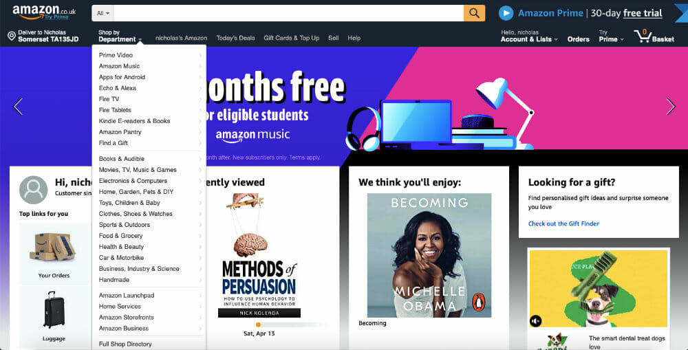
Having all these links helps people quickly access the content they are searching for.
For other niches, you want to reduce the number of pages that a person can access because you are trying to funnel site visitors to a limited number of core pages. An example of a site with just a few core links in the menu is HubSpot:
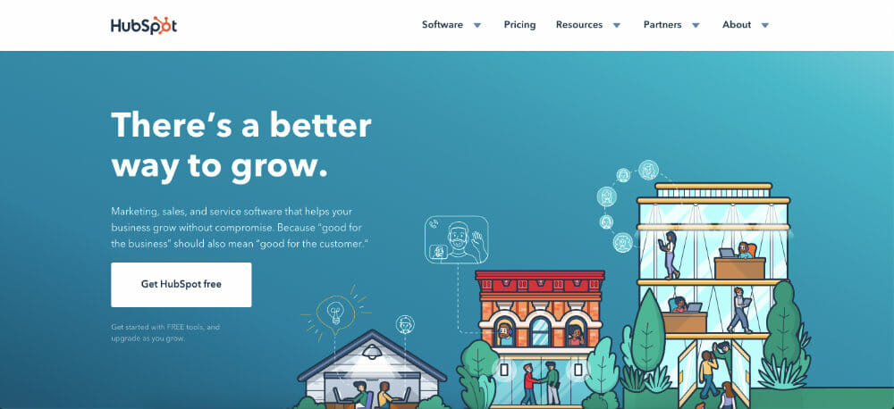
Two quick tips for optimizing your menu:
- The most important links should be on the left-hand side. This is because in English people read from left to right.
- Use common phrases for your anchor text, like “blog” rather than “magazine” to avoid confusing people.
If you don’t know what to link to from your menu, check out the competition. If most of the big companies in your vertical have the same menu structure consider stea– *ahem* imitating them.
As Mark Lindquist, marketing strategist at Mailshake, points out:
“When it comes to structuring your site there’s no need to reinvent the wheel. Independent of SEO concerns, think about the user experience; people want to navigate through websites in a familiar way. Following the crowd makes it easier for potential customers to find what they’re looking for as fast as possible.”
While it’s good to see what your competitors are doing, it’s also worth thinking about what you could do differently. This might involve reviewing the menu structure applied by websites operating in other verticals. You might also want to use an adaptive website menu structure. I’ll show you how to do this below.
Dive Deeper: Making Data-Driven Decisions for Better Website UX
When to Use an Adaptive Menu Structure
An adaptive menu is when the links on a menu change as you navigate a website. The changes are normally based around categories. The basic theory is that if you can customize the menu around the interests of the visitor, they are more likely to click a link. This can help user flow.
I use an adaptive menu on the Indonesian travel site that my wife runs. A person coming from Google to a page about Bali will see content that is relevant to their interests. If that same person goes to a page about another destination, different links appear in the menu. You can see how this has been implemented in the screenshot below.
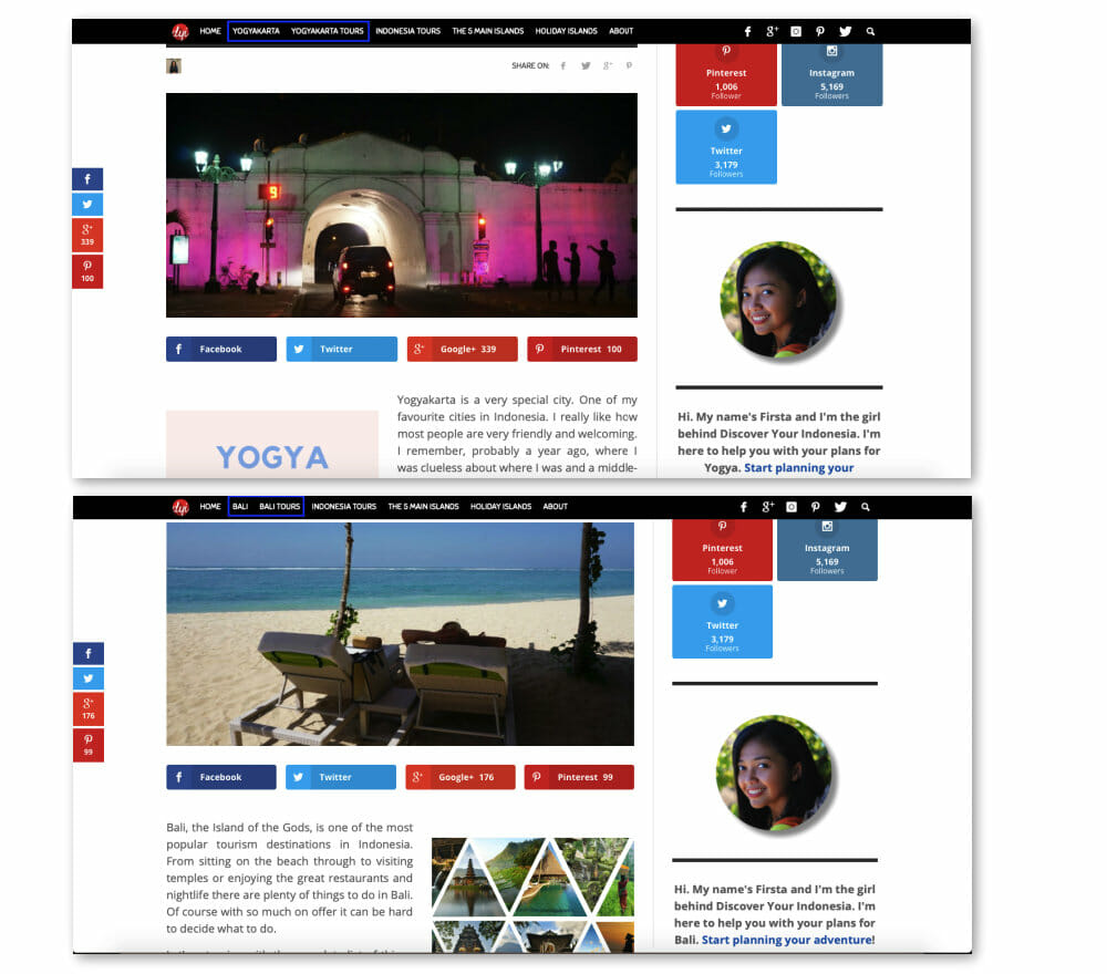
Being able to provide visitors with content based on their interests in the menu helps generate more sales across the site. In this sense, an adaptive menu structure works a bit like a content upgrade: you engage more people by providing them with relevant content.
Keller, founder of Leadsurance had this important point to add:
“A good adaptive menu goes unnoticed. This means the menu keeps it's overall design consistent and only slightly changes in options based on the page the user is on. This is important because having drastically different menus throughout your site will confuse visitors and reduce page views. It is important to find a balance of consistency and providing the right content with an adaptive menu.”
If you’re going to create an adaptive menu on your site, it’s important to find a balance between what changes and what stays the same. You may decide that an adaptive menu structure is not suitable for your website. On the other hand, it could be a useful feature that will help improve user flow across your site.
How to Optimize the Links in Your Footer
Your footer is like a final call to action across your website. Even though very few people interact with your footer links are important. These links are sitewide, and the anchor text that you use can have an impact on site rankings.
You should apply the same process to optimizing the links in your footer as the main menu. Keep in mind:
- Your footer can contain more links than your main menu
- You can add the same links in the footer as you did in the menu
- You still want these links to be useful to your visitors
Improving the structure of your menu and footer are easy wins. You can implement changes very quickly which can have major impacts on user flow across and overall website structure.
How to Link Between Articles to Improve User Flow
For an established website, improving the site structure and user flow is a huge task. There’s a good chance that you will have hundreds, perhaps even thousands, of pages to review, copy to improve, and URL structure that might need adapting if you want to make more money from your blog or product pages. Before you start editing those pages, there is a good chance that you will need to cluster your content together.
Dive Deeper: The Ultimate Guide to Link Building with Content for SEO
How Article Clustering Works
The idea of a content cluster is to group pieces of content on the same topic or series of keywords together. When you’ve finished optimizing them, these clusters of content form a funnel that helps direct visitors around your site and supports your SEO strategy.
Check out the graphic below to see how article clustering can work in practice.
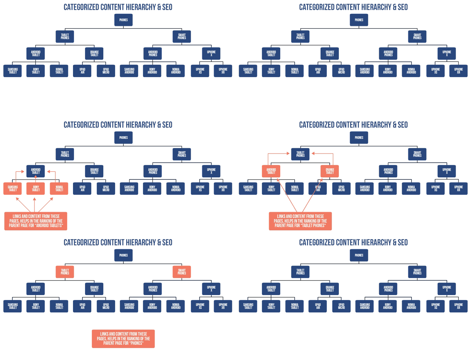
With a disorganized site, the easiest way to cluster content is to export all the website data from Google Analytics. The export will provide you with a list of all posts and pages across your website.
You can then create topic clusters. I do this by first highlighting the core pages of the website. Then I go through the list and group content together around a theme using a traffic light system: Green for content at the top of the funnel and red for content at the bottom.
As you review all the content on your site you might come across two pieces that target the same keyword. This is a common issue for sites with a lot of content. Duplicate content is something you’ll need to deal with.
A Quick Guide to Link Structure in Your Content
Now that you’ve clustered your pages and posts together, you need to interlink between the articles. The fundamentals of this process are relatively simple: Near the beginning of the article, insert a link to the relevant money page or thematic page for that content.
In the body of the article, link between the relevant pieces of content around the topic that you’ve created. Then at the end of the page, use a call to action to funnel people towards your money page. As you do this, your website architecture should start to resemble a spider's web.
If you are running an e-commerce store, you’ll also want to send links between your blog, which is where you’ll find it easiest to acquire backlinks and the different pages of your store. This animated graphic should give you a nice overview of how that works:
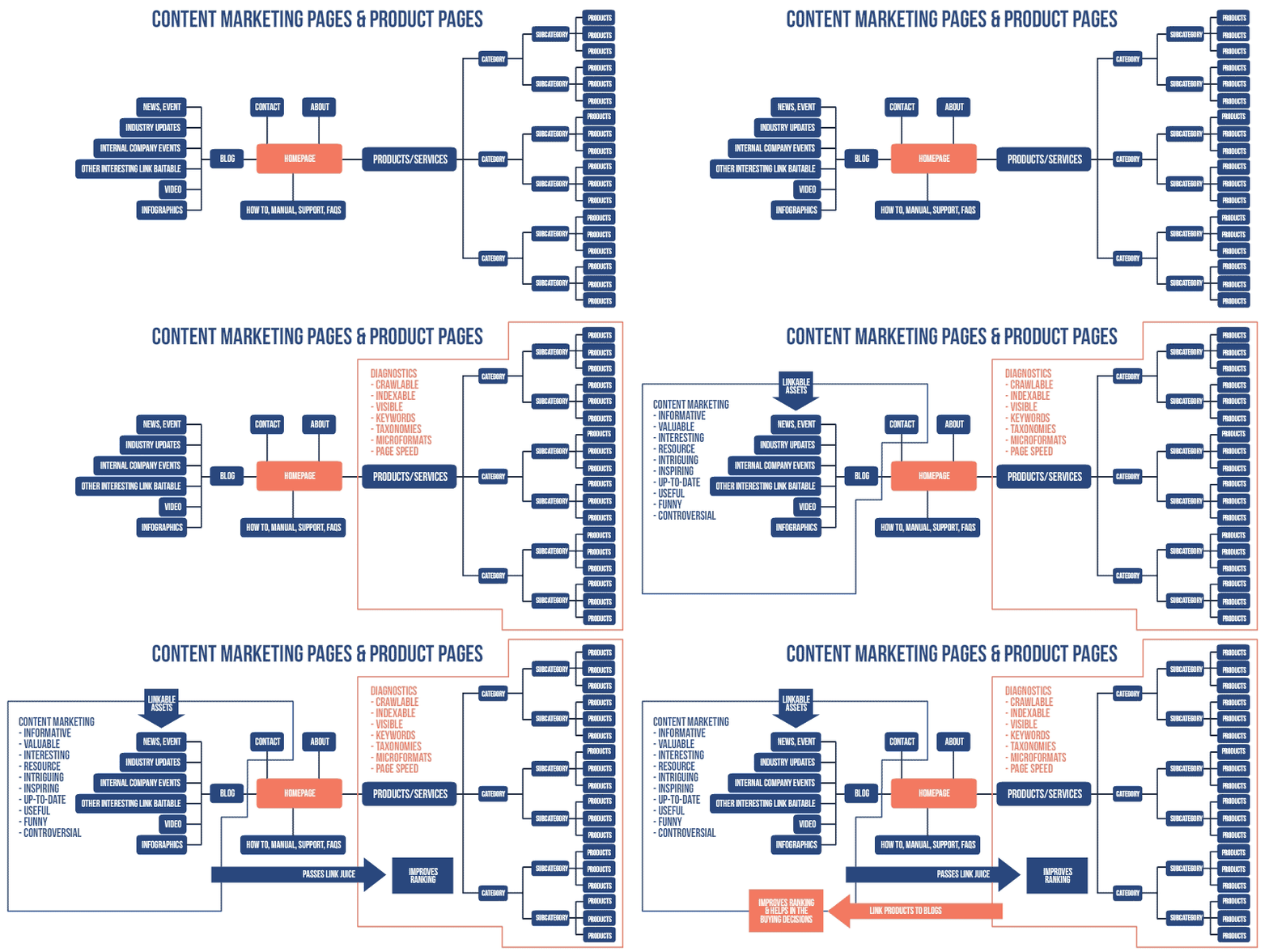
What you’re essentially doing is spreading the link love between relevant pieces of content that the website visitor will find useful. At the same time, you are also highlighting to Google the most important content across your site.
In addition to passing links between your blog and sales pages, you should also crosslink between your content silos. The graphic below illustrates why this is important:
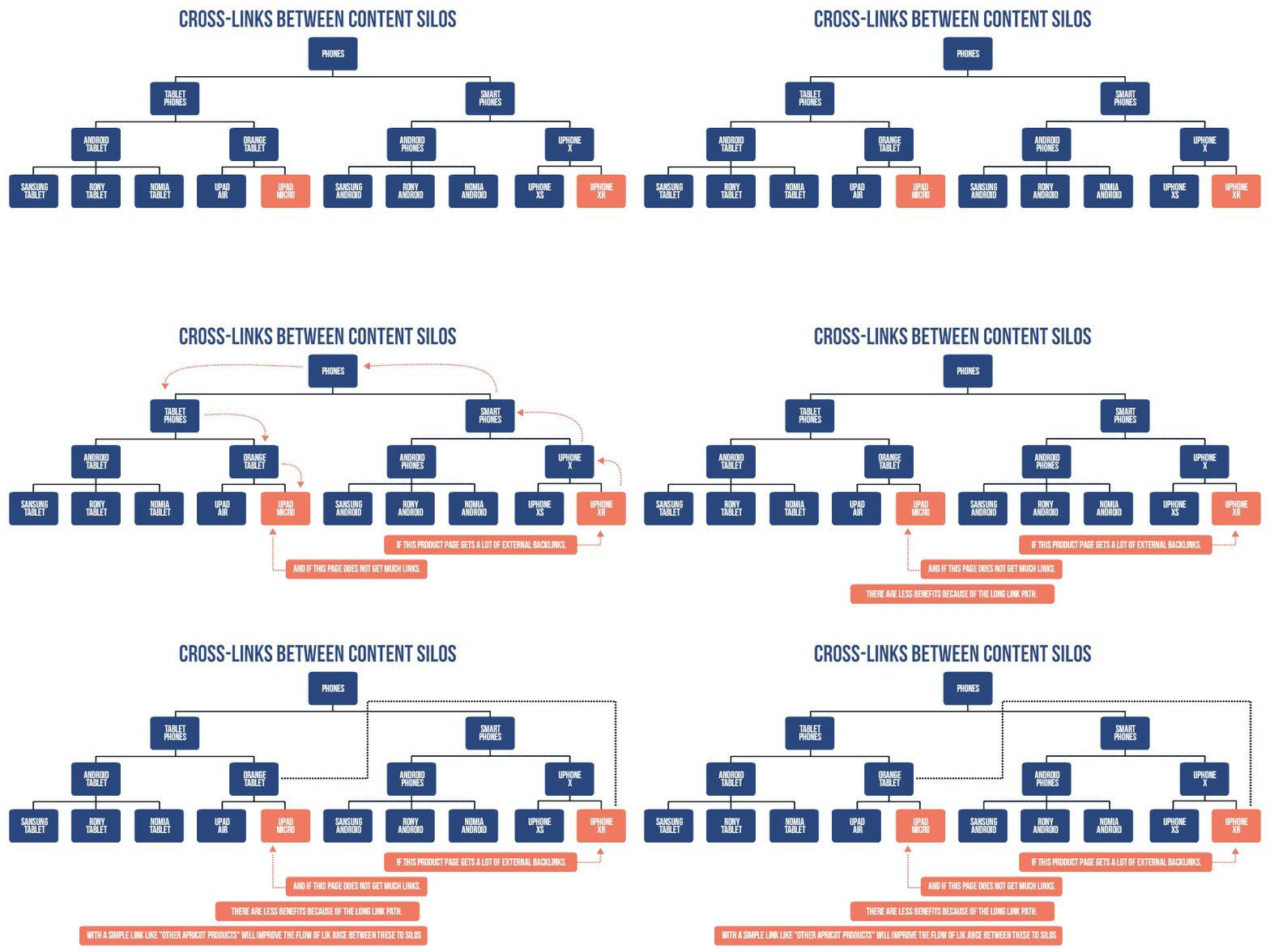
To ensure that you are spending your time most effectively, it’s best to prioritize the content that gets the highest volume of traffic. Then slowly work your way down through the list of pages, making improvements as you go.
How to Use Ranking Signals to Optimize Your Content
Optimizing where you place links in your content is just one of the updates that you will make to the content. You want to take some of the other ranking factors I mentioned earlier into account when updating your content. For example, if your article has a low CTR, then you should consider making changes to the headline and metadata text.
Alternatively, if your page has a high bounce rate or low time on the page then you might need to make updates to the content. This will normally mean removing links or adapting the content with clear calls to action that move readers in the right direction.
Dive Deeper: The Skyscraper Technique: How to Build High-Quality Backlinks to Your Content
Wrapping Things Up
In this guide to site architecture and user flow, I’ve tried to provide you with a step-by-step approach that you can apply to your website to improve user flow across the site. Over time this strategy will result in SEO benefits for your content and, just as importantly, funnel people towards the most important content on your website.
Keep in mind that the strategy I’ve laid out here should be incorporated into the way you manage your website. Once every six months, you should review how people are using your site. Making sure that your website structure is easy to navigate and your content is relevant is a surefire way of increasing your revenue.
The post How to Improve Your Website Structure to Boost Your Profits appeared first on Single Grain.
from Single Grain http://bit.ly/31D8B0y


No comments:
Post a Comment