Historically digital marketers are more concerned about attracting traffic to the site than boosting on-site conversions.
This is unfortunate because conversion optimization usually requires smaller investments and provides faster results than growing your traffic.
Here are eight ways to increase your ecommerce conversions quickly by providing better usability and smoother user experience.
1. Make your checkout process simpler
The name of the game is convenience. Don’t make it difficult for the consumer to finish a purchase. The more barriers your site throws up, the more likely it is your customers will leave the cart without completing the purchase.
According to BigCommerce’s 2019 Omni-Channel Retail Report, convenience is among the top 3 reasons U.S. consumers across all generations chose to buy from an online store. When shopping online, millennials have become used to speed and convenience while younger generations have never known shopping without these.
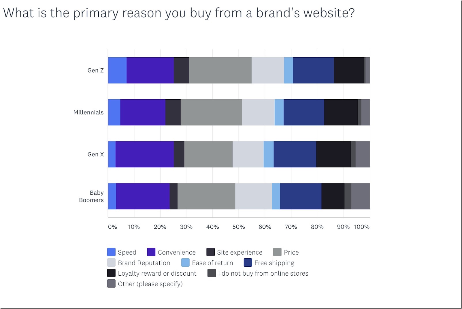
You should have a simple checkout process because that’s what is expected from your site these days (and often the primary reason why they shop online anyway). For example, sites that force you to sign up before you can check out are frustrating, and many users are not willing to spend time creating an account. Remove the forced signup and provide an option to checkout out as “guest.”
Every section of your checkout process is another opportunity for the consumer to quit and walk away. Consider whether any given section is worth the chance of losing sales and if you can safely remove it. Or, if it can’t be removed, find a way to streamline the entire process. For example, include a duplicating button that allows users to make their delivery address their billing address, without entering the same information twice.
Create easy cart navigation and decrease the number of steps needed to complete the purchase. This will increase sales and profits as well as customer satisfaction.
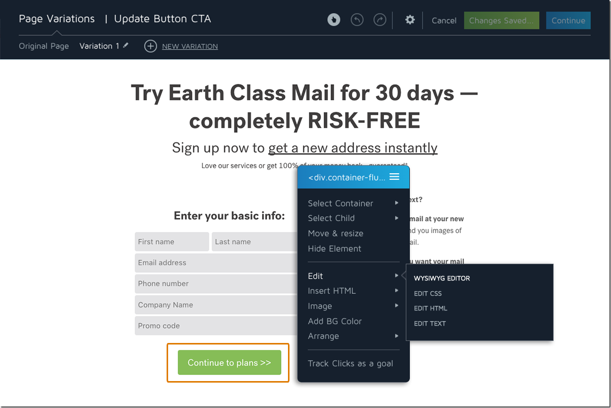
Featured tool: Convert.com allows to easily A/B your site shopping experience to come up with the best solution for your customers. Additionally, for WordPress, here’s a detailed A/B testing tutorial.
2. Provide one-click upsells
According to ConversionXL, it is 25 times more expensive to develop new customers than it is to re-convert your current customers. You need to work to keep re-engaging your existing customers continually.
They are more valuable to you than a new visitor. Studies have shown that if you can increase your customer retention by 5%, you can increase your profits by up to 25%.
You can keep these consumers through a one-click upsell option. It convinces customers to complete an additional, unplanned-for transaction. It’s exactly how impulse shopping works in brick-and-mortar stores. They place enticing items by the register to convince you to add them to your purchase while you stand in line.
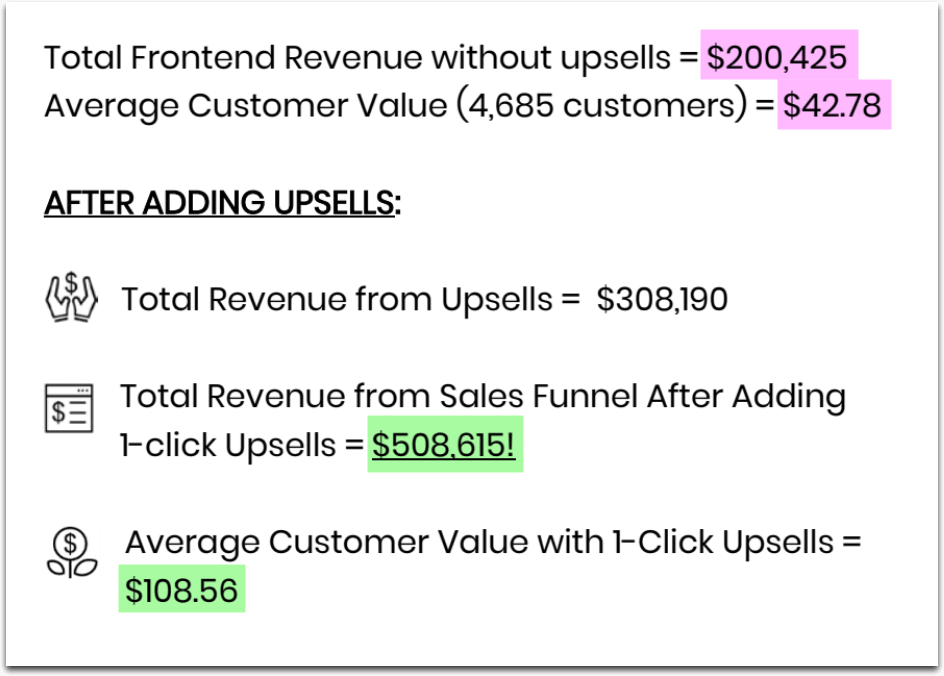
PayKickstart users have demonstrated powerful proof of concept: Many of them have seen both their average customer value and the total revenue more than double after they implemented one-click upsells:
3. Make your shopping experience mobile-friendly
Mobile shopping is continually growing. More people are using their mobile device or tablet to shop on ecommerce sites than ever before, and with the fast adoption of smartphones worldwide, the numbers will continue to go up.
Users are more likely to abandon a cart and navigate away from your site if it’s difficult to browse on a smartphone. You don’t always need to develop an expensive app, but you do need to make your website easy to read and use on a smartphone.
One powerful way to make your shopping experience mobile friendly without investing into a standalone app is to use web design platforms that support progressive web apps (PWAs) which act like native mobile apps but don’t need to be installed by your customers. According to Google, PWAs are “a new way to deliver amazing user experiences on the web.”
PWAs also support many app-like functionalities that most mobile-optimized websites do not, such as push notifications, which can be especially useful for omnichannel retailers.
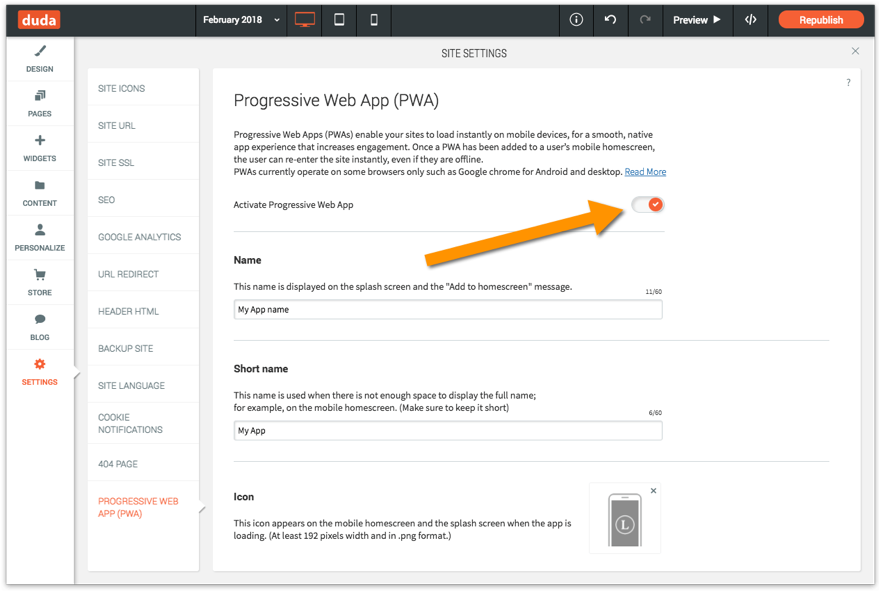
Duda allows agency professionals to roll out progressive web app versions of their clients’ sites with one click of a button:
4. Provide personalized shopping experience
Several studies found personalized experience is a growing ecommerce trend that shouldn’t be neglected:
- 59% of e-commerce shoppers find it easier and more engaging to shop on sites that are personalized.
- 56% of shoppers are increasingly more likely to return to a site that recommends products to them.
- 53% of shoppers believe that e-commerce retailers that offer personalized shopping provide a valuable service.
With Amazon leading the digital marketing industry, most of US consumers already expect to receive personalized treatment whenever they shop online.
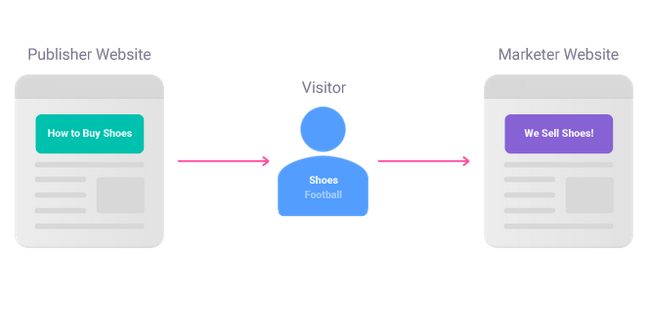
Alter helps you set-up personalized shopping experience without the need to invest into an in-house solution. It works as follows:
- Visitors read content or research products like they normally would on their favorite websites and blogs
- Alter anonymously determines non-personal visitor interests based on the web pages they’re viewing (e.g. shoes, cars).
- Visitors see personalized content based on those interests to help save time on websites they visit later (marketer websites).
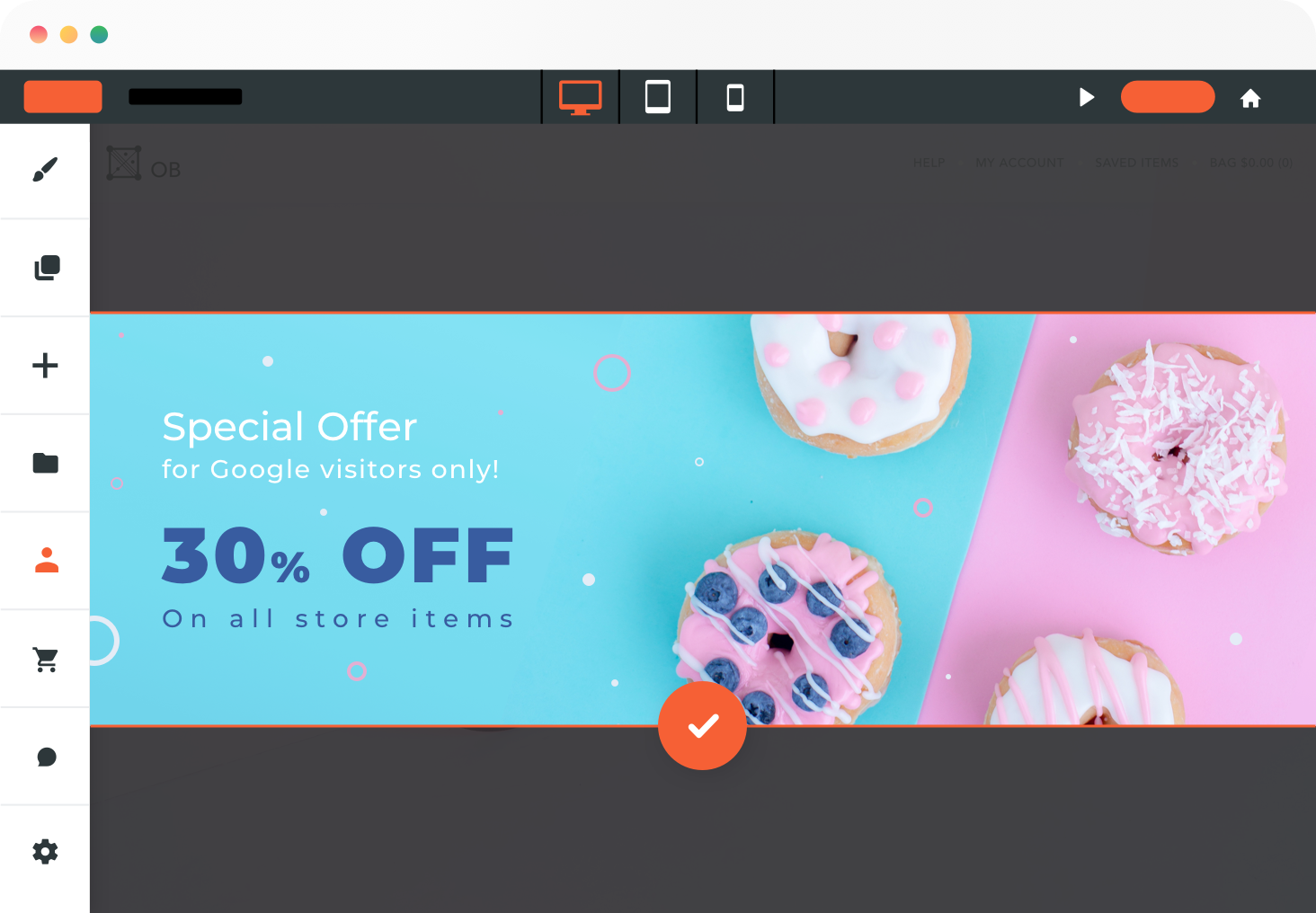
Some content management systems also provide for solid personalization options (which would be even easier to implement). For example, Duda allows you to personalize CTAs and special offers based on time of day, geolocation, number of visits and more:
5. Match your customers’ expectations
Many of your customers discover your products through Google search. Are your landing pages doing a good-enough job matching their expectations?
Search intent optimization is often overlooked. Yet, it’s what often determines your users’ on-page engagement. Whether they will instantly see what they expected to see determines whether they will want to stay and give your landing page a chance to convert them into buyers.
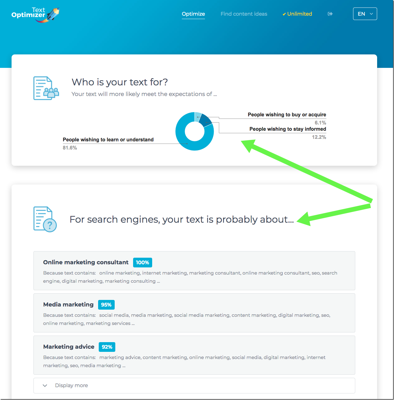
Text Optimizer is a great way to optimize your landing page copy to meet Google’s and its users’ expectations. It uses semantic analysis to extract important concepts from Google’s search results. Use these terms when crafting your landing page copy to optimize it better and engage more of your site visitors:
6. Add a sense urgency
Have you ever had a case of FOMO or fear of missing out? You’re not alone. The fear of missing out on something amazing or special or even extremely ordinary is a powerful psychological force that you can tap into.
Add a sense of urgency to your shopping cart page to develop FOMO in your costumer. This can give hesitant customers the extra push they need to complete the purchase.
Amazon uses FOMO extremely well by adding a countdown timer tied into your shipping. It tells you to buy the product in the next XX minutes to qualify for one-day shipping.
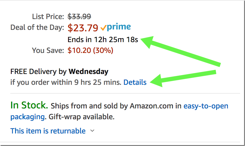
You can use this tactic by adding a timer to your cart page, or a countdown clock to the end of a sale (here’s how). You could even go simply by writing “checkout now” instead of only “checkout.”
7. Add breadcrumbs
Site navigation can be tricky. If you’ve never been on a particular website, you might struggle to find your way around after you move from the landing page.
This is especially troublesome for e-commerce sites. You need to implement clear site navigation for both SEO and usability.
Setting up breadcrumbs throughout your pages is a simple way to help your users feel confident at each step of their journey. Make it obvious where the consumer should go and what they should click next, and you are likely to see your conversions go up.
Conversion optimization may seem overwhelming. Luckily there are tools and solutions that can make it quite doable. Before investing in attracting more traffic to your site, try implementing the tips above to get the most of those visitors you already have.
The post How to increase conversions: Ideas, tools, examples appeared first on Search Engine Watch.
from Search Engine Watch https://ift.tt/2FkhtOt


No comments:
Post a Comment