
Here’s our starting principle:
A polished, professional landing page can improve your conversion rates. (And a messy one can hurt them.)
Pretty simple, right? You’ve probably heard something similar before. But what the heck does it mean to be “polished” and “professional” on a landing page, anyway? And when it comes to conversions, what’s the magical x-factor that sets exceptional marketers apart?
With these questions in mind, we want to show off some fresh landing page examples to inspire your next creation. Go ahead and save their smartest, slickest, and snappiest elements for your swipe file.
Throughout, we’ll offer an Unbounce-certified perspective on what makes each page so darn good—and, occasionally, how each could be improved. (Incidentally, all of ’em show off what you can do with the Unbounce Builder.) Let’s go.
What makes a landing page effective?
Before looking at the examples, it’s worth highlighting some of the qualities that most great landing pages share. (Ain’t got time for that? Jump ahead for the top landing page examples.)
Here are a few fundamental practices of high-converting landing pages:
- Use a clear and concise value statement (above the fold) so visitors understand the purpose of your page immediately.
- Match your primary headline to the ad your visitor clicked to land on the page in the first place (or the button of the email CTA, for example).
- Include social proof and testimonials to back up your claims.
- Focus the whole page on a single offer, with just one primary call to action (CTA).
- Use a conversion-centered layout to make your CTA stand out (think about whitespace, color, contrast, and directional cues).
- Test new ideas using A/B testing. Sometimes what works will surprise you.
The Best Landing Page Examples
1. Athabasca University
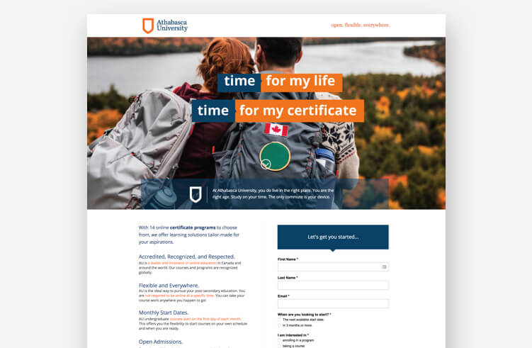
Athabasca University pioneered distance education in Canada in the 1970s. Today, it uses landing pages to boost its online enrolment initiatives, including this example representing its 14 certificate programs. It’s a smart choice since landing pages allow AU to focus a visitor’s attention on a particular slice of its many online program offerings.
Industry: Education
Why it inspires…
- Smart copy: It might be worth testing out a more direct headline, but the copy here matches the school’s other branding initiatives elsewhere. It’s also very sharp. The target is clear: people who might further their education but don’t feel they have time to pursue it. This landing page says otherwise (in words and in its hero image).
- You-oriented copy: This page is all about me (or, uh, “you”) and not about the “Great and Powerful” Athabasca University. Marketers working in education understand the need to appeal to self-interest better than many of their counterparts in other industries, who can slip into bragging. I’m not sure what part of Maslow’s hierarchy of needs calls for tech bro flexing, but AU does better by appealing to a desire for self-actualization.
- Testimonials: A little bit of inspiration never hurts. Here, the social proof shows pathways to personal success before people make a significant investment. I’d test to see if doubling down doesn’t produce even better results here. Giving each testimonial more visibility and offering a smidge more biography—along with portraits to humanize them—might provide a little boost. (Of course, it might not. But that’s why we test!)
- Z-pattern: This page is a classic example of a Z-pattern at work. That is—its visual hierarchy takes advantage of the way people typically scan a webpage. In this case, the eye is encouraged to travel from the Athabasca University logo to their tagline (“Open. Flexible. Everywhere.”), then diagonally across the heading to the supporting copy, and then finally right to the call to action. (Pow!) Other visual queues also encourage the eye to move down (including, cleverly, the pointed tip of Athabasca crest).
2. blow LTD.
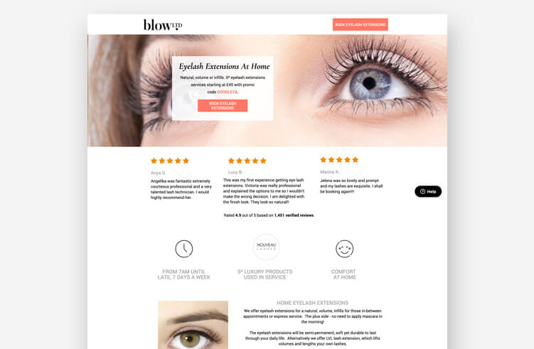
If you look past the buzzy “Uber for beauty” thing, UK brand blow LTD. solves a genuine problem in a genius way. They offer affordable, professional beauty services that come to you, and—more importantly—you can book an appointment with one of their pros straight from their app. Smartly, landing pages are a big part of their campaign strategy. The example, for instance, promotes in-home eyelash extensions in clever ways.
Industry: Beauty
Why it inspires…
- Crystal-clear value statement: This landing page doesn’t mess around with cute copy (e.g., “Eyes That Amaze”). Instead, it clearly states the offer and relies on value (and maybe a little bit of novelty) to win over prospective customers. A promise doesn’t get more unambiguous than “Eyelash Extensions At Home,” and that’s precisely why this headline is so effective.
- Promo code: Providing a promo code to visitors sweetens the pot, but it’s also doing something more. The call to action (“Book Eyelash Extensions”) redirects to their main website, where they might get distracted or frustrated. The promo provides extra motivation to carry visitors through to complete a booking. Want these savings? Then ya’d best use that code before you forget.
- Social proof: People are understandably picky about who does their hair and makeup, so providing social proof is a must. The testimonials here have been selected to highlight the personalized nature of the experience too. Since blow LTD. only works if prospects feel they can trust their professionals, providing social proof helps humanize the service and start building relationships.
- Simple steps: Looking further down the page, we might pause over the “How It Works” section. In this post-Uber world, the service offered by blow LTD. is pretty easy to understand, so why bother including a three-step breakdown of it? That’s just the point, though. This landing page includes these steps to highlight this simplicity. I mean, come on—step three is “Sit Back & Relax.” That’s something I can get behind.
- Subtle app promotion: Rather than aggressively funneling visitors into an app, the landing page ends with a gentle reminder that you can download the app on your iPhone or Android. (I’d test a mobile variant of the CTA that goes straight to the app.) Some people will certainly get excited about booking with blow LTD. on the go, but visitors don’t feel too pressured to whip out their smartphone. Once a visitor has converted, there’ll be plenty of other opportunities to onboard them to the app.
3. Border Buddy
Ever try to cross the border with a 10-pound wheel of Wisconsin cheddar strapped into the passenger seat (and disguised as your wife)? Me neither. But if I did, I’d want Border Buddy behind me. This landing page works by evoking common anxieties and then offering to solve them without fuss.
Industry: Customs
Why it works…
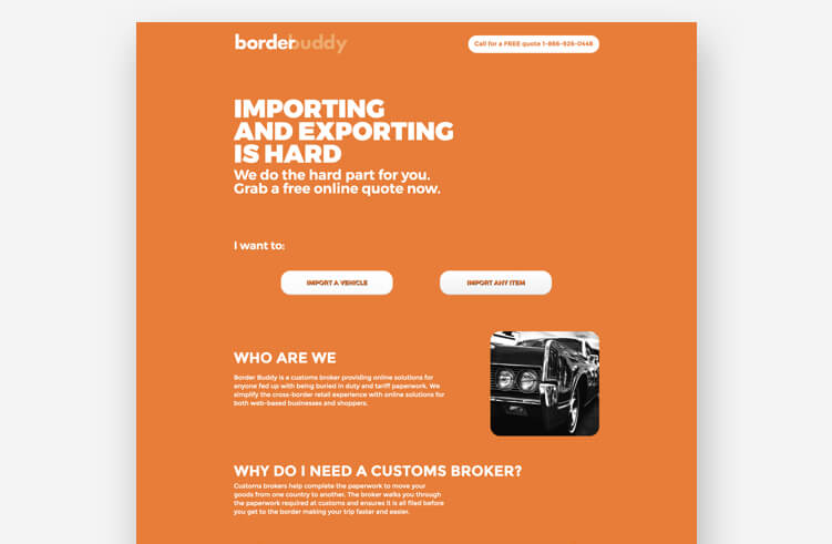
- Presenting the problem: The headline starts with the pain and insecurity (“Importing and Exporting Is Hard”) that any visitor who hits this landing page from a PPC campaign is likely to be feeling. Crucially, though, the promise of a solution appears with equal clarity above the fold: “We do the hard part for you,” says Border Buddy. Perfect.
- Simplicity: Bringing your purchases across the border can get very messy, so keeping this landing page clean is essential. There’s no more information here than what you need to know. No legalese either. You’ll have a customs broker worrying about all those small details for you.
- Speed: At Unbounce, we have a lot to say about the impact that page speed can have on your conversion rates. But Border Buddy is already ahead of the curve on this one. On mobile, this landing page takes less than three seconds to hit first meaningful paint. Border Buddy avoids weighing down the page with unnecessary media or scripts, ensuring immediate visitor engagement. (Prepping an SVG version of their logo could shave a few kilobytes off of what’s already a very lean page.)
- Unexpected vibrancy: Sometimes marketers associate the push for faster speeds with a need to sacrifice the visual appeal of a landing page. This example from Border Buddy shows it that doesn’t have to be the case. They’ve made careful choices in terms of font, layout, and visuals to maximize impact and reinforce branding (without distracting the visitor).
- F-pattern: Like the Z-pattern, the F-pattern layout mimics the way our eyes move across the screen when we look at content. It reduces cognitive load and ensures that the key pieces of the message (including the call to action) are located in the places that they’ll most noticeable.
4. Bouquet Bar (Agency: Power Digital Marketing)
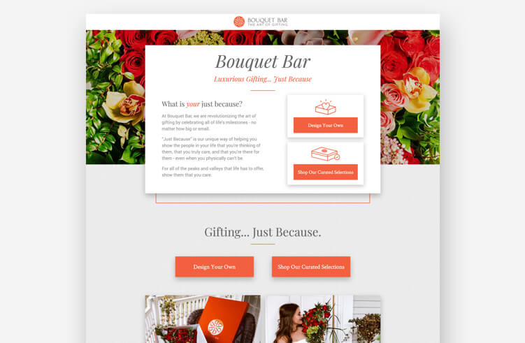
Power Digital Marketing created this gorgeous landing page for Bouquet Bar. Though other landing pages target specific holidays, this one says that you don’t need an excuse to treat someone you love (or, y’know, need to impress) to a bouquet. You can do it “Just Because.” Ryan Picardal, the designer who worked on it, describes their goals:
For a fairly new brand, our team realized that we needed to capitalize on not only driving sales from these landing pages, but also expanding their audience. In order to achieve that, we needed to focus on putting enticing messaging and imagery at the forefront, and ensure that all key benefits Bouquet Bar provides are clearly visible and eye-catching.
Industry: Florist/Gifts
Why it works…
- Choose your own adventure: While maintaining focus is important, sometimes a single call to action doesn’t quite capture the types of visitors your landing page receives. In these cases, it can be quite effective to provide multiple options. For buyers who want to craft something personal, the first call to action invites you to create your own bouquet. But for those short on time or imagination, “curated selections” provide a shortcut to celebrating an important person or occasion.
- Just Because: 75% of roses sold in the US are purchased by men for Valentine’s Day. And 25% of all adults report buying flowers as gifts on Mother’s Day. It’s likely Bouquet Bar does a significant amount of business around these two days, but the “just because” messaging here invites business during the other 363 days of the year.
- The right color palette: This point touches on Bouquet Bar’s overall branding, but it’s worth pointing out in the context of the “Just Because” page. Orange, particularly the deep shade they’ve chosen, aligns with the brand’s warm, sophisticated personality. A lot of what gets labeled as the psychology of color is fairly dubious—using pink won’t suddenly make your funeral home appear more cheerful—but the accents here definitely support the identity that Bouquet Bar wants to establish.
- Evocative photography: The gallery helps contextualize the product as an “expression of love, gratitude and friendship” by showcasing people receiving the gift. Images of people can be more effective at evoking emotions than words, so a company like Bouquet Bar is wise to employ them here. The photos also, much more practically, show scale. This can be a real concern when purchasing products sight unseen. It’s an excellent lesson for anyone practicing ecommerce.
5. Class Creator
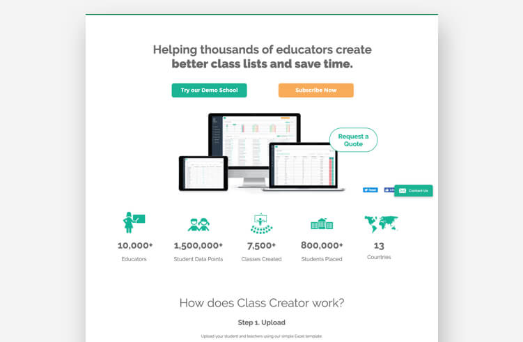
Australia-based Class Creator uses this Unbounce landing page to make inroads in the US market (and, hopefully, help the company secure US partners) when school’s between sessions in their home country. The page showcases many of the product’s features as well as the primary benefits. It targets high-level decision makers who need as much information as possible before they buy.
Industry: Education/SaaS
Why it works..
- Breakin’ the rules: I know what you’re going to say. “That’s not a landing page. It’s a homepage. It breaks all the rules. Just look at that navigation bar! Look at all those different links. The Attention Ratio is out of control!” Grumble, grumble, grumble. But there’s a lesson here for anyone looking for landing page inspiration: stay flexible. Tim Bowman, Class Creator’s CEO, told me they’ve found it more success with this homepage than a traditional conversion-focused landing page. I wanted to include it here as an example of just what you can do.
- Floating navigation bar: If you must include a navigation bar, it’s best to keep it in view at all times. This also lets Class Creator keep the primary call to action (“Demo School”) at the top of the page so that no scrolling is necessary for their visitors to find it.
- The numbers don’t lie: Above the fold Class Creator marshals some pretty serious numbers as a form of social proof. They leverage the 10,000+ educators in 13 countries who’re already using their software as a powerful persuasive device.
- Easy access to a product demo: In the SaaS space, it’s remarkably common to see companies throw up too many barriers between potential customers and demoing their product. (“Submit your firstborn for access to our 5-minute free trial.”) Class Creator knows that it’s essential for prospects to get their hands dirty with a demo or trial version of the software. This ensures that they get to evaluate the product in action, generating qualified leads (with a simple email form) and carrying them further down the funnel.
- Smart use of lightboxes: This landing page (acting as a homepage) already has a ton to say about Class Creator. Relegating any additional information to lightboxes works to keep it out of the way. It’d certainly be worth their while testing different versions of this page that swap out features for benefits or put the testimonials in a more prevalent place.
6. Good Eggs
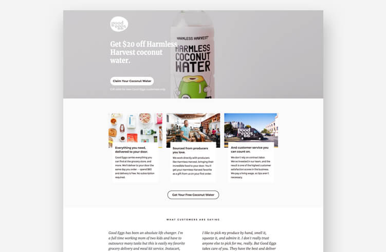
The good people at Good Eggs know how to use slick marketing (just look at their rockin’ homepage!). In fact, I think a lot of their landing pages would be a great fit for this post about about landing page design. This particular example, which promotes free coconut water, is no exception, but it also offers a masterclass in restraint. It shows how to use a promo to score conversions without becoming overbearing.
Industry: Grocery Delivery
Why it inspires…
- Freebies: Free seems universally good. But in this case, the promise of free is doing more than appealing to our instinctual love of not paying for stuff. It builds good will, provides a sample of a product that Good Egg carries, and quickly establishes a lifestyle match between the service and the visitor. What do I mean by lifestyle match? Well, if you’re thrilled by the getting free coconut water from Harmless Harvest, you already know Good Eggs will be a great fit for you.
- Added value: At first, I was taken aback by the headline here because I thought you’d hit harder with the whole free thing (like, I dunno, “Free Coconut Water” could work?). But it’s likely the average Good Eggs customer has more on their mind just getting a deal. Here, the promotion helps show off brand values of wellness, sustainability, and ethical labor practices. So it’s not just free, it’s also a good thing.
- Testimonials: It can be a little risky to mention your competitors, but Good Eggs gets around this problem by letting a customer do it for them. Sometimes testimonials can get a little samey, repeating the same point in different voices. (That’s not always a bad thing.) Here, though, they’ve been carefully selected to reinforce the three value propositions listed above.
7. Jet Pet
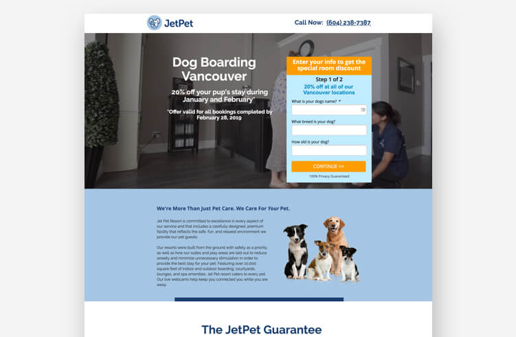
For every person living in Vancouver, there must be at least six dogs. Jet Pet understands this city’s love of pooches, and they’re big fans of using the Unbounce Builder to advertise their premium dog boarding service and three locations to locals. We’ve included it here because this landing page is an inspiration for anyone targeting a select geographic area.
Industry: Pet Care/Boarding
Why it works…
- Clear value statement: A simple heading (“Dog Boarding Vancouver”) lets the searcher know they’ve hit the jackpot. For paid campaigns, Jet Pet can also use Unbounce’s Dynamic Keyword Replacement (DTR) to swap in a search keyword (“Dog Kennels Vancouver”) for improved message match. Then, when a prospect clicks on an ad in Google, they’re brought to a page with a headline that matches their expectations.
- Two-stage form: Typically, using multi-step forms can lead to higher conversion rates than a single long form. Here, a two-stage form reduces psychological friction in two ways. First, it minimizes the perceived effort in signing up for the service. (And even if the second form proves frustrating, someone who’s already filled out the first form is invested and more likely to continue onward. Sunk cost fallacy FTW.) Second, a two-stage form can delay asking for more “sensitive” questions until later.
- Friendliness: Speaking of the form, I love that the first thing they ask you (and the only required field on the first page) is your dog’s name. I’d expect this question if I walked into one of their locations with my pup on a leash, but seeing the same question here made me smile. Jet Pet’s page is full of friendly gestures like this one that make them memorable.
- Trust building: Trusting somebody else with your dog requires significant peace of mind. So it’s important that Jet Pet uses copy that builds that trust and leaves their customers feeling secure that they’ve left Fido with ”loving experts” who have his best interest in mind. The reassuring language that Jet Pet uses across the page reinforces this message, including emotionally loaded terms like “care,” “safe,” and “love.”
- Video testimonials: You don’t always need a video to have an effective testimonial, but in Jet Pet’s case, I think this is a smart move. There’s a lot of questionable testimony out there, so showing actual dog owners speaking to the camera helps build further credibility. (I’d love to see the dogs in these videos too.)
8. Wavehuggers (Agency: Everett Andrew Marketing)
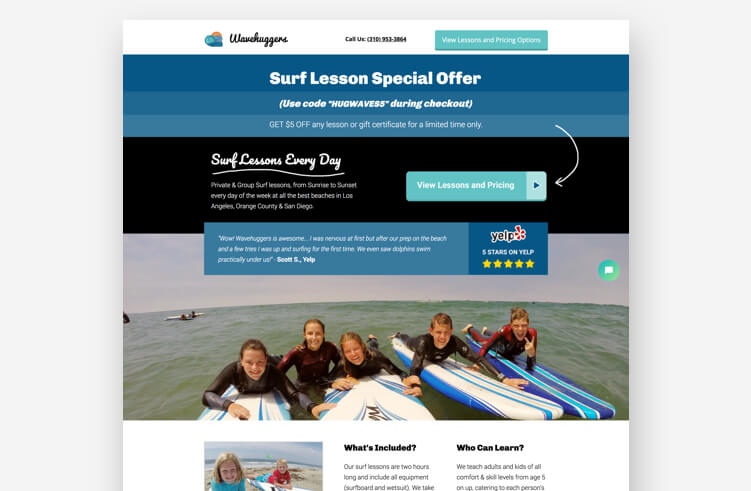
Created by Everett Andrew Marketing, this brilliant landing page connects safety and fun together through carefully selected visuals and clear, concise messaging. According to Mark Chapman, Founder and President of Everett Andrew, this design was all about standing out:
Our goal in creating the page was to cut through the clutter and crowded market of businesses here in southern California offering surf lessons—both on Google and Facebook. Getting each important conversion component (i.e. social proof, urgency, hero shot, CTA, etc.) into the page, mostly above the fold, was tricky but in the end we found a way to segment these out so each part catches the eye.
Industry: Surf Lessons
Why it inspires…
- Yelp score: Even the crummiest of products or services can gather together a few positive testimonials. (“The CEO’s mom thinks we’re cool.”) That’s why high scores from Yelp, TripAdvisor, Amazon, or Google can complement testimonials, as they do here. It’s much more challenging to maintain strong scores on these sites. (Just remember that visitors can always verify your score for themselves.)
- Timed special offer: Like many of the examples here, Wavehuggers add urgency to the landing page with a limited time promotion. It may not seem like much—this kind of thing is almost a marketing cliche at this point—but even small tweaks like adding “for a limited time only” to a promo code can affect your conversion rates.
- Safety, comfort, fun: Prospects are likely seeking out lessons to feel more comfortable on the water. Everything on this landing page focuses on the promise of a positive experience. The copy on this landing page reassures them throughout that surfing is “not as scary as you might think.”
- Real customers: The photographs here don’t have the polish of some of the others on this list (see Western Rise below), but guess what? They shouldn’t. A stunning stock photograph of a professional surfer hanging ten would be far less effective than these visuals of kids having fun on their boards. From the cursive fonts to the hand-drawn arrows, Wavehuggers’ style reflects the relaxed vibes of surfer culture.
9. Western Rise
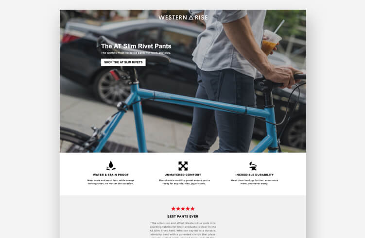
Sometimes when prepping a piece like this one, you end up buying the product. I’m very, very close to pulling the trigger on a pair of Western Rise’s AT Slim Rivet Pants. And why not? This sharp landing page quickly establishes the appeal of the product through visuals and copy that stresses the benefits of these “elevated” pants. It may be time to give up on my ratty jeans altogether.
Industry: Clothier
Why it works…
- Bold visuals: These pants may be handmade in Los Angeles, but many of the photos here (including the hero shot) scream Brooklyn. It’s easy to imagine wearing the AT Slim Rivet Pants as you peddle your fixie through traffic, balancing a latte on your handlebars on the way to a chic rooftop cocktail party.
- Stressing the benefits: I never thought I’d be writing about the common pain points associated with wearing pants, but here we are. On this landing page, Western Rise addresses them all. Jeans are prone to tearing and tend to overheat. Chinos get dirty and wrinkled. Dress pants are for squares, man. By promising versatility (“pants for all day, every day”) and keeping the benefits up front, Western Rise offers a solution to a problem you didn’t know you had.
- “Tech specs”: Though there’s some clever copy on display here, Western Rise is extremely straightforward about the features of the AT Slim Rivet Pants in the “Tech specs” section on the page. They provide precise details about materials (“Durable Nylon Canvas” and “Gusseted Crotch”) and design (“Media Pocket” and “Extendable Hem”) in a clear, concise way.
ABT: Always Be Testing
There you have it. These are some of the best landing page examples I’ve come across here at Unbounce, selected to represent a wide swath of industries with many different conversion goals. I hope you’ve found some qualities to inspire you.
But I have one final piece of advice for you: no page is ever perfect—or, more to the point, every page can be better. And what works for one page (with one target market) won’t necessarily work for you. With this in mind, you should always be testing your landing pages. If you’ve got a page you’re already planning to tinker with, try running it through our Landing Page Analyzer for some actionable steps you can take.
Be the Michael Jordan of landing pages
When I was in middle school, I had a friend who gave up playing basketball after watching Michael Jordan in the NBA Finals. “I’ll never get anywhere near his level,” he told me, “so what’s the point?”
Great landing page examples like the ones above should inspire you. But sometimes seeing other people’s awesomeness can have the opposite effect.
But don’t give up!
The good news is that everything you see here was built with Unbounce’s drag-and-drop builder. Though many take advantage of custom scripts to kick it up a notch, all these examples started in the same place as you will—with a brand, a blank page, and a big idea. Heck, some of these inspiring landing pages even started as Unbounce templates, though you’d never know it by looking at them. And we’re not tellin’.
So swipe a few ideas from these examples, load up your favorite template, and, yeah… be the Michael Jordan of landing pages.

If you’ve got a landing page you’d like to show off—yours or even somebody else’s—please share below.
from Unbounce http://bit.ly/2TGVw20



No comments:
Post a Comment